


Webinar: Popup teardown session [summary]

As you might know, we often organize events where we help business owners and marketers like you to achieve their goals with onsite campaigns.
This time, we asked the Wisepops community if they wanted to have some of their popup campaigns reviewed by an expert.
The result:
Lisa, our own head of customer success, analyzed popups in a recent webinar.
Today, we’re sharing her review of a few campaigns in more detail. Below, you’ll find out more about how to create high-converting popup campaigns and see real examples from businesses like yours.
In this post:
Where to find the webinar video?
Get more conversions with behavior-based campaigns
Show your offers to the right website visitors at the right time thanks to advanced display settings

1. Forage Hyperfoods: discount popup
Website: Forage Hyperfoods
Campaign goal: Build their email and phone number list.
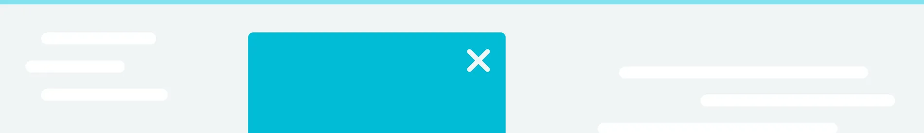
Forage Hyperfoods, an online store, is using two versions of this popup: the desktop one and the mobile one.
We’ll review the mobile version of this campaign.
Campaign design:
The window on the left was the first one to appear. If visitors signed up, they would see the screen on the right where they could get the discount by clicking on the button.
)
Display settings
This version of the campaign appeared only on mobile devices.
As you can see from Wisepops settings below, both new and returning visitors could see it (“Audience.”) The website did not display the campaign to those who signed up or saw the campaign five times (“Stop displaying.”)
The full display settings for this campaign:
)
Performance
Both desktop and mobile versions performed well.
The mobile one was the winner, achieving a CTR of 3.61% and collecting almost 500 emails.
)
Here’s what this data tells us:
Forage Hyperfoods did a great job by creating a separate campaign for mobile users (since the mobile campaign is optimized for small screens).
The brand knows that a lot of its website’s traffic comes from mobile, so making a special campaign totally makes sense.
Lisa’s comments
Here’s what Lisa had to say about how to improve this popup:
Too much text
Logo is a bit too big
No visible popup closing button
Popup was not made full-screen (it seems like they wanted to do that)
How to improve this campaign
Make the logo smaller
Move the disclaimer to the bottom of the popup
Add some text to mention the perks of subscribing
Add one more step (so the email and the phone number are collected on different screens)
Add a delay to ensure that visitors have some time to browse the website
Lisa reconstructed this campaign and used her comments to improve it.
Here’s how her version compares to the original one:
)
💡 Expert tip from Lisa
Activate a tab for your discount popups.
The tab is a small teaser that shows the popup when clicked.
Thanks to this feature, you can make popup campaigns non-intrusive (and visitors can get discounts from popups whenever they’re ready to buy—without the need to wait for the popup to appear again).
Tabs are a popular feature, used by successful stores like Death Wish Coffee. See that small red “Get 15% off” in the lower right corner? That’s the tab!
)
To activate the tab in Wisepops—
Go to Tab in the main menu in Wisepops and click the toggle button.
)
Get help with the tab:
Helpful guides:
💡 Blume case study: Discover how an online store converts 5% of visitors with an email signup popup campaign (with a tab)
💡 SMS popup examples: Get tips on how to collect more phone numbers from your visitors
💡 Email popup examples: Learn more about designing popups that collect emails and see examples from successful businesses
💡 Discount popup guide: Learn how to make effective discount popups based on the examples from online stores
💡 How to use unique Shopify discounts in Wisepops: Discover how to use unique discounts from your Shopify account in popups automatically
2. Quandoo: Spin-to-win wheel popup
Website: Quandoo
Campaign goals:
Generate leads
Introduce some gamification
Let visitors win loyalty points
Campaign design:
The campaign was made by using Wisepops’ popup wheel template, which was nicely customized to fit the website’s color scheme.
)
Display settings
As you can see, the campaign was shown to both new and returning visitors. Also, the popup would stop displaying to the visitors that converted.
)
Performance
This wheel popup performed well, generating a 10.8% CTR.
)
Lisa’s comments
Popup had a different font from the one on Quandoo
Using a full-screen version might increase signups
How to improve this campaign
Try the full-screen wheel popup template
Use the font used by Qandoo’s website for visual consistency (thanks to the Custom fonts feature)
Add more spacing between elements for better readability
Change the format + increase the size of the email signup section
)
💡Expert tip from Lisa:
Add a background image
The image will significantly improve the look of the campaign and make it look more professional and branded.
Let's see two cool examples from Wisepops customers.
Faguo added this beautiful image (which was appropriate, too—the brand plants trees for every product they sell). And check this out: this campaign generates 5,000 emails every month:
)
If you’re interested in more details: Faguo spin-to-win popup campaign analysis.
And—
Here’s one more (taken from Oddballs):
)
Helpful resources:
How to create a spin-to-win popup: step-by-step instructions (Wisepops Help Center)
How to use a custom font in your campaign: a guide from Wisepops help center
Spin-to-win popup guide: instructions to create spin popups + examples of campaigns
Want more examples from Wisepops customers?
Find out how OddBalls generated £50k with clever onsite notification campaigns: OddBalls success story
3. ChefEquipment: Email popup with segmentation
Website: Chef Equipment
Campaign goals:
Build the email list
Collect information about visitors for personalizing email campaigns
Campaign design
The popup appeared at the center of the screen. It used the lightbox effect (the blurred background) and required the visitors to give some extra info (the answer to “what best describes you?”)
)
Display settings
As you can see below, the popup was triggered to appear only after the visitors viewed two pages. That was a smart idea because it would allow potential customers to learn more about the brand’s products.
Here are the full settings:
)
Performance
The popup converted 149 customers, reaching a CTR of 7.6% (for comparison, the average popup conversion rate is 3.8%).
)
Lisa’s comments
Too much information in one popup—the campaign might look overwhelming, especially on small mobile screens
Two headlines with two different value propositions on one popup screen (the special deals with 35% off and the $10 first-time customer discount)
The thank-you screen says “Take advantage of fast shipping anywhere in Canada,” which would sound irrelevant to many visitors (given that the popup was set up to be shown to visitors from all countries)
How to improve this campaign
Make the main incentive (the first-time customer discount) stand out more
Add more spacing between the elements to make the text easier to read
Activate the multi-step popup option to split the popup into two windows (so the popup has only the email signup field in the first window and the question in the second one)
Use location targeting to show the “fast shipping” promo only to Canada-based customers
And here’s the final comparison (keep in mind that Lisa moved “the question” part to the second window):
)
💡 Expert tip from Lisa
If you’d like to notify your visitors about a special offer for a specific group of customers (like fast shipping in this case), use website bars.
In Wisepops, that means clicking Bars when choosing the templates.
)
Using a bar will reduce the amount of information to share in the popup. Besides, the bars are highly visible, so it’s safe to assume that most of your visitors will see the offer.
Example of a bar made with Wisepops:
)
Helpful resources:
Popup copy tips: Get tips on how to write texts for your popups
How to choose positions for bars: a Wisepops Help Center guide for beginners
Country targeting (Wisepops Help Center): Step-by-step guide on how to target customers in specific countries
4. Sun Coast Sciences: Email & SMS popup
Website: Sun Coast Sciences
Campaign goal: Capture emails and phone numbers
Campaign design
This website used Wisepops to display this “welcome gift” campaign to both desktop and mobile visitors. We’re going to review the mobile version (below). As you can see in the image, the website used a full-screen popup.
When visitors signed up, the popup showed the second screen with a phone number subscription.
)
Display settings
This is an on-landing popup displayed at the homepage. As you can see, the campaign is set up to stop displaying after visitors sign up or see the campaign three times.
)
Performance
As you can see, this popup had an impressive CTR of 23.3% and added over 800 potential customers to the company’s email list.
)
Lisa’s comments
Popup does not require the phone number in the first window. This was a smart idea because popups with only one signup field have the highest CVR
There’s a page and second delay—so the popup is not shown immediately after visitors land on the website
Popup stops showing after visitors have seen it three times: that’s a good way to avoid “spamming” all visitors with the same campaign
How to improve the campaign
Use custom property to exclude the existing subscribers
Exclude email traffic (people who registered on the website already)
Activate a tab so the campaign stays easily available at all times
Excluding email subscribers from this campaign means creating a UTM campaign and setting the Audience rules in Wisepops like that:
)
💡 Expert tip from Lisa:
Use an embed to share this campaign on any page on the website.
Embeds are signup forms that you can add to website pages. Because the campaign is already performing well, the website can maximize email collection by adding one or two embeds to popular web pages.
Why?
Because the popup can be shown every two days (plus you don’t want too many popups on your website) but the embed stays available.
Here’s how Lisa added the embed to a product category page:
)
Related resources:
Over to you
Have a question? Need more info about how Lisa improved these campaigns?
No problem: watch the webinar and get all the tips, insights, and even more campaigns.

Pawel Lawrowski
Pawel is the Head of Growth at Wisepops and an expert in lead generation, popups, ecommerce, and onsite marketing.
With over a decade of experience in digital marketing and ecommerce, he has both build marketing teams from scratch and led strategic business growth projects.
Pawel has worked with countless online businesses on marketing strategies and is now sharing his knowledge. Previously, he was an head of growth at Tidio, where his responsibilities ranged from creating marketing materials to building acquisition channels.
Education
West Pomeranian University of Technology
Certifications
Marketing Strategy (course)
Advanced Growth Strategy (course)
Retention & Engagement (course)