15+ Lead Generation Form Examples [+Best Practices]
Let’s be real here:
Getting users to fill out lead generation forms can feel like an impossible task!
A lot of websites put up a form, sit back, and hope for the best, only to be disappointed by the lack of conversions.
After all, your visitors have got this far. They probably just need a nudge in the right direction to keep that momentum going.
To help you out, we’ve gathered the best lead generation form practices along with real-life examples.
Capture high-quality leads at scale
Engage your visitors with personalized popups and forms that achieve conversion rates of up to 25%. Start your 14-day free trial and see the impact on your store in minutes.

More guides on lead generation:
What is a Lead Generation Form?
A lead generation form (or simply lead form) is a web form created to collect emails and information of potential customers so that you can nurture them via their inbox.
Lead generation forms come in a variety of different formats, including contact forms, registration forms, lead magnet forms, and newsletter signup forms. But they all have the same goal: to turn website visitors into leads and subscribers.
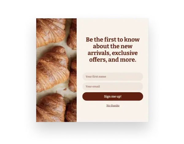
Here's how a typical lead generation form looks:

)

See lead generation forms and their performance from 10 online businesses:
18 Lead Generation Form Examples
1. HubSpot
Your lead generation form is a great moment to get to know your leads. Think about the kind of information that would be useful for you to have – their job title? What kind of business they run? How many employees they have?
The more you know about your leads, the easier it is to personalize your communication with them. For example, if you know that a lead manages a team of 10 people, you can share content and tips that centre around management and organization.
HubSpot asks subscribers to share their company name and how many employees work there before they can download this guide.
)
2. Intercom
We mentioned before that web users are familiar with lead generation forms. They know the drill. Keep form fields simple and limit the amount of text subscribers have to read to avoid confusion and to make the process as slick as possible.
This doesn’t mean you can’t ask for more details, though. Intercom specifically asks subscribers for additional information on top of the standard name and email address fields.
)
3. KlientBoost
Reduce the risk for subscribers by laying out exactly what they can expect once they hand over their details. Or, you can take it one step further and let subscribers know upfront what will happen next when they click the CTA in your lead generation form.
KlientBoost has a multi-step lead generation form which can be a bit risky. However, they remind leads what information they’ll receive when they reach the other side. The form also tracks subscriber progress through a colourful progress bar.
)
Related:
4. Blume
The majority of internet users browse the web from their mobile devices. This can be a huge sticking point for brands that only create lead generation forms for desktop experiences.
It’s a really easy fix, though. Make sure your lead generation forms are compatible: how to make mobile popups.
A Canadian self-care brand Blume does exactly this and converts 5% of their visitors (which is higher than the average popup conversion rate, 4.01%):
)
5. Offer an Incentive Like Overstockart
Who doesn’t love a discount? No one, that’s who. Use this to your advantage to encourage leads to hand over their information.
Take a leaf out of Overstockart’s book and offer a dollar value discount in exchange for an email address. Alternatively, you can offer another incentive, like a free gift, free shipping, or a limited-time offer.
)
6. Make it Fun Like OddBalls
The lead generation process doesn’t have to be one-sided. In fact, you can make it fun for potential leads by gaming the whole thing and incorporating an interactive activity into the mix.
Make like OddBalls, an underwear brand that invites leads to “spin the wheel” to claim money off their order:
)
Related:
7. Personalise Your CTA like CrazyEgg
Consider your form from the perspective of your leads and use language to reflect that. These are the people that are going to be reading your forms and you want them to feel comfortable and like you’re speaking directly to them.
CrazyEgg does exactly this by using first-person pronouns in their lead capture popups. This targets leads directly and compels them to press that all-important sign-up button.
)

Make targeted popups in minutes. Drive traffic to marketing offers with onsite notifications. Convert more of your existing traffic.
8. Lemonade
Online consumers crave human connection more so than ever. They want to build relationships with the brands they invest in, which is why putting a face to your lead generation forms can be a really successful tactic.
Disruptive insurance company Lemonade is a great example of a brand that does this. They know that personal relationships are incredibly powerful in online business (particularly in a notoriously dry industry like insurance) and use that to convert more leads.
Their lead generation “bot”, Maya, is on hand to help potential leads find the right price for them.
)
If you're looking for lead generation tips for your B2B business:
9. StitchFix
Form fields are the most common element of a lead generation form, but you don’t have to solely use them. In fact, there are plenty of other ways you can extract important information from subscribers without the laborious rigmarole of endless form fields.
Take clothing subscription brand StitchFix, for example. They add click-able elements to their forms that provide an interactive approach while still getting personalised information about their leads.
)
10. LeadFormly
It’s a big ask for leads to hand over their email addresses. They’re going to want to know what’s in it for them, and it’s your job to clearly outline that information.
The easiest way to do this is to remind them of the benefits they’ll get in return. LeadFormly does this through punchy bullet points and by bolding key information.
)
11. Dropbox
Not everyone is willing to type in their email address for every website they land on. Luckily, this isn’t the only way you can capture subscribers – you can also provide them with a social signup option.
Aside from Dropbox’s eye-catching brand imagery, they also provide leads with the option to sign up using their Google account. This limits the number of steps a lead has to take and removes potential friction from the process.
)
12. OkDork
We can’t hammer home enough how important brand personality is. There’s so much competition around today that you need that extra pizzazz to stand out.
The key is to speak to your leads like they’re real people (because, spoiler alert, they are!).
OkDork does a great job of using conversational language to explain what leads will get when they sign up. It’s almost like speaking to a friend – plus, who doesn’t enjoy being told they’re liked?
)
13. Thrillist
If your business is location-dependent or you can provide a better experience if you know where a user is based, incorporate that into your lead generation form.
You can always use a form field to ask where a lead is, or you can do what Thrillist does and identify the lead’s location automatically. This will help you personalise communication going forward and gives you a better insight into the demographics of your subscribers.
)
14. Blue Apron
Countdown timers are psychologically proven to increase website conversions by creating a sense of urgency – so, if you can, use them to your advantage.
Blue Apron does this in a simple but effective way by encouraging customers to claim their discount there and then before the timer runs out.
)
15. ClickMechanic
As well as the look and feel of your lead generation forms, there’s also an art to knowing when to serve them.
Exit-intent popups are a popular option. They capture leads that have finished browsing your site and are just about to leave. Avoid losing them completely by serving a lead generation form just before they go.
ClickMechanic uses their exit-intent popup to offer an incentive and to lay out what leads will get if they sign up – they basically bring out all the stops before the visitor parts ways.
“From our exit campaigns, we have helped over thousands of customers who were confused about what repair they might have needed,” reveals Simon Tinsley, Growth Manager at ClickMechanic.
)
16. Content Marketing Institute
There’s nothing like a bit of social proof to cultivate FOMO (or the dreaded Fear Of Missing Out). No one likes to feel like they’re falling behind or that their peers are cashing in on something they’re not.
Content Marketing Institute makes the most of this phenomenon by sharing how many other marketers are already signed up. After all, there’s safety in numbers, right?
)
Lead Generation Forms: Best Practices
We’ll dig into the best practices in action further down. But first, here are some tips to get your lead generation forms converting from the get-go.
Customize Your Forms
Incorporate your brand colours, fonts, and recognisable visuals so visitors feel comfortable handing over their details to you.
Learn more: Examples of signup forms
Keep Leads Focused
Attention spans are at an all-time low (especially online), which means it’s hard to attract and keep the attention of website visitors before they sign up. Use punchy copy and a clear path to action to ensure they’re engaged from start to finish.
Related:
Simplicity is Key
Don’t overcomplicate things. Website visitors are no strangers to lead generation forms, so say it as it is. Keep form fields to a minimum and use easy-to-understand instructions so subscribers know exactly what to expect.
Get Creative
Don’t limit yourself to just form fields. Why not throw in some clickable alternatives and make the process a whole lot more interactive?
Learn more: Examples of great popup designs
Tweak and Optimise
It’s very unlikely that you’re going to create the most amazing, high-performing lead generation form straight off the bat. Often, it takes a little while to get right, which is why it’s important to consistently experiment with different form types and optimize each element to maximize your results.
Incorporate Brand Personality
Your brand’s personality is what makes you unique (it’s also what draws customers to you in the first place). Put this on show through personality-packed text and visuals that match your vibe.
Say Thank You
It’s a big deal for visitors to hand over their email addresses. After all, inboxes are one of the only sacred spaces we have left. Let them know how grateful you are by thanking leads for signing up and then follow up with them immediately to validate their decision.

Summary
Use the examples laid out here to inspire the design of your lead forms and to get some initial ideas circulating.
But remember, what works well for one brand might not work as well for another. The best thing you can do is continue to experiment with and tweak your forms until you find a formula that works for you and your unique website visitors.

Greg D'Aboville
Greg is a former Head of Growth at Wisepops. He has a degree from the ESSEC Business School and has been working in digital marketing since 2014.

