8 Common Website Popup Mistakes [+How to Fix Them]

Are your campaigns performing not as well as you wanted?
No worries.
There’s a chance there are some popup mistakes involved. It’s easy to make them, and they might hurt your conversions, big time.
But guess what—
It’s also easy to fix those mistakes.
Let’s go through the most common website popup mistakes so you what might be preventing you from getting the conversions you need:
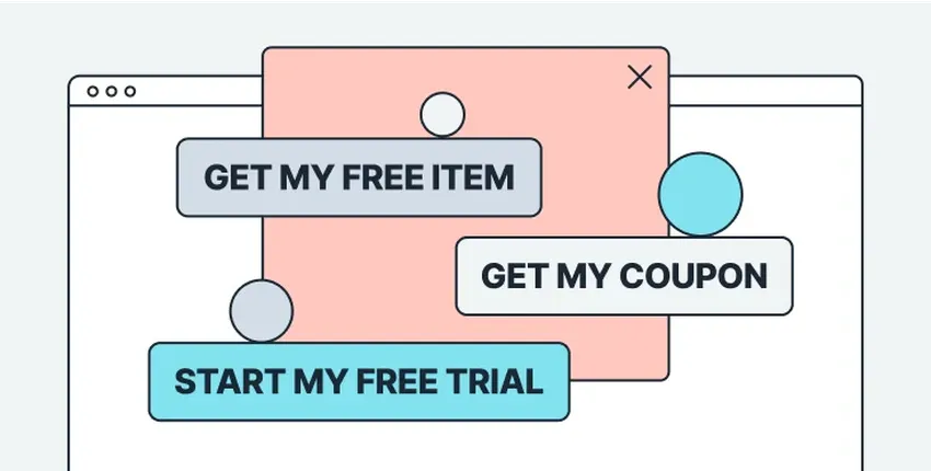
Get more leads with effective popups
Launch high-converting lead capture popups in minutes—no dev needed—and target the right visitors based on behavior, location, traffic source, and more.

Original study of 500 stores: The State of Visitor Engagement on Shopify
How many Shopify businesses use discounts
The most popular discount sizes they use
How they share discounts and coupons
)
1. Displaying popups on every page load
What this means:
The popup shows on every page your visitors view.
As a result, they have to close popups to be able to see your website every time they view a different page.
How to fix this popup mistake
Add a pageviews delay.
This means choosing how many pages the visitor needs to view on your website before seeing the popup. This way, you’ll ensure that the popup won't appear immediately when the user arrives on the website, giving them time to explore and engage with the content before being presented with the popup.
To add the delay in Wisepops:
Go to Display Rules > Trigger > add the number of pages in Show only after > choose Page views:
)
Adding pageviews delay can help reduce the feeling of intrusiveness and annoyance that visitors may feel when confronted with a popup as soon as they land on a website.
Click Save once you’re done.
💡 Pro tip:
Add a tab to your campaign.
A tab is a small “teaser” displayed in a corner of a website. Clicking the tab allows you to see the popup again, so there’s no need to interrupt the visitors’ experience.
Here’s how the tab works in Wisepops (on Blume, an online store):
)
Here’s how to get it done:
Want to know how Blume's campaigns perform?
2. Interrupting the browsing experience with a middle-screen popup
What this means:
This popup mistake is classic.
The popup appears in the middle of the screen (often almost immediately after landing), preventing visitors from browsing the website until closed. While this is something many folks do, there’s a risk of annoying a good portion of their visitors.
How to fix this popup mistake
Reduce the size of the popup
Choose a more user-friendly display position
Let me give you an example of how Wisepops users use this tactic.
Cabaiia allows visitors to keep exploring the website even without closing their campaign. The brand just shows their welcome popup in the right bottom corner of the screen like that:
)
Here’s how to fix this popup mistake in Wisepops.
To reduce the popup size—
Go to Design > Style and choose Medium.
)
Next—
Let’s change the position of the popup from the center of the screen to a less intrusive one.
For that, go to Design > Position and choose, for example, the bottom right corner (this way, your popup will be shown exactly like Cabaiia’s):
)
Want to see more examples of cool popups?
3. Not segmenting audience
What this means:
A campaign that does not use audience segmentation shows the same message to every visitor. As a result, the offer in the campaign will be irrelevant to many (if not most) visitors.
For example:
A customer who already bought can be asked to be subscribe to the newsletter every time they visit your store again
A returning customer who enrolled in the loyalty program can be invited to join the loyalty program again
A customer based in the UK can be shown messages about shipping delays or special deals for shoppers from the U.S. or other countries
Of course—
A popup campaign like that will be ignored.
How to fix this popup mistake
Three steps to take here:
Determine the main segments of our visitors (new, returning, organic, paid, etc)
Create an offer for one of these segments (for example, a welcome offer for new visitors)
Set up Wisepops to show your popup to only that segment
Let’s illustrate.
If you’d like to convert first-time visitors, you can create a welcome popup with a $10 discount for the first order.
To show this popup to new visitors only, do this in Display Rules > Audience:
Choose New visitors in Frequency
Exclude email subscribers by selecting Medium - Is equal to - email in UTM
Select the second checkbox in Behavior and add “1” (this means visitors will see only one popup during one visit—in case you’re running other popup campaigns)
)
How to convert more new visitors:
4. Not waiting for a sign of interest from visitors
What this popup mistake means:
Showing popup right away without visitors taking any action on your website. In other words, blasting them with a popup before they had a chance to browse around.
How to fix this popup mistake
Create a popup that shows when visitors show specific signs of interest.
The signs of interest can be:
X seconds spent on a page. This might mean that a visitor has stopped to read more about a product, service, or your business
Scrolling down to X% of the page’s length. Also might suggest interest because the visitor is engaging with more content
Clicking on/hovering over a specific element. These actions also might mean that a visitor wants to learn more about, say, a product or service
This approach ensures that the visitor has shown some level of interest in the website or the content before being presented with the popup.
To create such campaigns in Wisepops:
Select on Scroll, on Click, or on Hover in Display Rules > Trigger.
)
These guides will help you with each trigger:
Also, here’s a cool example from our own website—
This popup appears only when the visitor clicks Book a demo:
)
Want to see more examples?
5. Not creating mobile-specific popups
What this popup mistake means:
Publishing popups that are optimized for desktop screens only / displaying them to mobile visitors.
As a result:
Businesses are missing an opportunity to convert mobile visitors
The experience of mobile shoppers is often disrupted by desktop-only popups that cover the entire screen (and are often hard to close)
Using desktop-only popups might go against Google’s guidelines on using interstitials, which could lead to a penalty
How to fix this popup mistake
Create mobile-friendly popups.
They are:
Optimized for viewing on small screens
Compliant with Google’s guidelines
Easy to interact with on mobile devices
Besides, if your website gets a lot of mobile visitors, creating an optimized campaign to engage them makes total sense.
Here’s proof—
Look at the difference in the performance between a desktop and a mobile campaign from one of our users:
)
The difference is quite noticeable, agree? Now, imagine if they ran only the desktop campaign—they would not have collected extra 498 emails to their list!
In Wisepops, you’ve got everything to create mobile-friendly popups.
One way to do this—
Pick a mobile-friendly popup template when creating your campaign.
Here’s how they look like in Wisepops editor:
)
Another way—
Duplicate the desktop version and set it to Display on mobiles (in Display rules > Audience):
)
In this second way, though, you’ll also need to:
Reduce the size of the popup to about 320 (width) x 160 (height)
Choose the bottom center display position (so it’s shown at the bottom of the screen)
Use the preview to see how the popup’s copy and image appear on the screen (and make changes if necessary)
These steps will ensure that the final version of the campaign is fully compatible to be viewed on mobile screens.
6. Running only one campaign
What this means:
Having only one campaign for all visitors is a huge missed opportunity. Your website gets a lot of visitors with different goals and needs, so engaging them with one campaign is like
Let me give you a few ideas of fantastic campaigns online businesses run.
The first one (a popular one)—
A welcome popup with a first-time customer discount:
)
Next—
An exit popup with a customer review to encourage visitors to keep browsing:
)
Next—
A campaign with the last viewed product (see on the right side of the screen) to motivate returning visitors to check it out once more:
)
Or—
A sale promotion campaign that announces a sale and has a link to drive shoppers there:
)
Or—
A campaign that invites visitors to try the service (an email marketing app) for free:
)
Of course—
I can keep going.
But I don’t mean to say you need to run all of these at the same time. Just think about how you can personalize your offers and how many different strategies you can try!
How to fix this popup mistake:
Try creating different popup campaigns in Wisepops—there’s so much to choose from!
Let me give you a couple of good ideas.
The first one: you can create an exit-intent popup with free shipping shown to returning customers who have a product in their cart but decided to leave. Who knows, maybe they just need a little bit of extra encouragement, right?
Here’s how to make this campaign:
And here’s one more:
How about making a welcome popup with a first-time customer discount?
In this video below, you’ll see how to create a popup displayed after visitors view two pages on your website (so we will wait for signs of interest from visitors) and learn how to send emails directly to an ESP (Klaviyo):
More helpful resources for your next high-performing campaign:
Grab one from these discount code ideas
Get inspired by these 40+ email popup examples
Check out this creative campaign from Soi Paris (that combined four popups in one!)
7. Making popups difficult to close
What this means:
Popups without the closing button, or a with button that’s a bit difficult to see, or the ones with a confusing exit strategy can be frustrating for visitors and may lead to a negative user experience.
Take this one as an example—
Looks quite okay, but it might not be easy to understand how to close this huge thing (you’ll need to click the tiny No thanks below the button):
)
How to fix this popup mistake:
Make sure that your visitors can easily understand how to close your popups.
The best way to do that—
Make the closing button (or the text line that closes the campaign) clearly visible.
Let me give you a few examples of how Wisepops users do that.
This one from Asphalte is also a full-screen popup—but unlike the last example, it’s got a closing button in the top right corner:
)
Next—
The closing button here in this CODAGE Paris campaign has a white background, which also makes it very easy to spot:
)
Or—
Here, SurfStitch even added not one, but two ways to close the campaign.
If visitors don’t want to subscribe, they can either use the closing the button at the top right corner or click “No, thanks” (which is clearly visible thanks to a light background):
)
One more thing—
To make sure you avoided this popup mistake, preview your campaign before publishing. This way, you’ll see the popup exactly the way your visitors see it. If you think that closing is a bit difficult, adjust the design a bit.
8. Not taking advantage of other campaign formats and/or channels
What this means:
Popups are a good, but not the only way to engage your website visitors. You can generate better results, be it collecting emails or sharing discount codes, or anything else, if you give other tools a go.
In Wisepops, you have a nice selection of other channels to choose from:
Bars
Embeds
Onsite notifications
How to fix this mistake:
Try a different channel in Wisepops.
For example—
The onsite feed! It’s a cool way to share updates, discounts, and other marketing messages in one place.
Look at how it looks (on OddBalls)—it’s like a social media feed on a website!
)
The notifications are perfect for:
Highlighting best-selling products
Converting visitors into subscribers
Making product announcements
Sharing personalized promo offers
Promoting Instagram posts
And more!
If this sounds interesting, get started with the onsite feed—grab a free account and go to Notifications in the main menu:
👉 See 10 ideas of using onsite notifications for your first campaign + success stories and tips from other users of the feed
Next—
You can also engage visitors with sticky bars (they’re perfect for making announcements and driving traffic to landing pages!)
A complete step-by-step guide: how to create sticky bars
In Wisepops, click Bars when choosing a template to get started.
)
And now—
You’ll see a couple of examples of how online businesses use Wisepops bars.
Voxie, a text marketing platform, shares announcements about webinars and events (note that the visitors can click Grab your seat and go to the registration page easily):
)
Also—
Mailmodo, an email marketing platform, has a bar at the bottom of the landing page. This way, they get visitors to try their software or visit a demo:
)
As you can see, bars can be added in different positions.
If you’d like to learn more about that, here’s how to choose positions for Wisepops bars.
And, last but not least—
Embeds.
Also called embedded signup forms, embeds are forms you can add to pretty much anywhere on your website. That could be really useful because you can add them in places where the intent to convert is high.
Here’s an example—
Let’s suppose you’re running this campaign with a welcome gift:
)
And—
You would like to maximize the awareness of the offer without showing a popup many times to every visitor.
The answer, of course, is an embed.
You can make this campaign and add it to product menu pages like that:
)
Just like that—
You’ll be able to get more signups in a visitor-friendly way.
If you’d like to see how to create embeds, here’s a video that will get you started:
Summary
Avoiding these common mistakes can help you create effective and user-friendly popups that can help you achieve your marketing goals while providing a positive user experience for your visitors.
If you’d like to learn more about engaging your visitors with different types of onsite marketing, check out these resources from Wisepops blog:

Oleksii Kovalenko
Oleksii Kovalenko is a digital marketing expert and a writer with a degree in international marketing. He has seven years of experience helping ecommerce store owners promote their businesses by writing detailed, in-depth guides.
Education:
Master's in International Marketing, Academy of Municipal Administration