


:quality(80))


:quality(80))


:quality(80))


:quality(80))


:quality(80))
:quality(80))
Read summarized version with
 ChatGPT
  Perplexity
  Gemini
  Claude
  Grok
Grok Key takeaways
Nonprofit popups work when the campaign matches visitor intent. The ask for a first-time explorer is different from the one for a lapsed donor or a recurring supporter.
Concrete impact framing outperforms generic asks. Describing what a gift funds — a school garden, a rescue operation, a family served — converts better than "your donation makes a difference."
Named match partners create more urgency than anonymous matching. Naming the sponsor makes the offer feel verifiable, not promotional.
Welcome popups with 3-4 clear options help first-time visitors self-select into the right section of your site and reduce early bounce.
Legacy giving popups connected to a planning tool convert the "I'll think about it" response into a completed action within a single session.
Show popups on high-intent pages after 30-60 seconds or significant scroll. Use frequency capping so the same visitor doesn't see the same campaign twice in a row.
Nonprofit websites attract several distinct visitor types at once: first-time visitors exploring a cause, returning supporters, potential volunteers, and people who clicked from a campaign email. The popups that work match the ask to what that visitor is ready to do.
Below are seven use cases, each with a real example and the setup logic behind it.
In this article:
Get a free traffic audit for your nonprofit site
Wisepops runs a free behavioral audit of your site — showing which visitor segments are arriving, what they're doing, and where donation and engagement campaigns would have the most impact.
:quality(80))
Grow your email list to increase donations
Not every visitor who lands on your site is ready to donate. Capturing those visitors on your email list first gives you a channel to build the relationship before any financial ask.
Volunteer-specific capture: Dallas Area Habitat for Humanity
Dallas Area Habitat for Humanity uses a popup framed around a specific intent: looking for volunteer opportunities. The headline matches what the visitor is already thinking. The form collects first name, last name, and email, and the background photo of a real volunteer in a hard hat shows what showing up actually looks like.
:quality(80))
Best practices:
Frame the popup around a specific intent (volunteer, supporter, event attendee) rather than a generic newsletter to increase signups from high-intent visitors.
Collect first name alongside email from the start, enabling personalized follow-up without needing a second step later.
Use a background photo that shows the actual experience of getting involved, not stock imagery or abstract cause visuals.
Show this popup after 30-60 seconds or 50% scroll on volunteer and about pages only. Suppress it on campaign and donate pages where the visitor's intent is further along.
Segmented list building: meaningandhope.org
Meaningandhope.org adds two checkboxes to the signup form: "I am a family caregiver" and "I want to support family caregivers." A visitor self-segments at the moment of signup. The result is two distinct email lists created automatically, without any manual sorting or post-signup survey.
:quality(80))
Best practices:
Use checkboxes or radio buttons to segment list-building popups when your audience includes both beneficiaries and supporters. Different follow-up sequences will convert each group better than one generic welcome email.
Keep the form short: name, email, and one segmentation question. Every additional field lowers completion rate.
Connect the popup directly to your CRM or email platform so segmented lists populate automatically on signup.
Expert tip: Use page-level targeting to show volunteer and community popups only on the pages where that intent is evident: /volunteer, /get-involved, /about. Visitors on those pages are self-selecting. Showing the same popup on the homepage or donate page breaks the context.
Help new visitors find what they came for
First-time visitors often land on your homepage without a clear next step. A welcome popup with 3-4 clear options lets them self-select into the right section of your site and reach it faster than any nav menu would get them there.
Four-button welcome popup: Appel Farm Arts Camp
Appel Farm Arts Camp uses a welcome popup with four action buttons: Book a Tour, Explore Dates, FAQs, and Contact Us. The headline is "How can we help you today?" rather than a brand statement. The photo of campers communicates the mission immediately, before a visitor reads anything.
:quality(80))
Best practices:
Limit the popup to 3-4 buttons. More than four creates decision paralysis and defeats the purpose of simplifying navigation.
Lead with a service question ("How can we help you today?") rather than a brand headline. It signals intent to help, not to sell.
Show this popup to first-time visitors only (visit count = 1). Returning visitors already know where they are going; showing it again is noise.
Suppress it on any page where the visitor already has clear intent: the donate page, the event page, and any campaign landing page.
Make the donation ask specific to a cause
Generic donation asks underperform specific ones. Naming a project, a beneficiary count, or a rescue event gives the visitor something concrete to connect to before clicking.
Named project with impact number: Fabretto.org
Fabretto's popup leads with the project name — "Bring School Gardens To Life" — and describes exactly what it funds: gardens that nurture learning, nourishment, and connection for students in Honduras. The photo shows a real beneficiary tending a garden. The CTA is a single button: "Make A Gift Today."
:quality(80))
Best practices:
Name the project, not the program category. "Bring School Gardens To Life" is more compelling than "Support Our Education Programs." Good popup copy names the action, not the department.
Describe what the donation funds, not just who it reaches. "Gardens that nurture learning, nourishment, and connection" tells a more compelling story than a headcount alone.
Use a photo of a real beneficiary, not a landscape or logo. Popups with people in them consistently outperform those without.
Keep the CTA to a single button. Multiple options on a donation popup split attention and reduce conversions.
Campaign popup tied to a real event: Humane World for Animals
After rescuing 174 cats from cruelty, Humane World for Animals tied a homepage popup directly to the rescue — linking to a dedicated donation page for that specific campaign. Rather than a static image, they used a cinemagraph: a looping animated image that matched the imagery on the donation form itself.
The campaign reached 201,057 visitors and generated 2,091 clicks. As part of Wisepops' popup contest, the web marketing team credited the animated format specifically, noting that moving images outperform static ones when the cause is emotionally resonant.
)
Best practices:
Tie the popup to a specific, named event rather than a general cause. "174 cats rescued" is a story. "Animal welfare" is a category.
Use a looping animation (cinemagraph or GIF) when the mission involves movement, animals, or people in action. Match the imagery to the linked donation page.
Place the campaign on the homepage during the active rescue window, then retire it. Time-bound campaigns stay credible; evergreen rescue campaigns lose urgency.
Expert tip: A/B test your donation popup headline against the campaign name. Two versions describing the same project will often convert at meaningfully different rates. Wisepops' experiments platform measures incremental impact using a control group, so you can isolate what the popup itself is contributing to donation volume rather than attributing all conversions to the campaign.
Use matched giving to create urgency
A matched donation offer addresses the two most common reasons people don't give in the moment: "my donation won't matter" and "I'll do it later." The match makes the gift feel bigger. A named deadline makes it feel urgent.
Emotional storytelling with a match: Gary Sinise Foundation
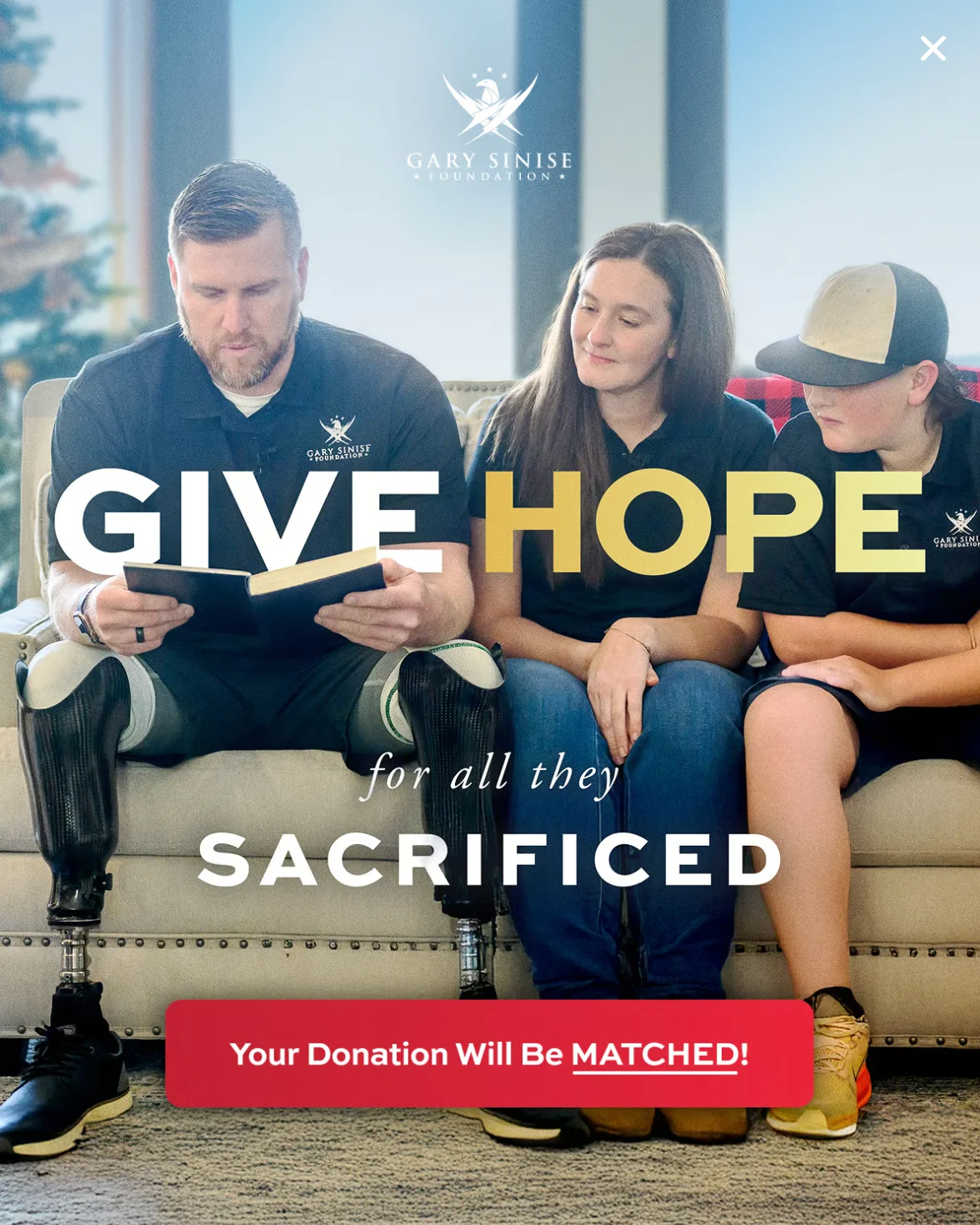
Gary Sinise Foundation runs a full-bleed popup with a photo of a wounded veteran reading with his family. The headline: "GIVE HOPE for all they SACRIFICED." The CTA: "Your Donation Will Be MATCHED!" The emotional image carries the mission; the match adds the financial reason to act now.
Best practices:
Lead with the story, not the mechanics. "Give hope for all they sacrificed" lands before the match offer. Reverse the order and the match feels transactional.
Use a full-bleed photo that puts real people in the frame. Abstract cause imagery loses the emotional connection the match is meant to amplify.
Keep the CTA short and match-specific: "Your donation will be matched" rather than a generic "Donate now."
Named sponsors, Day of Giving: Gary Sinise Foundation
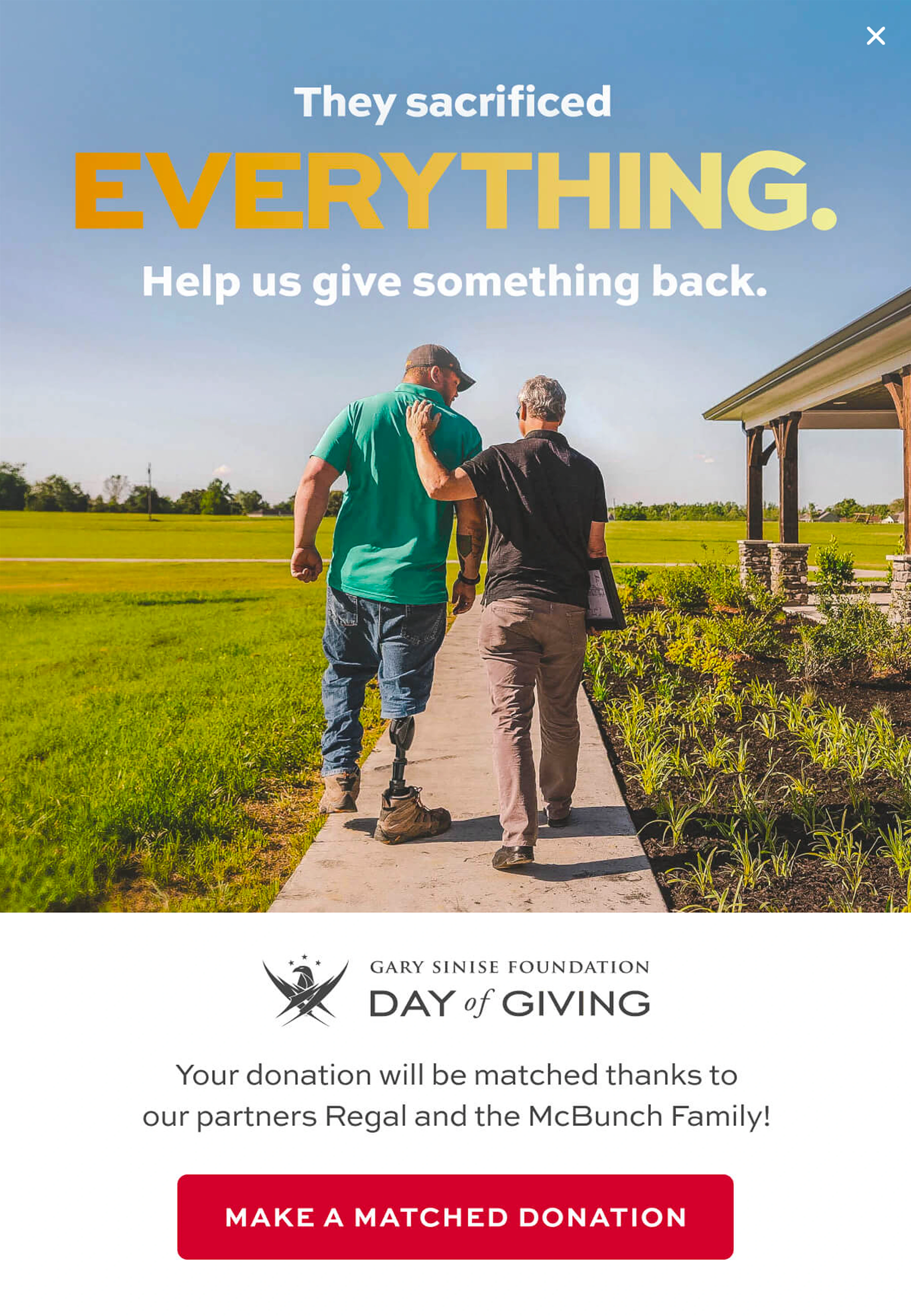
A second Gary Sinise Foundation popup, used for their annual Day of Giving, names the match sponsors: "Your donation will be matched thanks to our partners Regal and the McBunch Family." Anonymous matching can feel like a marketing mechanism. Named sponsors make the match feel verifiable and community-driven.
Best practices:
Name your match sponsors in the popup copy. It shifts the frame from "limited-time offer" to "community backing this gift."
Create a named event around the match (Day of Giving, Earth Month, GivingTuesday) so the urgency has a context rather than just a deadline.
Deploy on exit intent: visitors who are about to leave without acting are the highest-leverage audience for a matched gift offer.
Expert tip: Exit-intent targeting fires when a visitor's mouse moves toward the browser tab or back button. For matched giving campaigns, this is the highest-leverage trigger: it catches visitors who were interested enough to stay on the page but didn't act on the first pass. Cap display to once per session.
Promote events with a countdown timer
A countdown timer creates a deadline the visitor can watch. A static "upcoming event" announcement does not. When the timer is live, the urgency exists in the moment of the visit.
Annual luncheon with a live countdown: Habitat for Humanity SKKC
Habitat for Humanity SKKC's "Beyond the Build" luncheon popup features the keynote speaker (Seattle Seahawks head coach Mike Macdonald), the specific date and venue, and a live countdown showing 1 day, 4 hours, 48 minutes. Single CTA: "REGISTER NOW." The mission context is present but not the lead: the speaker and the live countdown carry the urgency.
:quality(80))
Best practices:
Lead with the highest-draw element (a keynote speaker, a celebrity, a milestone) rather than the mission statement. The mission is visible in the event name and body copy.
Show the countdown running, not a static date. A timer that moves creates urgency in a way a date string doesn't.
Show event popups from 7-10 days out, then increase to every session in the final 48 hours when urgency is highest.
Target returning visitors and email subscribers first: they are the audience most likely to register.
Drive recurring giving with campaign deadlines
Campaign deadlines reframe a recurring gift: instead of "give every month," the message becomes "give before Earth Month ends." That's a decision a visitor can make in a single session.
Earth Month campaign: One Percent for the Planet
One Percent for the Planet's Earth Month popup names the impact partner ("Recurring donations help us grow impactful partnerships for organizations like FoodCorps"), creates urgency through copy and a live countdown, and presets the donation tiers at $5, $10, and $25. The CTA is "I can help" rather than "Donate now."
:quality(80))
Best practices:
Name the impact partner rather than a vague "programs" or "causes." FoodCorps is a real, recognizable organization that makes the recurring gift concrete.
Preset the donation amounts at entry-level figures. Asking a visitor to choose from $5, $10, and $25 converts better than leaving the field open-ended.
Use "I can help" or "Start giving" over "Donate now." Softer language reduces the transaction framing without weakening the intent.
Run campaign-deadline popups for named giving seasons only. Outside those windows, revert to a standard donation popup so urgency language stays credible.
Reach legacy givers with a low-friction ask
Planned giving is high-value and chronically undercultivated on nonprofit websites. The barrier is usually not intent: many long-term supporters plan to include a nonprofit in their estate but don't act because the process feels complicated. A popup connected to a planning tool solves this in the same session.
Estate planning integrated: International Relief Teams
International Relief Teams runs a popup that addresses the complexity objection directly: "It only takes 20 minutes to protect your loved ones and the causes you care about most. Our free estate planning tool through FreeWill makes it simple." The CTA links straight to the FreeWill tool. The "20 minutes" framing is specific, credible, and removes the sense that this requires a lawyer and months of paperwork.
:quality(80))
Best practices:
Address the complexity objection in the popup copy. "20 minutes" and "free tool" remove the two biggest barriers without requiring the visitor to already understand estate planning.
Connect the popup directly to a planning tool (FreeWill or similar) rather than to a general planned giving page. The tool should be completable in the same session.
Frame the legacy gift as something the organization provides for the donor: "our way of saying thank you" shifts the dynamic from ask to offer.
Target this popup to returning visitors with three or more sessions. First-time visitors haven't built enough trust for a legacy ask. Cap at once per 60 days per visitor.
Nonprofit popup setup checklist
Each campaign type above requires different targeting logic. Display rules can be layered — page, timing, visit count, and conversion history — to make each popup as specific as needed. Full details in our popup targeting guide.
Goal
Where to show it
When to trigger
CTA
Build your volunteer or supporter list
Volunteer, about, get involved pages
After 30-60 sec or 50% scroll
Email form with one segmentation question
Orient new visitors to your site
Homepage only
On page load, first visit only
3-4 buttons: Donate / Volunteer / Events / Learn more
Drive donations for a specific campaign
Mission, impact, and campaign pages
After 60 sec or after 2 page views
"Make a gift" with project name and beneficiary count
Amplify a matched gift offer
Homepage, donate page, active campaign pages
Exit intent
"Give now — your gift will be matched" with named sponsor
Fill seats at a fundraising event
Homepage, events page, blog
Start 7-10 days out; every session in final 48h
"Register now" with live countdown timer
Convert one-time donors to monthly givers
Campaign, donate, and blog pages
While campaign countdown is active; exit intent in final hours
"I can help" with preset gift tiers ($5 / $10 / $25)
Introduce planned giving to long-term supporters
Planned giving, about, and donate pages
Visitor has 3 or more prior sessions
"Create your FreeWill" or "Start your legacy plan"
Frequently asked questions
Are popups appropriate for nonprofit websites?
Yes, when the targeting logic matches the visitor's context. A popup that fires on page load for every visitor is disruptive. The same popup shown after 60 seconds on a campaign page, for a visitor who has already scrolled through the impact section, is relevant. Timing and page-level targeting are what make the difference.
When should a nonprofit show a donation popup?
On high-intent pages: mission, impact, campaign, and donate pages. Trigger after 30-60 seconds or 50% scroll, not on page load. During active campaigns with a match or deadline, exit-intent triggers work well to catch visitors who are about to leave without acting.
How do you track whether a popup drove a donation?
Set a goal tied to the donation confirmation URL or thank-you page event. If your processor doesn't redirect to a distinct URL, a JavaScript event on successful form submission works as the trigger. For rigorous measurement, run a control group experiment and compare donation rates between visitors who saw the popup and those who didn't.
Should nonprofit popups be different from ecommerce popups?
In strategy, yes. Ecommerce popups offer discounts; nonprofit popups offer information, community, or impact. The donor journey is also slower — supporters often visit multiple times before giving — so returning-visitor logic and frequency capping matter more. The format and tools are the same; the strategy adapts to a cause-based conversion path.
What these examples have in common
Each popup above does one thing: it matches a specific campaign type to a specific visitor intent. The volunteer capture doesn't also ask for a donation. The legacy popup doesn't also promote the upcoming gala. That specificity is what makes them work, and it's available to any nonprofit that uses targeting rules rather than showing the same campaign to every visitor.
The Wisepops popup builder supports all the display rules covered here, including visit count, scroll depth, page URL, exit intent, and time on page, without developer involvement to configure.
Get started
in minutes
Start converting more visitors today.
Get started in minutes and see results right after.