










Food and Beverage Shopify Stores: 60 Examples

Read summarized version with
 ChatGPT
 Perplexity
 Gemini
 Claude
 Grok
Summary
Definition: A food and beverage Shopify store is a brand's own Shopify site selling food, drinks or nutrition products directly to consumers, such as Huel, Graza and Poppi. Many of these brands also sell through supermarkets and other retailers.
Top conversion tactics: The most frequent tactics are subscription discounts, starter sets and bundles, free-shipping thresholds, product quizzes and limited flavors. Chamberlain Coffee, Fishwife and Three Spirit use several of them.
Key features of successful Shopify food stores: A product quiz, navigation by goal or flavor, photo reviews, test results and flexible subscriptions. Examples are Firebelly Tea's flavor paths, Transparent Labs' lab results and Chamberlain Coffee's text-based subscription changes.
Product photography: Close-up shots, ingredient photos and customer photos give shoppers a sense of taste and texture before they buy. Intelligentsia styles each coffee with its tasting-note fruits, and NOBL shows customer photos.
First-order value: Starter sets, fixed-price bundles and free-shipping thresholds raise the value of a first order. Alpha Box & Dice sells any six bottles at one price, and Fly By Jing shows its threshold on every page.
Product discovery: Quizzes, goal-based navigation and AI shopping assistants help new visitors choose from a large or unfamiliar range, as at Three Spirit, Huel and Tropeaka.
Repeat purchases: Subscriber perks, refills, limited-edition flavors and rewards programs encourage customers to reorder, from Fly By Jing's Tastemaker Club to Graza's refills.
Food and drink brands sell products that run out, so the second order matters as much as the first. A bag of coffee or a box of cereal alone keeps the average order value low, and shipping costs weigh more on a small order.
The 55 food and beverage Shopify stores below are some of the top food and drink stores on Shopify. They handle that with subscriptions, starter sets, quizzes, guarantees and free-shipping thresholds.
For each store, I looked at its design, how it turns visitors into buyers and what other brands could learn from its approach.
In this article:
See your segments
Match each visitor to the right campaign
We review your traffic and show which behavioral segments you have, the campaigns that fit each one, and the revenue they could reach.
yourstore.com
Finding: Explorers convert well, with no campaign yet.
Food & drink stores on Shopify
Store
Category
Country
Highlight
Specialty coffee
US
Eye-catching launches styled with the fruits from the tasting notes
Breakfast waffles, pancakes and crêpes
US
Usage videos that keep a frozen staple interesting

of la belle-iloise's ecommerce revenue came from helping visitors discover new products and recipes
Shopify coffee and tea stores
Coffee customers finish a bag every few weeks. These beverage stores on Shopify lean on subscriptions, cases and a reason to try something new with each order.
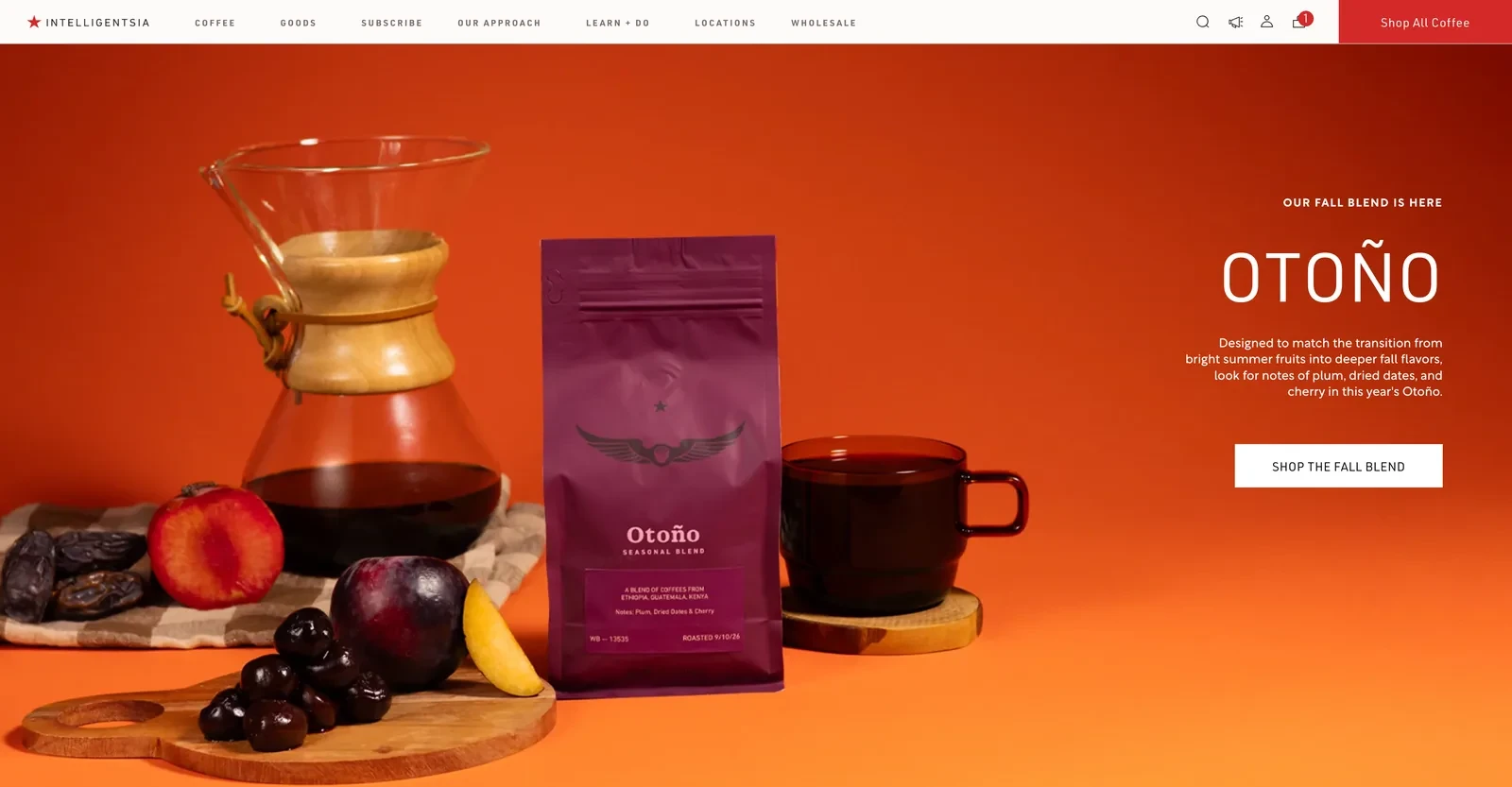
The Intelligentsia Coffee Shopify homepage
Design and navigation
Intelligentsia uses its homepage hero to launch new coffees, and each launch is styled with the fruits from its tasting notes. When we looked in November 2026, the fall blend, Otoño, sat among plums, dates and cherries, so shoppers could picture the flavor before buying.
The main menu stays short, with Subscribe as the third item and a red Shop All Coffee button on the right.
Conversion tactics
Seasonal and new releases give regular customers a reason to come back, and the hero's only button leads straight to the newest one. Customers who like a coffee can then set up regular deliveries from the Subscribe link in the menu.
Why the approach makes sense
A seasonal release gives existing customers news to come back for. Photographing the coffee with the fruits in its tasting notes helps sell a flavor shoppers can't taste online.
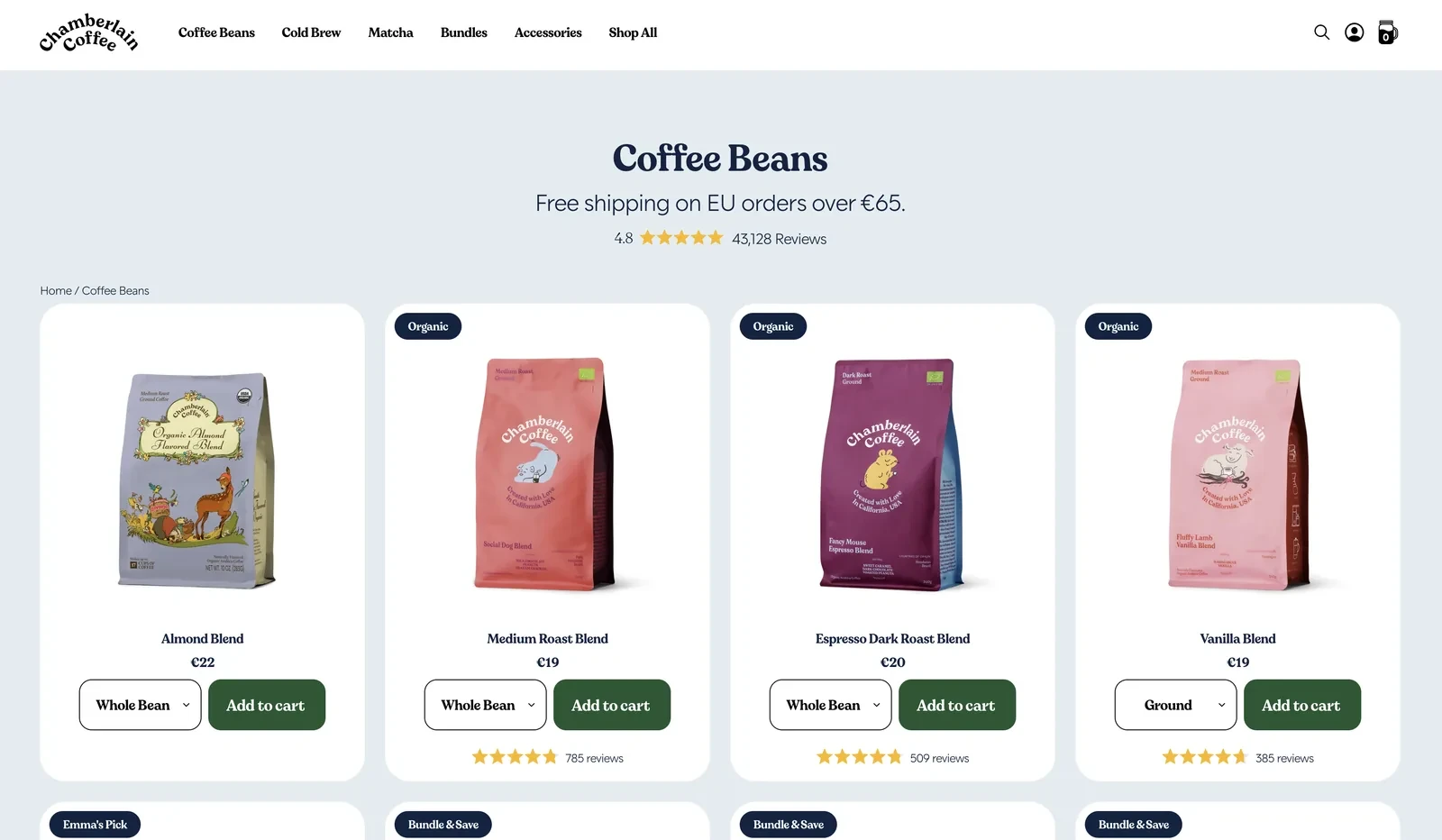
The Chamberlain Coffee collection page
Design and navigation
Chamberlain Coffee grew from a creator's fan base, and the store keeps that personal feel. Each blend has its own illustrated animal, such as the Fancy Mouse Espresso Blend, which turns similar coffees into characters fans can pick favorites from.
How the store converts visitors
The brand wants fans who arrive from social media to become regular buyers, so it removes every step it can. Shoppers add a bag straight from the collection page, and review counts on each card reassure anyone buying for the first time.
Subscribe and Save is then preselected at 10% off, so subscribing is the default. Subscribers can change or skip a delivery by text, which makes staying subscribed easier than cancelling.
Takeaway for Shopify drink stores
A creator-led brand sells personality first, so the design should carry it into every product. A preselected subscription with easy changes then turns a one-off fan purchase into a habit.
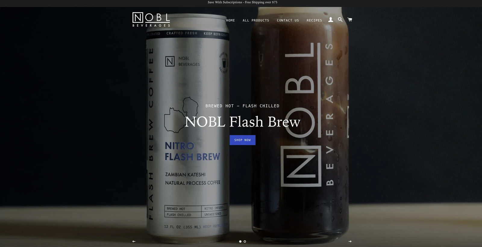
The NOBL Beverages Shopify homepage
Design and navigation
NOBL builds its product pages around customer photos. A grid shows the cans in real fridges, kitchens and gardens, next to verified reviews.
Conversion practices
A canned latte bought online raises two doubts: will it taste good, and will it arrive cold? Photos from real customers answer both better than any product shot the brand could take.
NOBL also wants its subscribers to stay. The Seasonal Latte subscription switches to each new flavor automatically, so regular buyers never get bored of the same order.
Why the approach makes sense for Shopify drink stores
Photo reviews stand in for a tasting when shoppers can't sample the product. A subscription that changes with the seasons also keeps repeat orders from feeling repetitive.
Related:
See how Shopify stores convert visitors with these Shopify popup examples
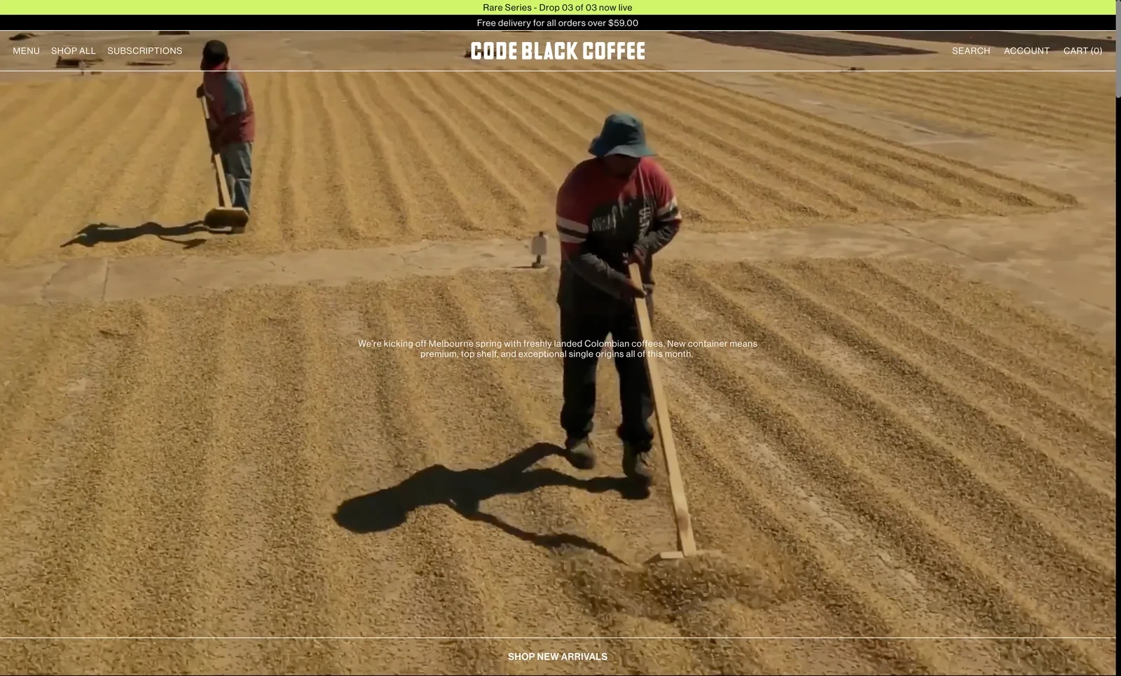
The Code Black Coffee Shopify homepage
Design and navigation
Code Black's homepage opens with full-screen video of workers raking beans on drying beds at a coffee farm. Before any product appears, the brand shows where its value comes from.
Conversion tactics
Single-origin coffee costs more than supermarket beans, and the store needs shoppers to see why. Product pages back up the video with a strict grid listing the farm, process and region, the details specialty buyers compare.
To bring regular buyers back, Code Black releases coffees in limited Rare Series drops, announced in a bar at the top of every page. Product pages also name the farmer behind each lot, which supports the higher price.
Takeaway for Shopify beverage stores
When a product's value comes from where it's grown, a short film from the farm explains the price faster than copy. Numbered limited releases then give loyal customers a reason to buy now.
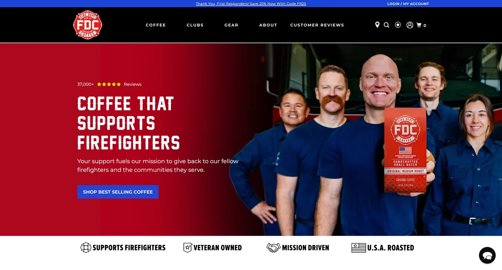
The Fire Dept. Coffee Shopify homepage
Design and navigation
Fire Dept. Coffee competes in a crowded category, so it leads with a reason to choose it over similar coffees. The homepage headline puts its mission first, supporting firefighters, followed by values such as veteran-owned and roasted in the USA.
How the store converts visitors
A mission only persuades if shoppers believe it, so the store shows the community behind the brand. Over 37,000 reviews sit above the headline, and Customer Reviews has its own place in the main menu.
First responders get 25% off with a code shown on every page, which turns the people the brand supports into customers. Coffee clubs then make it easy to keep buying every month.
Why the approach makes sense
A clear mission gives shoppers a reason to pick one coffee over another, as long as they can see real people behind the mission. A discount for the community it serves also turns supporters into regular buyers.
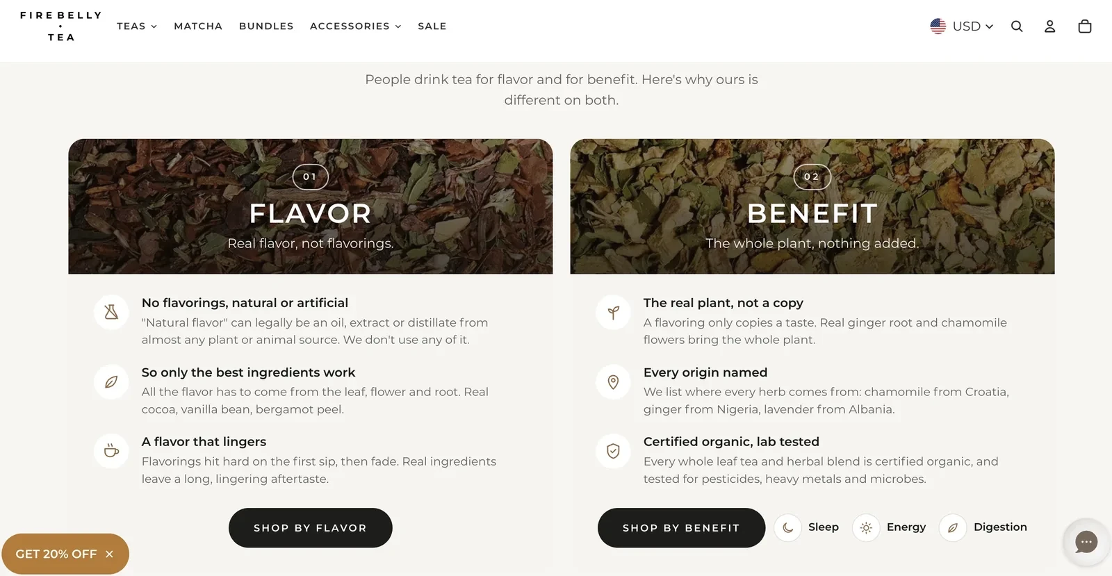
The Firebelly Tea homepage, with its flavor and benefit paths
Design and navigation
Firebelly's homepage splits the range by the two reasons people drink tea: shop by flavor, or shop by benefit, such as sleep, energy and digestion. Newcomers can start from what they want without knowing any blend names.
Conversion practices
Firebelly's main difference, teas with no flavorings at all, is invisible on a shelf. The store explains why that matters and backs it with details shoppers can check, such as chamomile from Croatia and certified organic, lab-tested blends.
The flavor and benefit paths then guide newcomers to the right product, so a shopper who's convinced by the ingredients also knows what to buy.
Takeaway for Shopify beverage stores
A quality claim persuades when shoppers understand why it matters and can check the details. Shopping paths built around why people buy also help first-time visitors choose.
7. VAHDAM India
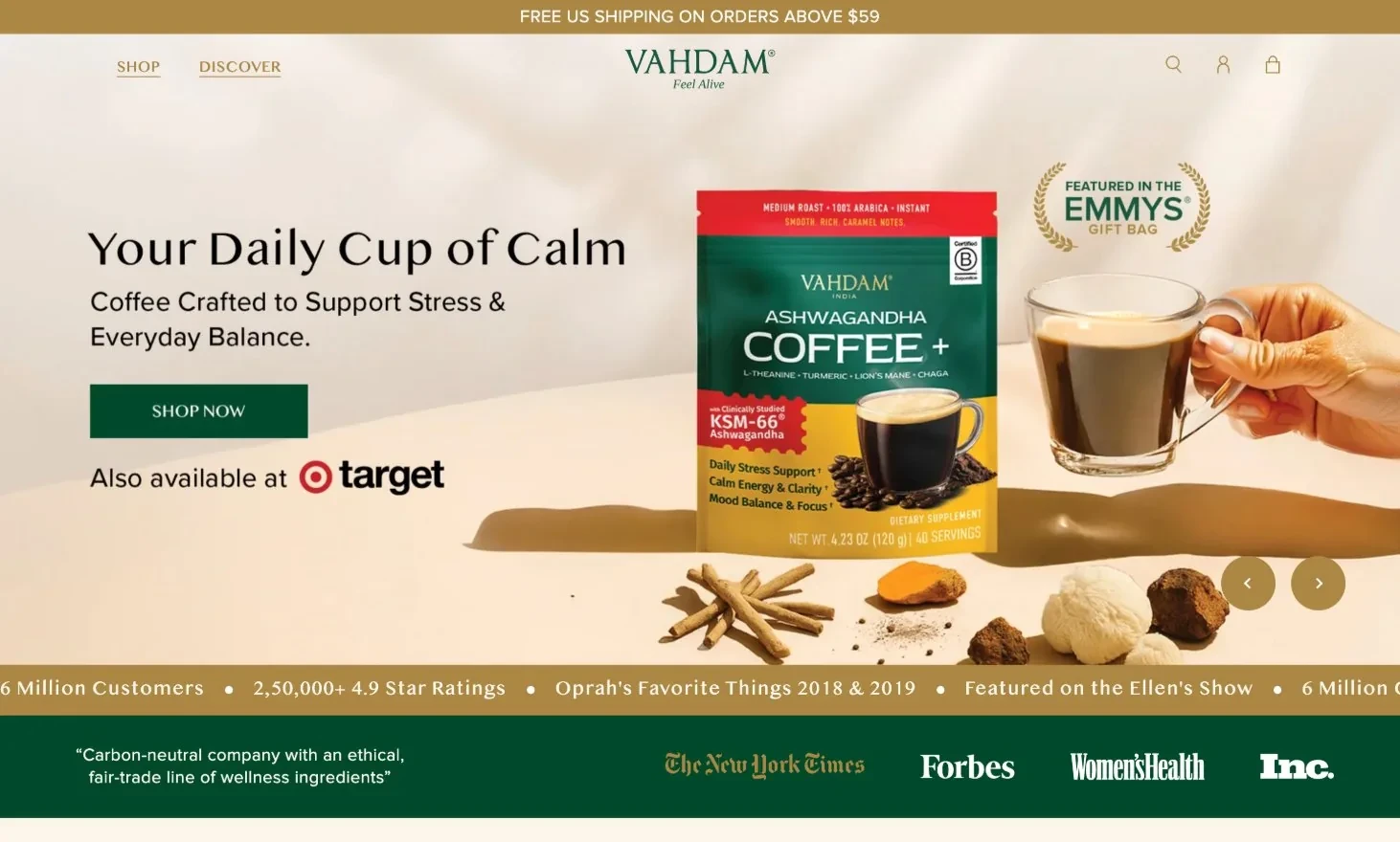
The VAHDAM India Shopify homepage
Design and navigation
VAHDAM's US homepage puts endorsements near the top, from Oprah's Favorite Things to quotes from Ellen DeGeneres and Mariah Carey. Press logos and over 50,000 five-star reviews follow.
Conversion tactics
Many US shoppers meet this Indian tea brand for the first time online, so the store has to earn trust before it can sell. Celebrity and press endorsements do that quickly, and a list of US retailers shows the brand is established.
The store then gives shoppers a reason to buy direct instead of at those retailers. A Website Exclusive tab and bundles at up to 30% off are only available online.
Why the approach makes sense for Shopify beverage stores
An imported brand needs trust before a first order, and well-known endorsements build it fast. Website exclusives then help a brand's own store benefit from its retail presence.
Shopify beverage stores for functional drinks and water
Functional drinks and water compete with shelves full of similar cans and bottles. These stores sell on a clear benefit and give shoppers reasons to believe the claim.
8. Recess
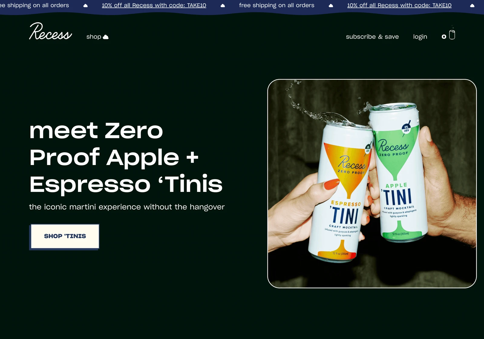
The Recess Shopify homepage
Design and navigation
Recess sells a feeling, calm, which no product photo can show. So the whole store is designed to feel calm, with soft pastel gradients, floating clouds and lowercase, relaxed copy.
How the store converts visitors
With four product lines and more than 20 flavors, a first-time visitor could easily get stuck choosing. Samplers near the top of the page turn that choice into one easy order.
Shipping is free on every order, so a single sampler is enough to try the brand without paying extra.
Takeaway for Shopify drink stores
When a product promises a mood, the design can deliver that promise before shoppers read a word. Samplers then turn a large range into a simple first purchase.
Related:
Find ideas for your own store in these ecommerce website design examples
9. Poppi
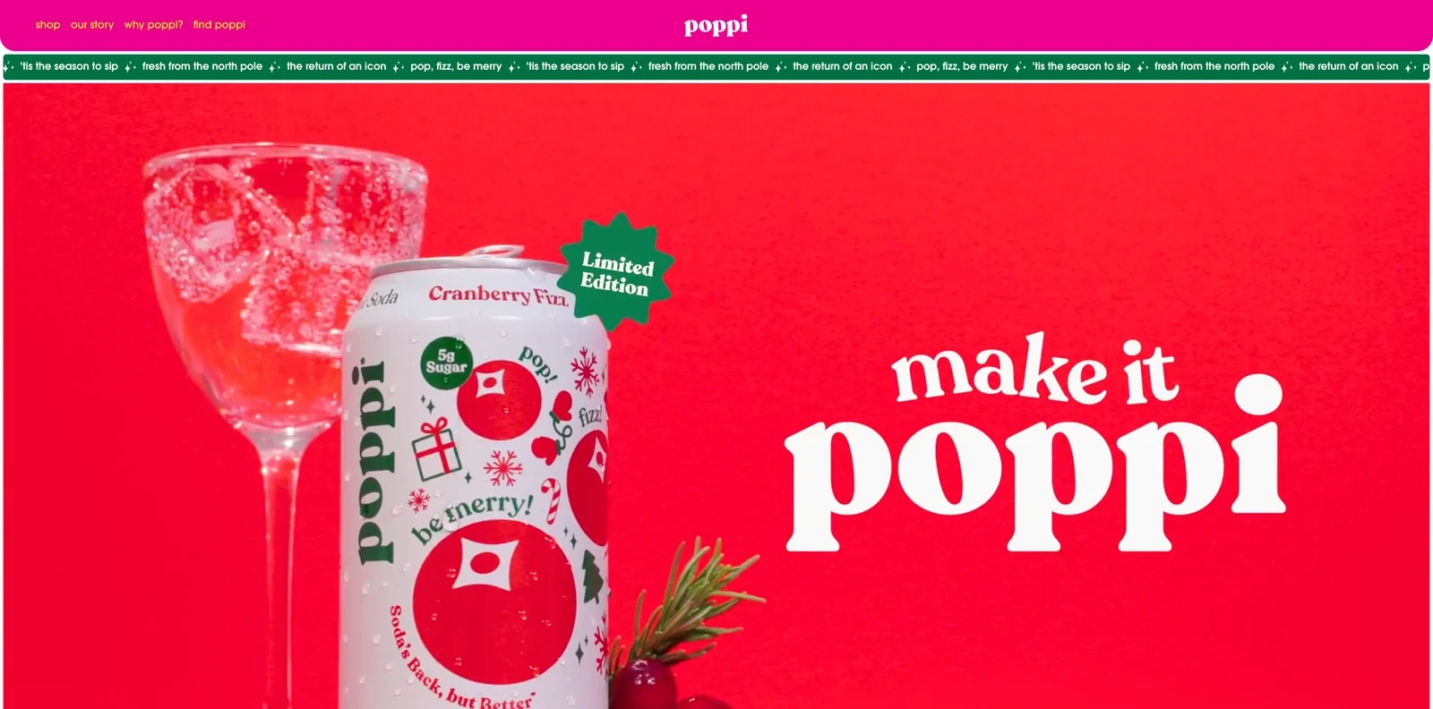
The Poppi Shopify homepage
Design and navigation
Poppi competes with big soda brands on personality as much as taste. Its homepage reads like a wall of small ads, with bright tiles, short jokes such as save water, drink soda, and lowercase copy everywhere.
Conversion practices
Poppi sells widely in stores, so its own site focuses on fans. Limited editions such as Cranberry Fizz give fans news to come back for, and a flavor carousel lets them buy straight from the homepage.
A tile invites fans to join Poppi on an app called tyb, with challenges, merch and prizes. That keeps the brand in touch with customers between purchases, wherever they buy the cans.
Why the approach makes sense
A playful design shows a brand's personality in seconds, which matters in a category full of lookalike cans. A fan program also keeps customers engaged even when they buy in supermarkets.
10. TRIP
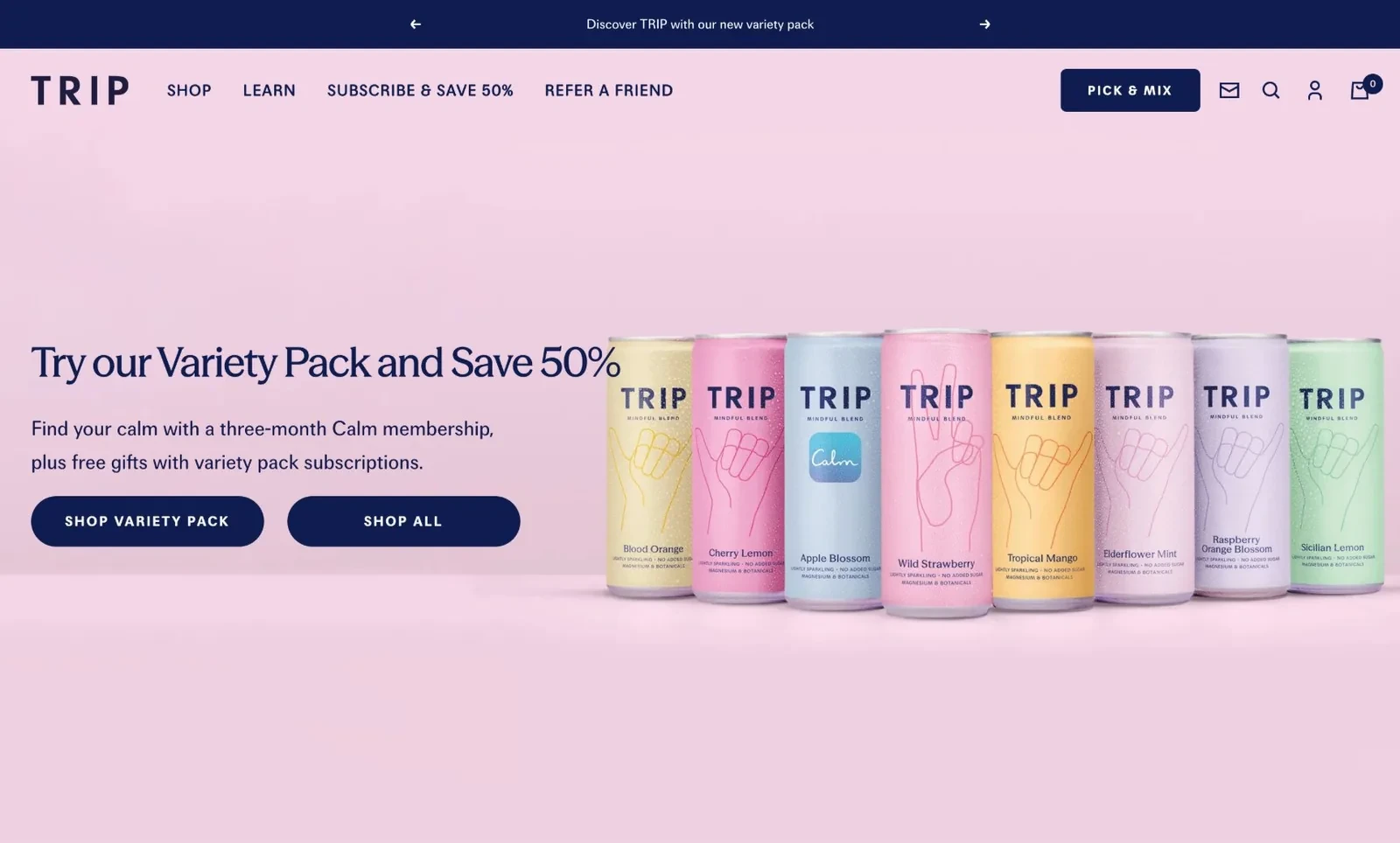
The TRIP Shopify homepage
Design and navigation
TRIP sorts its range by feeling, in a section titled How do you want to feel?, with choices such as more relaxed or hangover-free. Global ambassador Kendall Jenner and other famous fans appear next to over 30,000 five-star reviews.
Conversion tactics
TRIP's drinks are bought often, so the store is built to sell subscriptions from the first screen. The hero offers a variety box at 50% off with a free three-month Calm app membership, and every product card preselects Subscribe and Save.
The first delivery gets a bigger discount than later ones, which makes the first commitment easy. Refer a friend then has its own place in the main menu, so happy subscribers bring in new ones.
Takeaway for Shopify drink stores
Drinks people have every day suit subscriptions, and a deep first discount plus a partner perk lowers the barrier to start. A referral offer in the main menu then turns subscribers into a growth channel.
Related:
Plan a deal shoppers act on with these limited-time offer ideas
11. Gimber
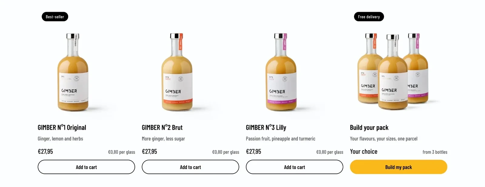
The Gimber homepage product grid
Design and navigation
Gimber sells a ginger concentrate, a format many shoppers haven't tried. A row under the hero answers the first questions in four facts. The ginger is organic and from Peru, there's no alcohol, and each bottle makes 35 glasses.
A section called Hot or cold, your call shows three ways to serve it, so the drink fits winter and summer alike.
How the store converts visitors
A €27.95 bottle looks expensive next to other drinks, so every product card also shows the price per glass, about €0.80. The Build your pack tool mixes flavors and sizes, with a lower price per glass for bigger bundles.
A newsletter signup offers free delivery on the next order, which gives first-time buyers a reason to come back.
Why the approach makes sense for Shopify drink stores
When a format makes the price hard to compare, showing the price per serving puts it in context. Several ways to drink the same product also keep it relevant all year.
12. Loonen
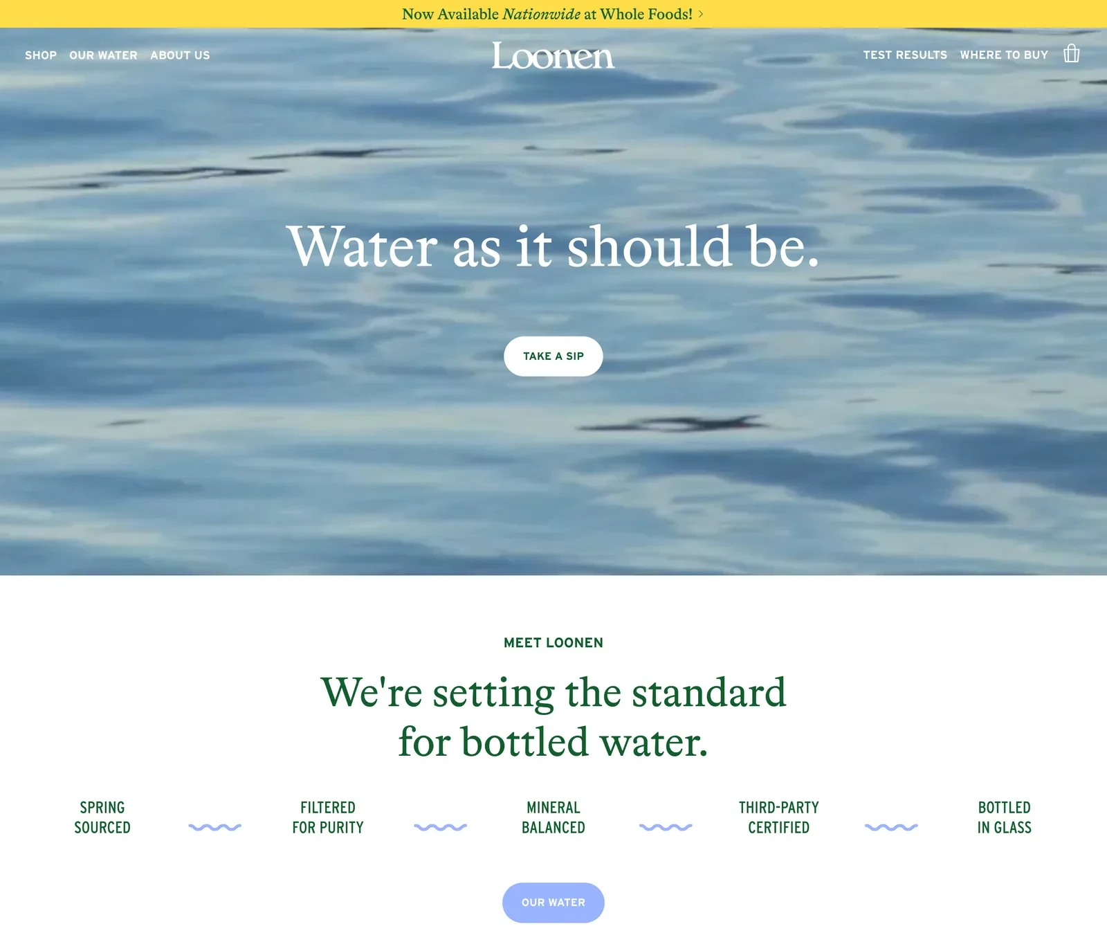
The Loonen Shopify homepage
Design and navigation
Bottled water looks the same from brand to brand, so Loonen sells its standard. A row under the hero lists five promises, from spring sourced to third-party certified and bottled in glass.
Conversion practices
Loonen charges more than ordinary water, so it publishes evidence. Test Results has its own place in the main menu, and photos of children drinking from the bottle speak to parents worried about microplastics.
The store sells only still and sparkling water, so it also sends shoppers to retail. Where to buy sits next to Test Results, and an interactive photo answers practical doubts about glass, such as whether it fits in a cupholder.
Takeaway for Shopify beverage stores
When a product looks identical to its competitors, a clear standard and published test results justify a higher price. A store with a tiny range can still earn its place by explaining what makes the product different.
13. Liquid I.V.
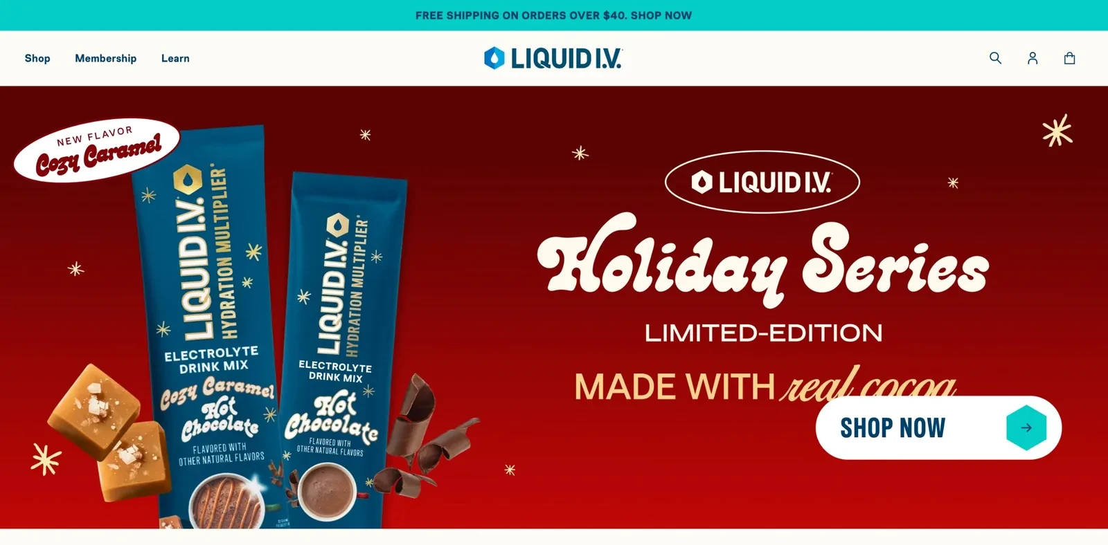
The Liquid I.V. Shopify homepage
Design and navigation
Liquid I.V. serves very different needs, from energy to immune support to kids. Tabs on the homepage sort the range by need, so shoppers find the right mix without scrolling through everything.
Conversion tactics
Hydration mixes are a daily habit, and habits get boring. Liquid I.V. keeps customers buying with limited editions, such as a Holiday Series, and licensed flavors like Ring Pop Cherry.
Its offers then push customers toward a routine of several flavors: buy three and get one free, or subscribe and save 30%.
Why the approach makes sense
Limited and licensed flavors give a functional product a fun reason to be bought again. Multi-buy and subscription offers then turn one flavor into a regular order.
Related:
Give a new flavor a strong start by running a flash sale
14. Waterdrop
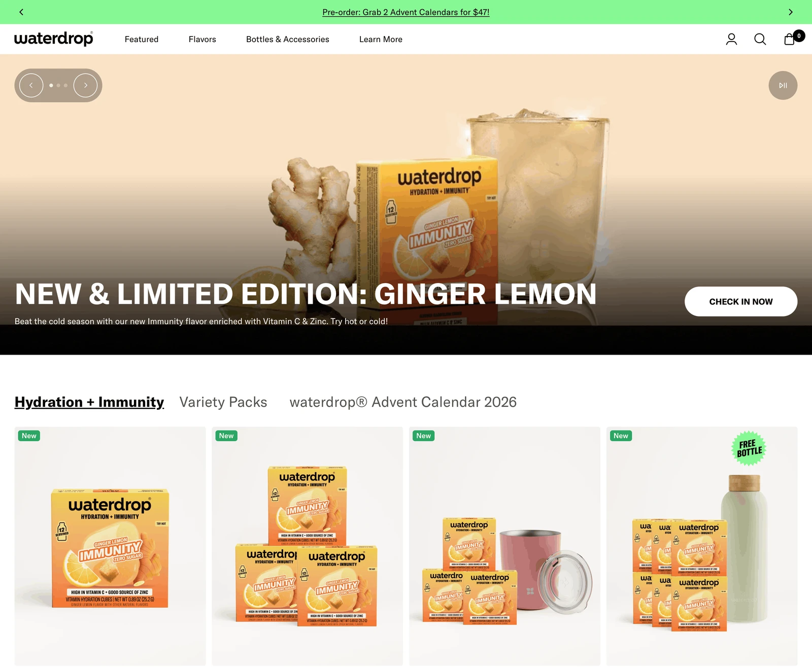
The Waterdrop Shopify homepage
Design and navigation
Few shoppers have seen a drink cube before, so Waterdrop explains it in three photos: water, drop, enjoy. Tennis players such as Taylor Fritz appear further down to tie the product to staying hydrated.
How the store converts visitors
Cubes are small and cheap, so Waterdrop needs ways to grow each order and bring customers back. The store also sells steel and glass bottles, and every bottle sold gives the customer a reason to keep buying cubes.
Two thresholds raise each order: free shipping from $35 and a free gift from $60.
Takeaway for Shopify beverage stores
A new format needs a quick visual answer to how it works before any other selling. Pairing the consumable with a bottle customers keep gives them a lasting reason to reorder.
Alcohol-free drink stores on Shopify
Alcohol-free brands sell a category many shoppers haven't tried yet. Their stores explain how to drink each product and make the first order low-risk.
15. Athletic Brewing
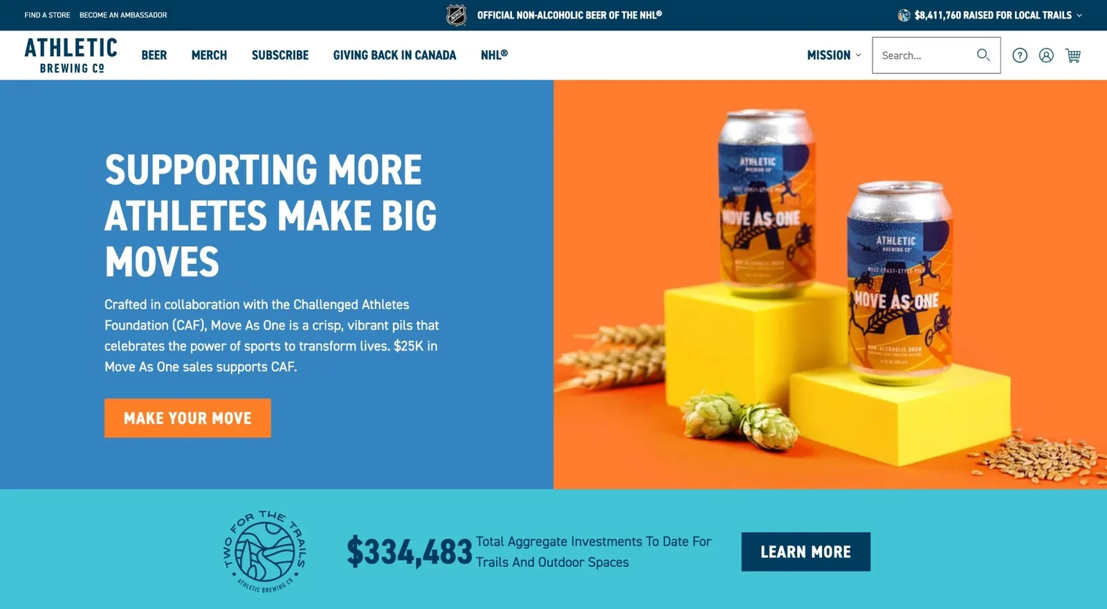
The Athletic Brewing Shopify homepage
Design and navigation
Non-alcoholic beer still carries an image of going without. Athletic's Canadian store replaces it with sport: an NHL partnership, a beer made with the Challenged Athletes Foundation and a video of trail runners.
Conversion practices
The biggest doubt about non-alcoholic beer is taste, and the store answers it head-on in a section titled Great, but how does it taste? Award counts sit on the cans themselves, such as 20+ awards for Run Wild IPA.
The Canadian store also localizes the brand's giving, with a running total of its investment in Canadian trails. That gives local shoppers a reason to buy from this store specifically.
Why the approach makes sense for Shopify beverage stores
Tying a product to an active lifestyle helps when a category has an outdated image. Answering the top doubt with awards and reviews then makes the first order easier.
Related:
Launching something new? See how to promote a product
16. Lucky Saint
The Lucky Saint Shopify homepage
Design and navigation
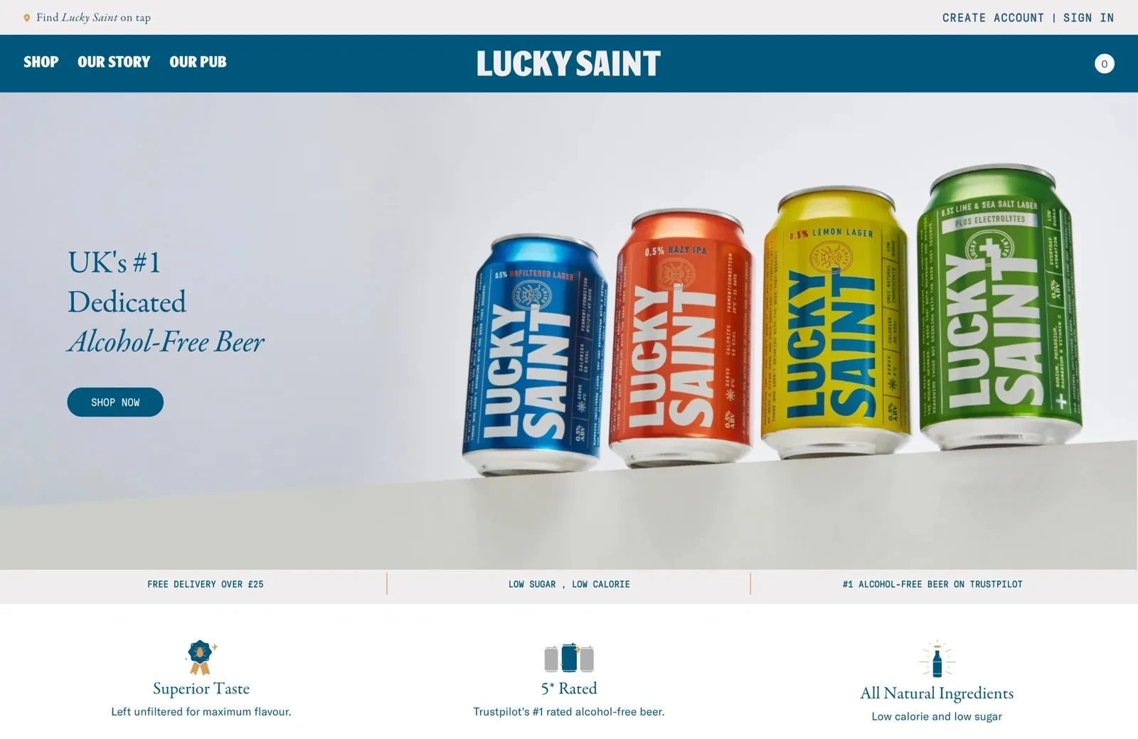
Lucky Saint wants to be seen as a real beer that happens to have no alcohol, so its store points to where it's poured. A Find Lucky Saint on tap link sits at the top of every page, and the brand runs its own pub.
Conversion tactics
Alcohol-free beer still has to convince people it tastes good. Lucky Saint does that by borrowing credibility from chefs: its journal notes the beer is served in 40% of the UK's Michelin-starred restaurants.
Its customers often skip alcohol but still want to join in at the pub. Journal guides to pubs and weekends away show the beer at exactly those social moments.
Takeaway for Shopify drink stores
Showing where professionals serve a product is strong reassurance for a category people still doubt. Content about social occasions also speaks to why customers buy it in the first place.
17. Seedlip
The Seedlip Shopify homepage
Design and navigation
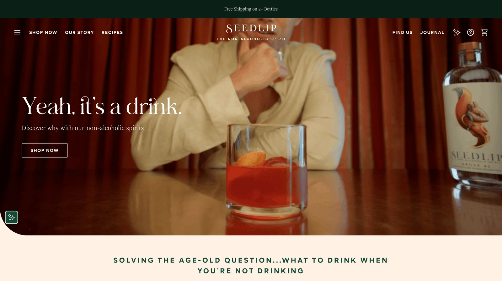
Seedlip's homepage headline answers the first doubt about a non-alcoholic spirit: Yeah, it's a drink. Product pages then illustrate each botanical in the blend, from allspice to grapefruit.
How the store converts visitors
A $31.99 bottle that tastes like no familiar spirit needs explaining before anyone will pay $31.99. Product pages note that one bottle makes 12 to 14 cocktails, which brings the price per drink down.
Each page also shows a simple serve and suggested recipes, so shoppers know what to make. Free shipping on two or more bottles then encourages a second flavor.
Why the approach makes sense
A new category has to settle the social doubt first, then the practical ones: taste, cost per serving and how to serve the drink. Answering all of them on the product page leaves fewer reasons to leave.
Related:
Want more product page visits to turn into orders? See these Shopify CRO tactics
18. CleanCo
The CleanCo Shopify homepage
Design and navigation
CleanCo's customers are often people cutting back on alcohol, and the homepage speaks to them directly. A personal note from the founder describes drinking heavily and then quitting.
Conversion practices
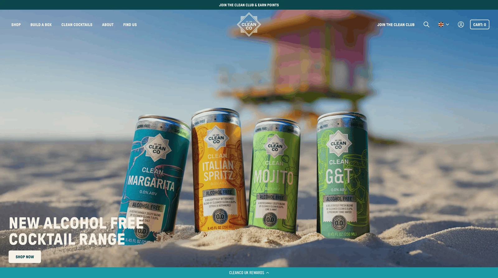
Switching from a familiar spirit is the hard part, so the store makes it simple. Each bottle is named after the spirit it replaces, such as Clean G for gin, and a short quiz suggests where to start.
Recipes for drinks like an espresso martini show how to use the bottles. A Clean Club then rewards points for orders and reviews, which brings customers back.
Takeaway for Shopify drink stores
An honest founder story can mean more than any product claim when customers share the same experience. Familiar names and a quiz then make switching an easy first order.
19. Three Spirit
The Three Spirit homepage product lineup
Design and navigation
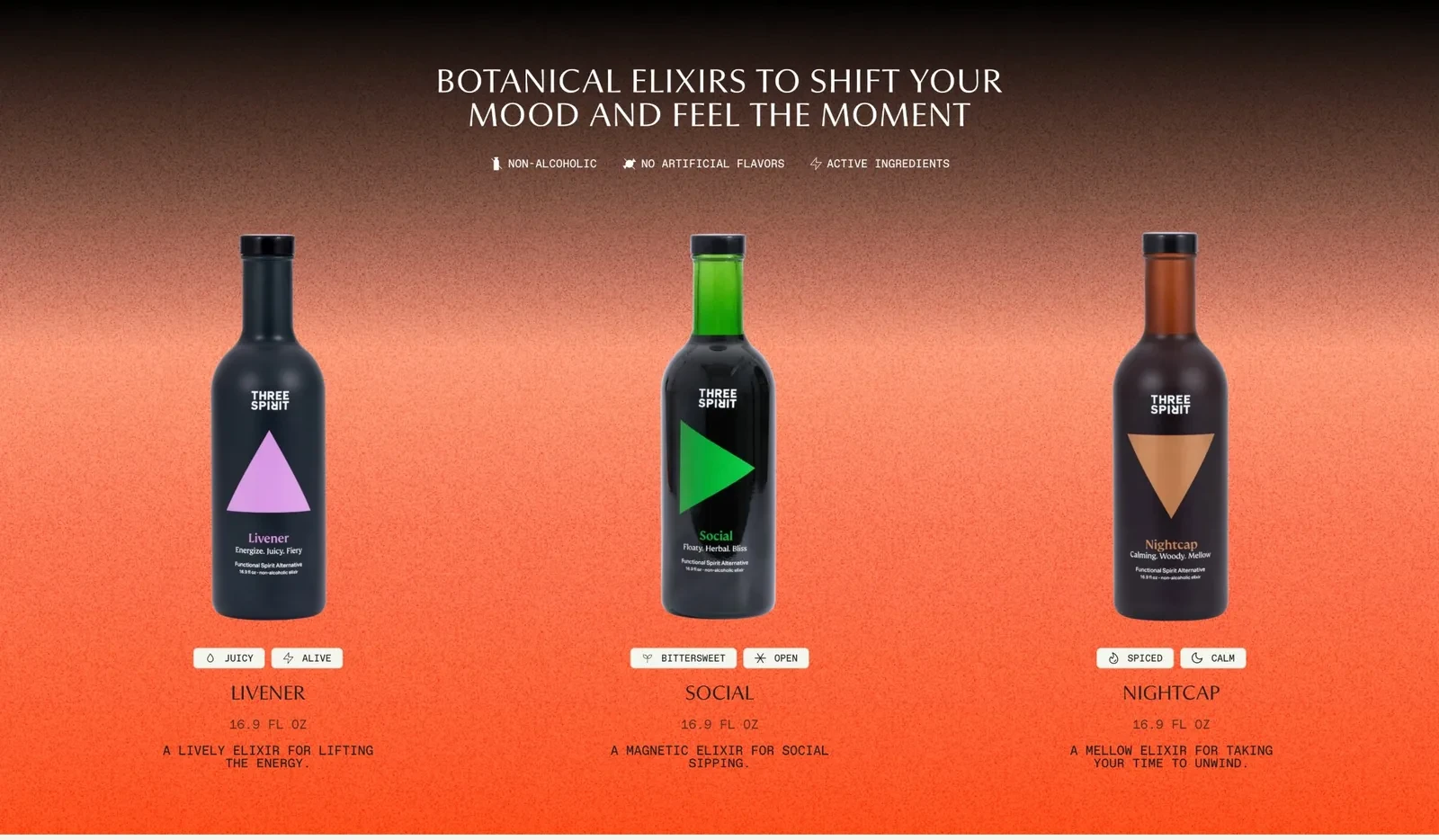
Three Spirit sells three main drinks, each for a different moment: Livener for energy, Social for parties and Nightcap for winding down. Two short words on each card, such as spiced and calm, describe how it feels.
Conversion tactics
Few shoppers know what a drink called Livener should taste like, so the store guides them. A bar on every page offers 10% off for taking a quiz that suggests which drink to try first.
The discount gives visitors a reason to finish the quiz and buy. Pages on each plant ingredient and cocktail recipes then answer the questions that come after.
Why the approach makes sense for Shopify drink stores
A short quiz turns an unfamiliar range into one recommendation. Tying a discount to the quiz gives shoppers a reason to complete it and place a first order.
20. Curious Elixirs
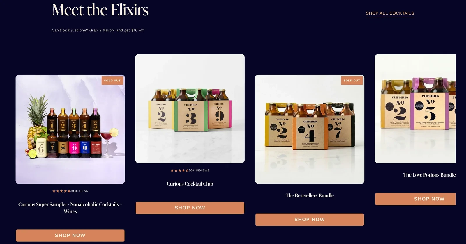
The Curious Elixirs homepage product lineup
Design and navigation
Each Curious drink has a number instead of a name, such as No. 2 or No. 9, printed large on the box. A customer who likes one can find it again by its number.
How the store converts visitors
Curious wants new customers to find a favorite and stay. Like Three Spirit, it offers a flavor quiz, and any three flavors together cost $10 less, so trying several at once is cheaper.
The Curious Cocktail Club sends members every flavor across their first four boxes, with up to 37% off and the option to pause or cancel. Once they find a favorite, the numbers make it easy to reorder.
Takeaway for Shopify beverage stores
A subscription that works through the whole range helps new customers find a favorite before they settle. Simple product names then make that favorite easy to reorder.
Highlight: Several of these stores greet new visitors with a quiz popup that asks about their favorite drink or how they want to feel.
Branching quiz popups like these point each visitor to a product. They also collect zero-party data, the preferences customers share directly, which the brand can use in later emails.
Shopify wine stores
Wine brands that sell online work around local shipping rules and a habit of buying wine in shops. These stores give shoppers a format or a selection they can't find on a shop shelf.
21. Archer Roose
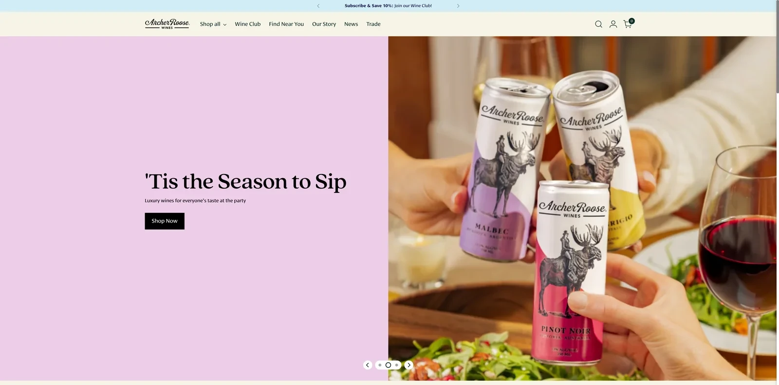
The Archer Roose Shopify homepage
Design and navigation
Each Archer Roose wine has its own color, used on the can and on its homepage tile. The bubbly is pale blue, for example, and the malbec purple. Every tile names the region and a line of tasting notes.
Conversion practices
Wine in a can still makes some shoppers doubt the quality, so the store answers on each product. Award medals, such as gold or 92 points, sit on many tiles, and named regions like Veneto, Italy, signal real winemaking.
Archer Roose also sells in shops and restaurants, so a map on the homepage shows where to find the cans. For direct buyers, the Wine Club offers 10% off and a newsletter signup gives 20% off the first order.
Why the approach makes sense
When a format raises doubts about quality, awards and named regions on every product answer them early. A store locator also helps a brand that sells as much in shops as online.
22. Dry Farm Wines
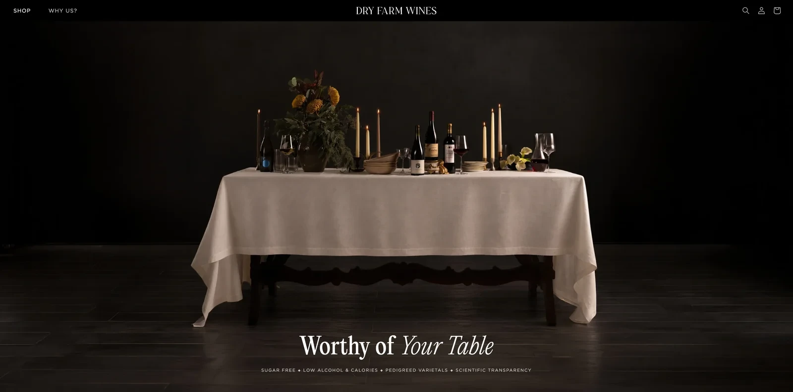
The Dry Farm Wines Shopify homepage
Design and navigation
Dry Farm Wines leads its homepage with a running count of the wines its team tested this year and how few it accepted. In November 2026, that was 1,537 tested and 234 accepted. Each one is lab tested for sugar, sulfites, alcohol, heavy metals and mold.
Conversion tactics
The brand's customers care about what's in their glass, and the numbers show how strict the selection is without the brand saying so. That justifies paying more than supermarket wine.
Buying works like a personal selection: shoppers choose the colors and styles they like, and the team picks the bottles. The wines are sold only on dryfarmwines.com, so customers who liked a bottle have to come back to the store.
Takeaway for Shopify beverage stores
Showing how much was rejected tells shoppers the selection is strict without any boasting. Selling only online also makes the store the one place to reorder.
Related:
Answer shoppers' questions on every product page: how to write product descriptions
23. Le Petit Ballon
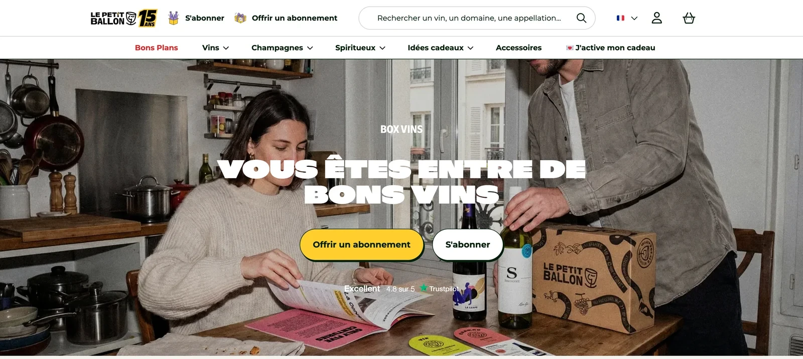
The Le Petit Ballon Shopify homepage
Design and navigation
Le Petit Ballon's homepage shows two buttons side by side: gift a subscription, and subscribe. The main menu also has a link for recipients to activate a gift they received.
How the store converts visitors
Many Le Petit Ballon boxes are bought as gifts, and each gift brings in a new person. The activation link and a section of subscribers' favorites, with 5% off for six bottles, give recipients a way to keep buying.
For subscribers themselves, the store lists three reasons to stay: bottles sold only through the club, a new wine every time and the option to pause.
Why the approach makes sense for Shopify beverage stores
A gift subscription introduces a new customer with a few months of wine to try. Letting recipients activate it on the site and reorder what they liked turns them into paying customers.
24. Alpha Box & Dice
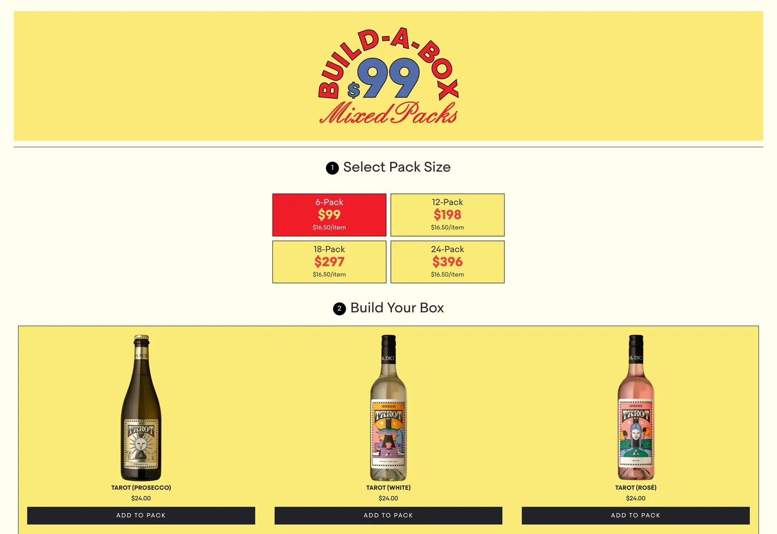
The Alpha Box & Dice Build-a-Box page
Design and navigation
Alpha Box & Dice photographs its wines with humor, such as a semillon called Yolk balanced on a watermelon among floating eggs. The Build-a-Box page walks shoppers through three steps: choose a size, add wines and watch the box fill up.
Conversion practices
A small winery makes more from a six-bottle order than a single bottle. So single bottles cost $24 to $28, but any six cost $99, which works out to $16.50 each.
The same price per bottle applies to cases of 12, 18 and 24, which keeps the offer easy to understand at every size.
Takeaway for Shopify drink stores
One flat price per bottle makes a bulk discount easy to understand. The offer also gives new customers a reason to try several wines instead of one.
Shopify snack, cereal and sweets stores
Snack and breakfast brands have low prices per item, so these stores raise the order with variety boxes, subscriptions and flavors sold only online.
25. Magic Spoon
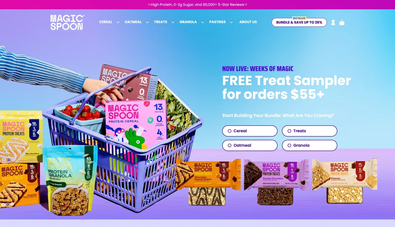
The Magic Spoon Shopify homepage
Design and navigation
Magic Spoon now sells cereal, treats, oatmeal and granola, so its hero starts with a question: what are you craving? Picking an answer starts a bundle in that product line.
Conversion tactics
Magic Spoon is building a base of repeat buyers, so the store turns first orders into subscriptions. Subscribers save 26%, and the perks go beyond the discount. They get a free bowl set, early access to limited flavors and the option to change flavors or skip a delivery.
Those perks give subscribers reasons to stay that a discount alone may not. For one-off buyers, orders over $55 come with a free treat sampler, which introduces them to more of the range.
Why the approach makes sense
A question in the hero helps shoppers find the right product line once a range grows beyond one item. Subscription perks such as early access build loyalty that a discount alone can't.
26. Belgian Boys
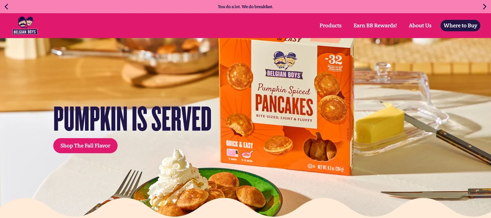
The Belgian Boys Shopify homepage
Design and navigation
Belgian Boys gives each product its own color, such as teal for the bite-sized waffles, and uses the same colors on the homepage tiles. The hero changes with the seasons, such as pumpkin spiced pancakes in the fall.
How the store converts visitors
Frozen breakfast can feel repetitive, which makes it easy to stop buying. A section called Make it your morning fills a grid with short videos. They show the waffles and pancakes in lunchboxes, as after-school snacks and as brunch cups.
Those ideas give busy parents new reasons to use the products. Where to Buy is the highlighted button in the main menu, since most shoppers will restock at their supermarket.
Takeaway for Shopify food stores
Short videos of real mornings show how a product fits into a family's week. For a brand sold mainly in stores, a clear Where to Buy button supports the way people actually buy.
27. SkinnyDipped
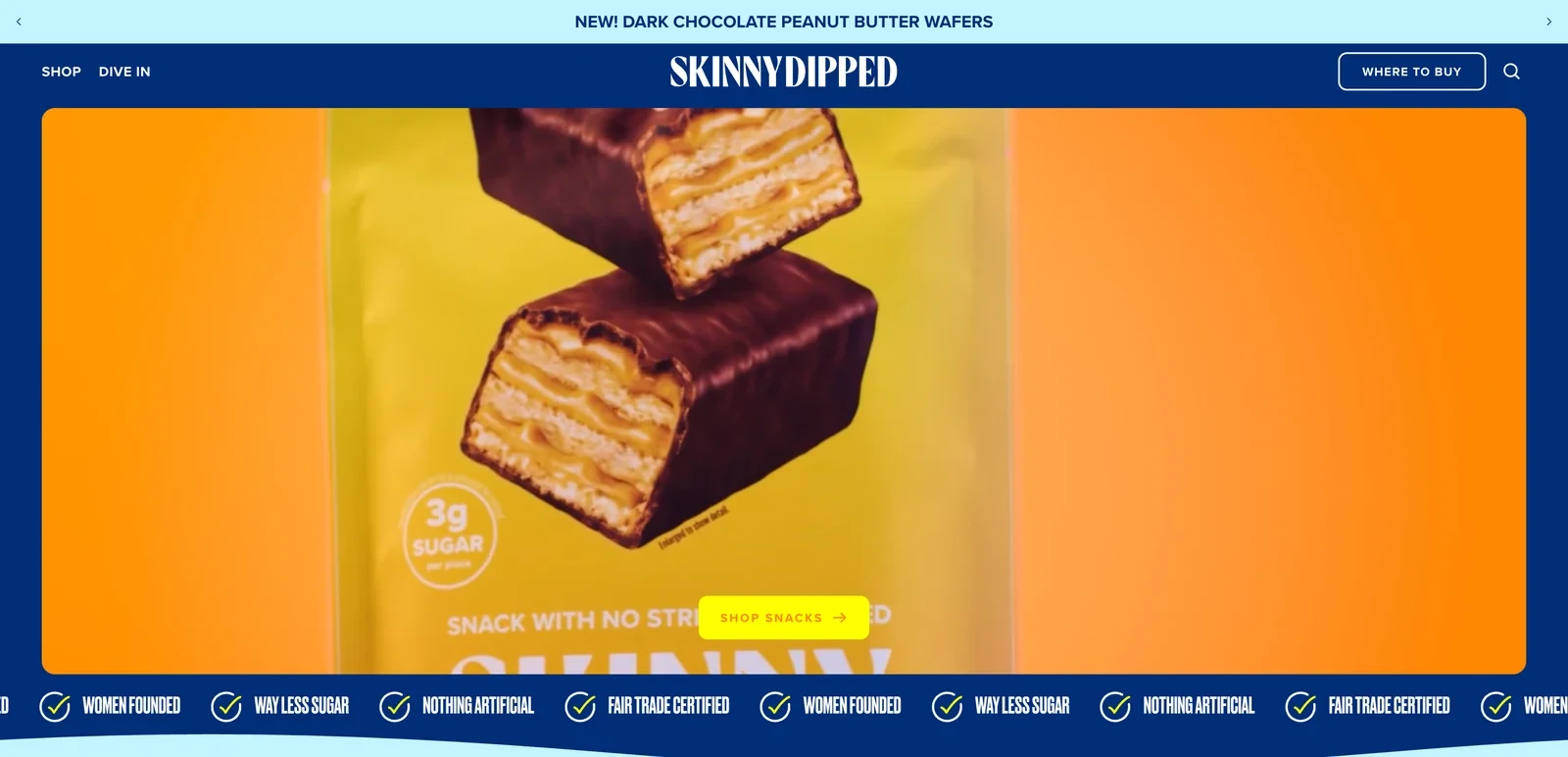
The SkinnyDipped Shopify homepage
Design and navigation
Lower-sugar snacks can look like diet food, so SkinnyDipped leads with indulgence. The homepage opens on a close-up of a chocolate wafer cut in half, and product cards show each snack up close.
Conversion practices
The sugar content comes second, as a small badge: 3 g of sugar per piece. That keeps the snack appealing while still giving health-minded shoppers the number they look for.
Reviews then repeat the low-sugar point in customers' own words, which makes it easier to believe. Where to buy has its own menu button for shoppers who'd rather pick up a bag in store.
Why the approach makes sense for Shopify food stores
When a product's selling point is what it leaves out, showing the treat first and the numbers second keeps it appealing. Reviews that mention the same numbers make the claim more credible.
Related:
Still building momentum? See practical ways of getting sales on Shopify
28. True Dates
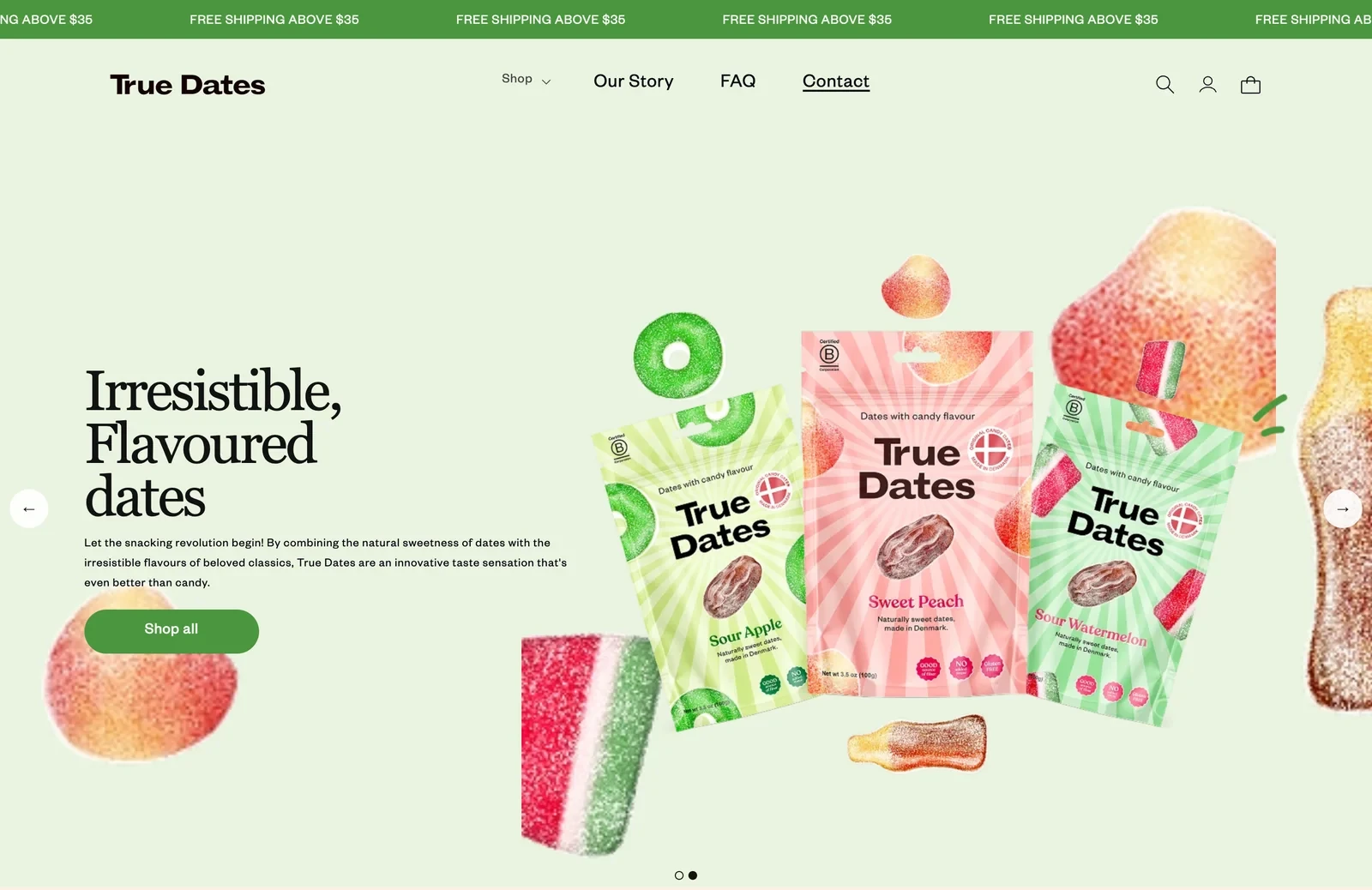
The True Dates Shopify homepage
Design and navigation
True Dates sells dates flavored like candy, and its photos explain the idea at once. Each bag floats among the real sweets it tastes like, such as gummy rings and cola bottles.
Conversion tactics
The store is aimed at shoppers who want something sweet but healthier. Icons list no added sugar, rich in fiber and made in Denmark, and handwritten notes on the photos repeat gluten free and good source of fiber.
To win a first order from shoppers new to the product, every item shows a sale price. Shipping is free above $35.
Takeaway for Shopify food stores
When a product is new, photos that show what it tastes like explain it faster than copy. Handwritten notes on the photos also make health benefits feel friendly and personal.
29. Chomps
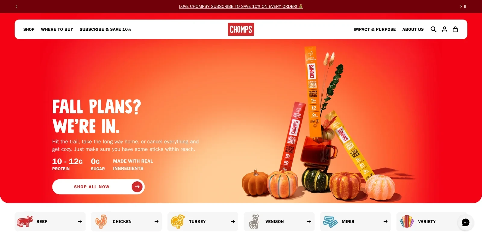
The Chomps Shopify homepage
Design and navigation
Meat sticks still carry a gas-station image, and Chomps addresses it directly with the line all stick without the ick. A row of icons follows: 10 g or more of protein, 0 g of sugar, real ingredients and allergy friendly.
How the store converts visitors
Chomps is sold in over 65,000 stores, so its online store needs to give shoppers a reason to order direct. Subscribe and save 10% appears in both the top bar and the main menu.
New visitors also get 10% off their first order for signing up by email or text. That builds a list of customers the brand can reach directly, even if they usually buy in stores.
Why the approach makes sense
When a category has a poor reputation, naming the problem and listing what's inside helps shoppers reconsider. A brand sold almost everywhere needs a clear reason to buy online, and a standing subscription discount gives one.
30. LesserEvil
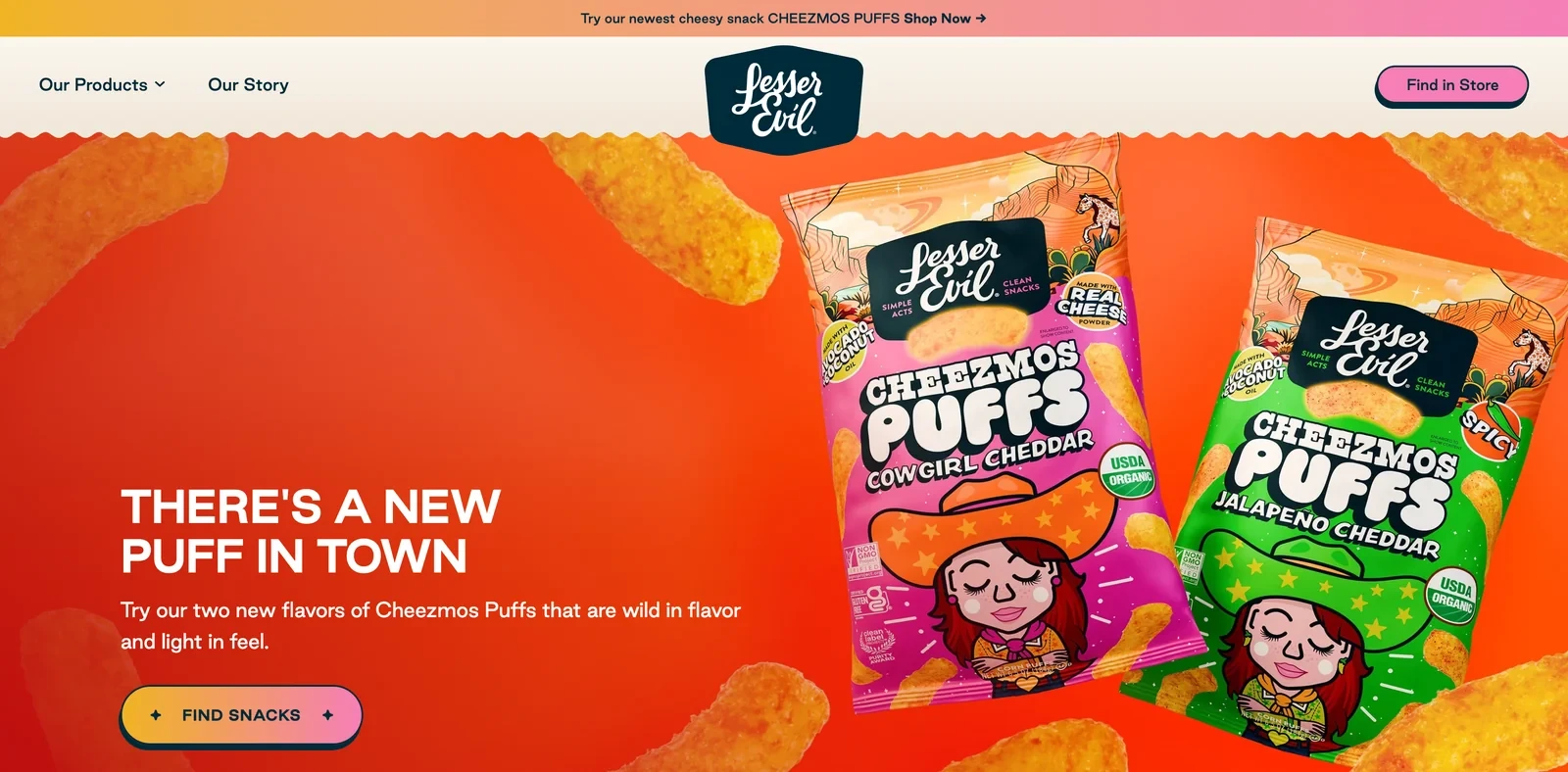
The LesserEvil Shopify homepage
Design and navigation
Every LesserEvil bag has its own illustrated character, like a cowgirl for the cheddar puffs, and the site uses the same playful style. Instead of a long menu, shoppers explore by taste: cheesy, savory, spicy, sweet and kid-approved.
Conversion practices
LesserEvil sells mostly through grocery chains, so its site is built to win the decision before shoppers reach the shelf. Find in store is the main button in the header, and retailer logos from Walmart to Costco sit under the products.
A simple table answers the question shoppers have in the aisle: why pay more for this bag? The table compares LesserEvil with the other guys on five points, from certified organic to no seed oils.
Takeaway for Shopify food stores
A brand sold mostly in stores can use its site to make the case before the shopper reaches the shelf. A short comparison table makes that case faster than paragraphs of copy.
31. Legendary Foods
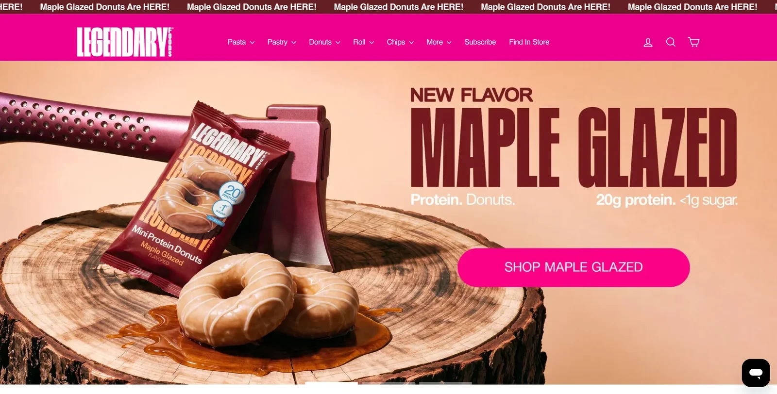
The Legendary Foods Shopify homepage
Design and navigation
Legendary Foods' homepage works like a full catalog. Every product appears grouped by type, from protein pasta to donuts and chips, and protein and sugar numbers are printed large on every package.
Conversion tactics
People who buy high-protein snacks compare numbers first, so showing them on every card saves a click. Star ratings, review counts and starting prices from $4.99 make a first purchase feel low-risk.
To raise the order value, bundles at the bottom of the page show the saving in dollars and a Ships free badge. A rolling bar announces each new flavor, which gives regular buyers a reason to return.
Why the approach makes sense for Shopify food stores
Putting the numbers shoppers compare on every product card shortens their decision. Bundles with a visible saving then turn a small first order into a bigger one.
32. Opopop
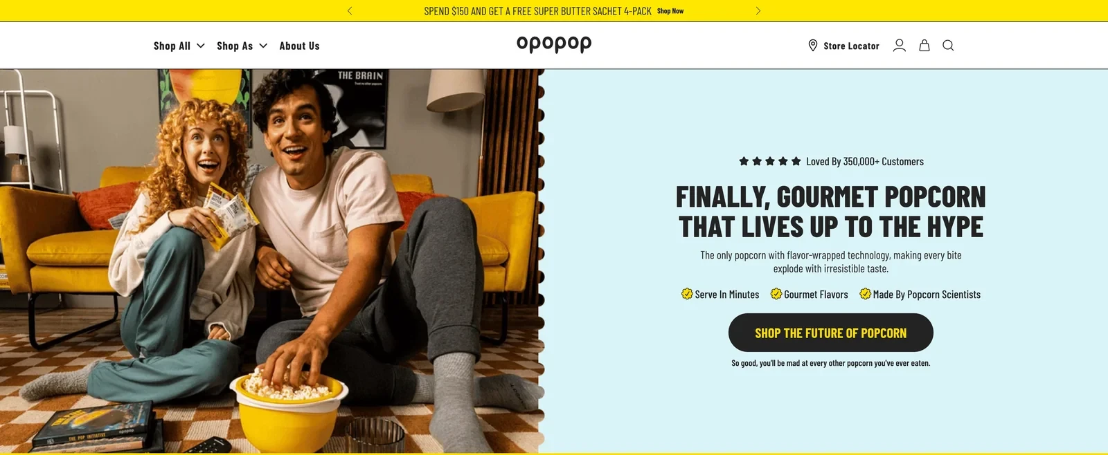
The Opopop Shopify homepage
Design and navigation
Everyone thinks they know popcorn, so Opopop spends its homepage on what's different. One section shows a single kernel up close to explain its flavor coating, and another sums up the process in three photos: peel, pour, pop.
How the store converts visitors
To win a first order, Opopop gives new visitors their own section with a build-your-own box. A 100% satisfaction guarantee backs that first box. A table comparing Opopop with basic popcorn backs up the higher price.
To bring customers back, the store sells a reusable popper bowl, which gives owners a reason to keep ordering kernels. A newsletter offer of up to 45% off and free shipping adds another.
Takeaway for Shopify food stores
When shoppers assume they already know a product, a close-up and a side-by-side comparison show what's new. Selling the tool that uses the product also builds repeat orders.
Related:
Ask for a small yes before the signup with micro-commitment popups
33. Hippeas
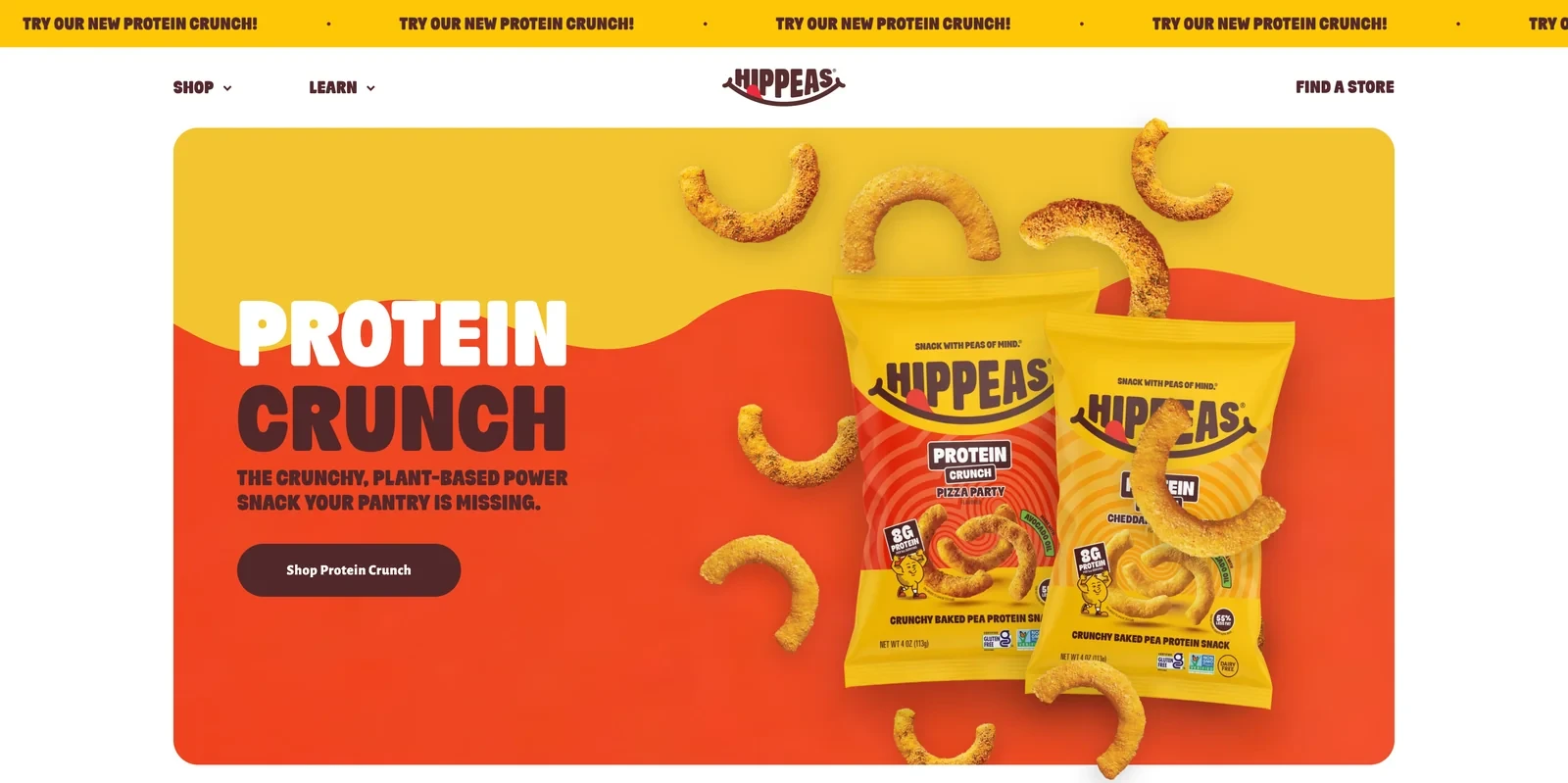
The Hippeas Shopify homepage
Design and navigation
Hippeas uses a retro, playful style with bold colors and puns such as snack with peas of mind. Right under the hero, a row of badges shows its certifications: non-GMO, gluten-free, vegan, kosher and free from the top nine allergens.
Conversion practices
Parents buying snacks for children often check allergens before anything else, and the badge row answers that before they scroll. Product cards then have their own Add to cart buttons, so buying takes one click.
Each review ends with a link to the snack it mentions, which turns a positive comment into a path to the cart. A newsletter offering first dibs on new flavors keeps fans coming back.
Why the approach makes sense
Dietary badges right under the hero answer the first question many snack buyers have. Linking each review to its product also shortens the path from interest to purchase.
Shopify chocolate and gift stores
Chocolate is often bought as a gift, so these stores sell occasions, personal touches and choice.
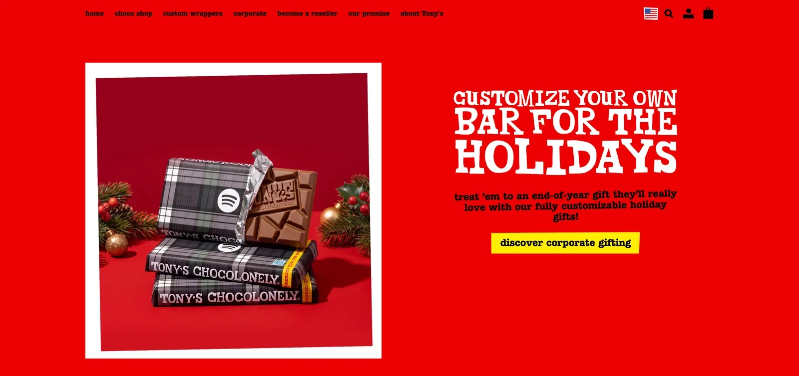
The Tony's Chocolonely Shopify homepage
Design and navigation
Tony's US store looks like its wrappers: bright red backgrounds, chunky hand-drawn lettering and photos in white polaroid borders. The shop is organized by occasion, with ready-made wrappers for weddings, birthdays and events.
Conversion tactics
Tony's bars are already in supermarkets, so the store focuses on what shelves can't offer: a bar with your own design. Custom wrappers, corporate gifts and becoming a reseller sit in the main menu, and ahead of the holidays, the hero leads to corporate gifting.
These are large orders, so the store reassures the people who place them. The Wall of praise quotes buyers at organizations such as LACMA and Uber.
Takeaway for Shopify food stores
A brand already on supermarket shelves can use its own store for orders shops can't take. Quotes from business buyers then help when the goal is a large custom order.
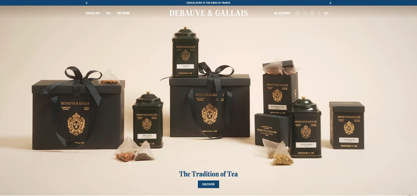
The Debauve & Gallais Shopify homepage
Design and navigation
Debauve & Gallais sells luxury chocolate and tea, and the store looks the part. Cream backgrounds, navy serif type and a royal crest set the tone. A bar at the top calls it the chocolatier to the kings of France.
How the store converts visitors
Many of these chocolates are bought as gifts, so the store spells out how they arrive. Every order is gift wrapped, and buyers can add a message printed on Debauve & Gallais letterhead.
Instead of customer reviews, the store quotes writers such as Marcel Proust. Its three Paris boutiques are listed with opening hours, which reassures buyers paying for a luxury gift online.
Why the approach makes sense for food and beverage Shopify stores
For luxury gifts, how the product arrives matters as much as the product itself. A long history and real boutiques can do the job that reviews do for younger brands.
36. Lakrids by Bülow
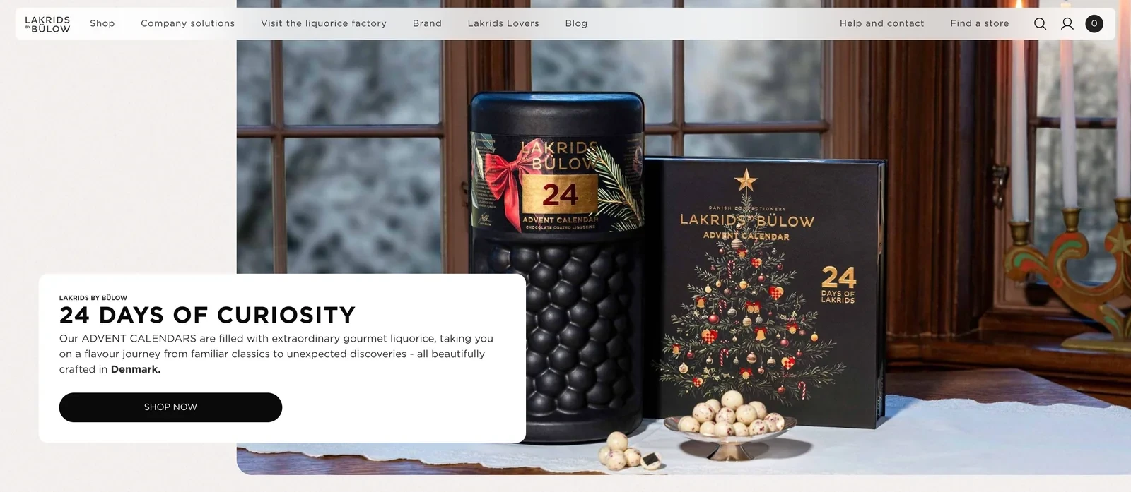
The Lakrids by Bülow Shopify homepage
Design and navigation
Lakrids by Bülow sells its liquorice in black jars marked with large letters, such as A or D, and uses those jars as its main visual. Category photos fill whole tiles with colorful liquorice balls around a jar.
Conversion practices
Liquorice divides people, and the store turns that into a talking point. The homepage says the brand has been turning skeptics into Lakrids Lovers. A section titled Share it with a hater invites customers to win over their friends.
Gift formats make the brand easier to try, from advent calendars to selection boxes and limited editions. Company gifts have their own place in the main menu, which opens a second, larger type of order.
Takeaway for Shopify food stores
A brand selling a divisive flavor can turn that into a reason for customers to talk about the brand. Gift boxes also lower the barrier, since they're easier to try than a full jar.
Related:
Reach more new buyers with these Shopify marketing strategies
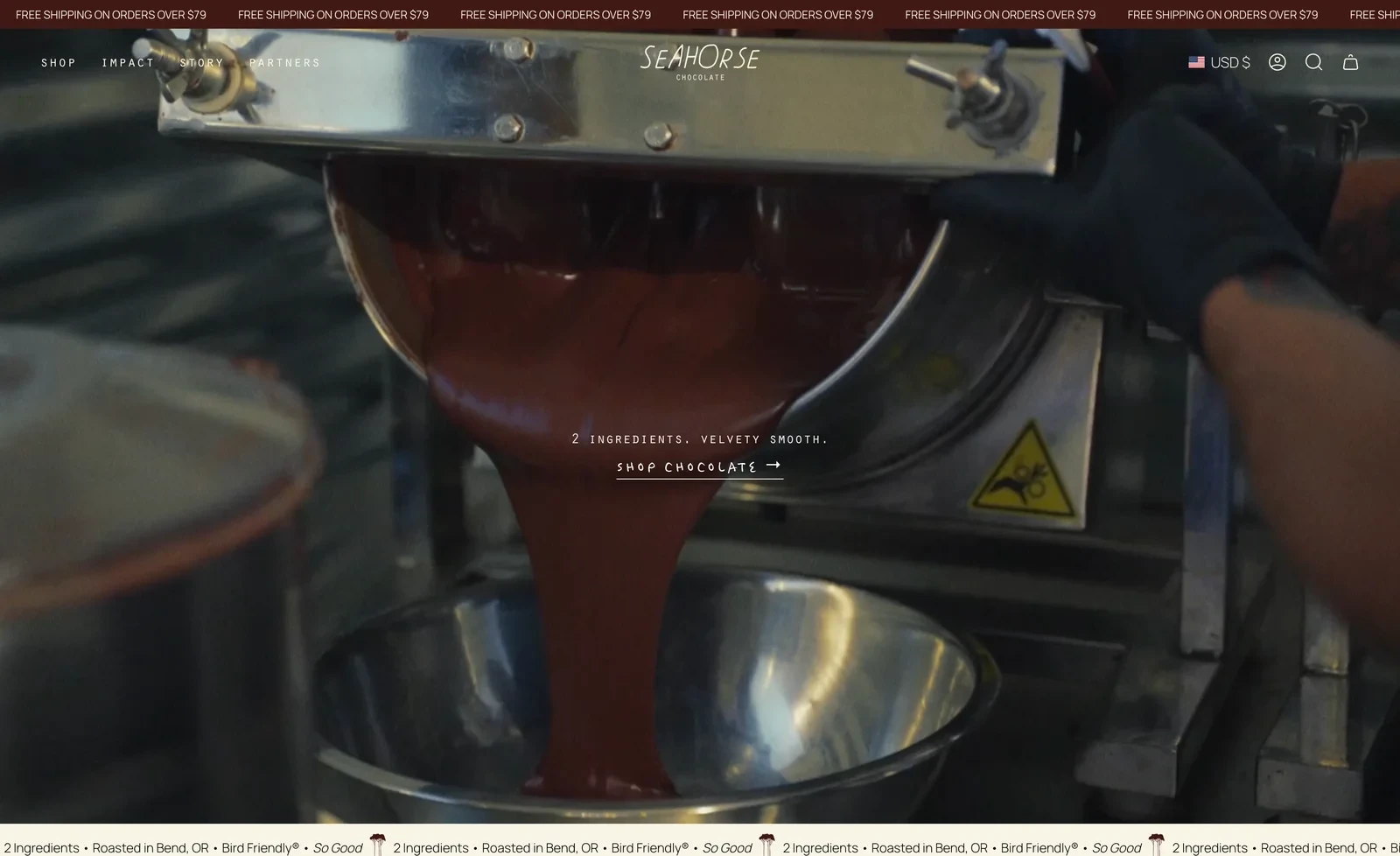
The Seahorse Chocolate Shopify homepage
Design and navigation
Seahorse Chocolate opens with video from its roastery as melted chocolate pours from a machine, under one line: 2 ingredients, velvety smooth. A section then walks through the process, from fermenting cacao at origin to wrapping each bar by hand.
Conversion tactics
A $14 bar needs a reason to cost more than a supermarket one, and the store gives several. Award badges sit on the product photos, a section called No fillers lists what the bars leave out, and reviews average 4.9 stars.
An illustrated map then pins each farm the cacao comes from, with a button to taste each place. That turns one purchase into a reason to try bars from several origins side by side.
Why the approach makes sense
When a product has only two ingredients, the story is in where they come from and how they're made. A map of origins also turns a single bar into a reason to try the range.
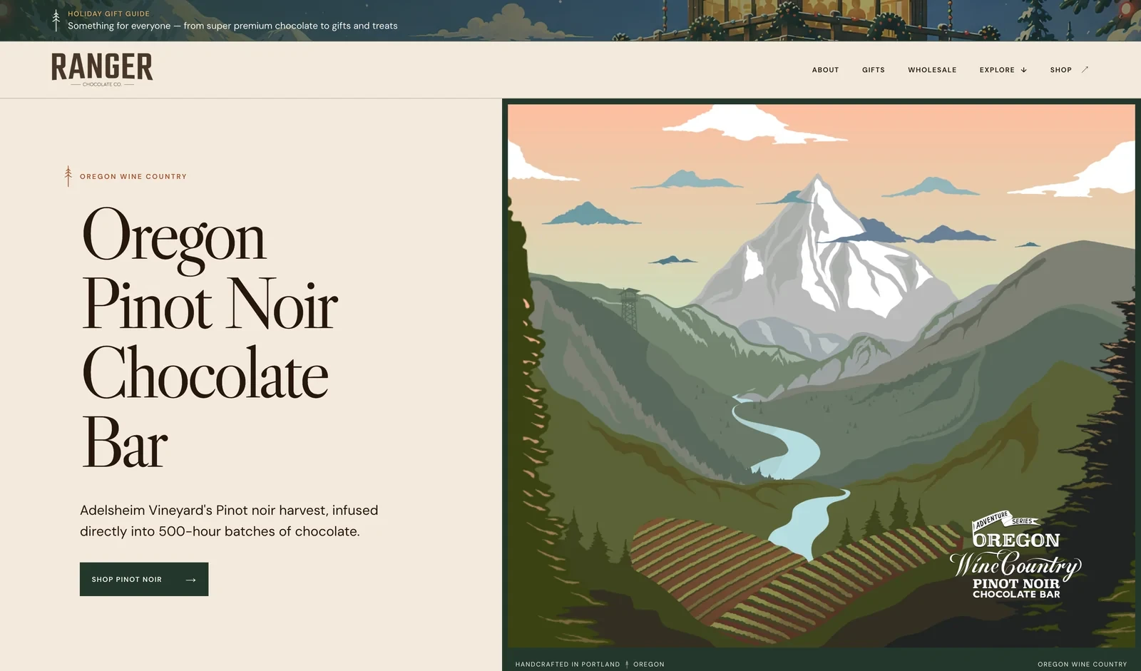
The Ranger Chocolate Co. Shopify homepage
Design and navigation
Every Ranger bar has a wrapper painted like a vintage national park poster, and the hero gives each bar its own full-size poster. The store keeps to an outdoor palette of forest green, cream and rust.
How the store converts visitors
Collectible packaging gives shoppers a reason to buy more than one bar. Collaborations with local producers add urgency, such as an Oregon Wine Country bar made with a local vineyard's pinot noir harvest.
Ranger also has a shop in Portland, and the homepage invites visitors there with the address, opening hours and a button for directions. Gift guides, wholesale and corporate gifting in the menu open up larger orders.
Takeaway for Shopify food stores
Packaging that looks like collectible art encourages shoppers to buy several bars. A product made with a local partner also turns a regional connection into a selling point.
Related:
Write product copy that persuades with these ecommerce copywriting examples
39. Compartés
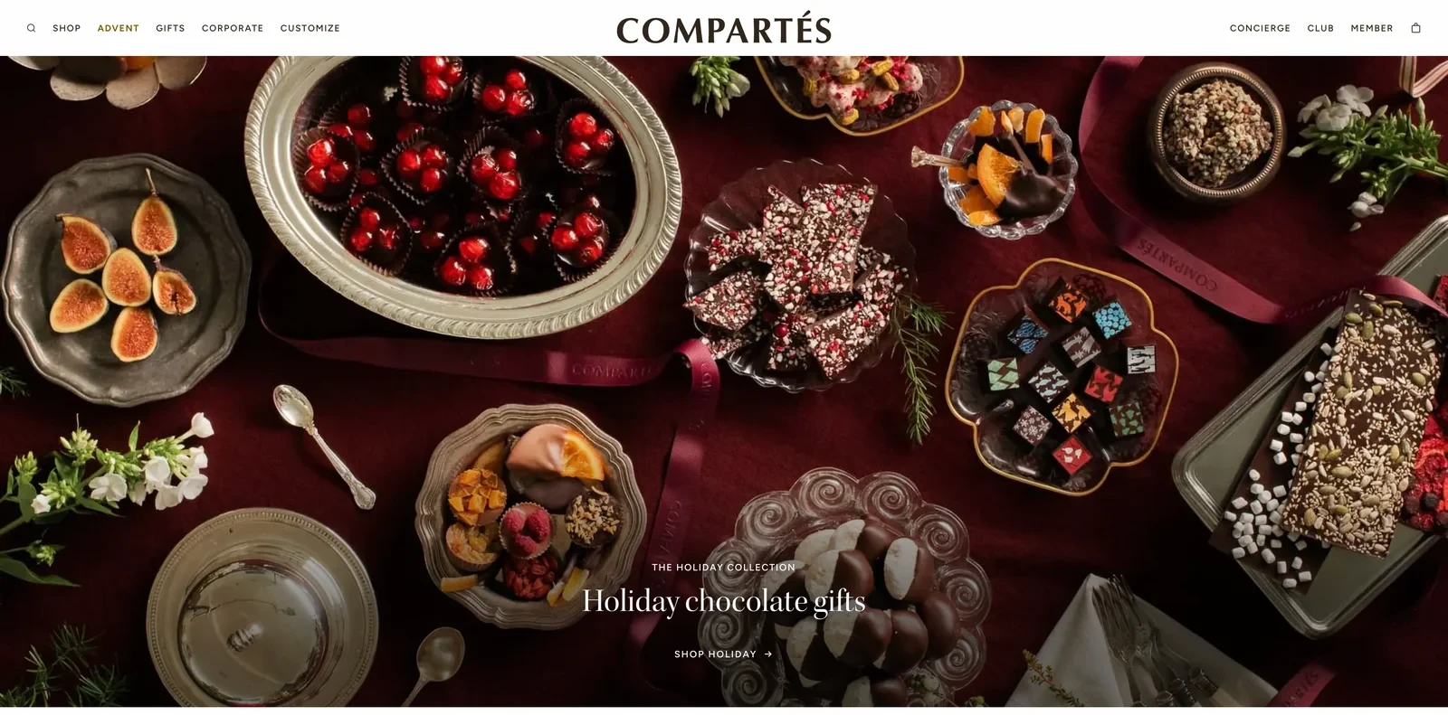
The Compartés Shopify homepage
Design and navigation
Compartés styles its hero like a set table, with chocolates and fruit on vintage silver platters, and changes it with the seasons. Right under the hero, one press quote introduces the brand: a modern day Willy Wonka with an Andy Warhol flair.
Conversion practices
Compartés sells expensive gifts, and its menu is built for the people who buy them. Advent is highlighted in gold next to gifts, corporate orders and custom chocolates, and a Concierge link gives buyers of large orders someone to talk to.
Chocolate sent as a gift can melt on the way, so the product page answers that worry right under the Add to bag button. Three short notes promise a no-melt guarantee, shipping in one to two days and free shipping over $99.
Why the approach makes sense for Shopify food stores
When shoppers send chocolate as a gift, a no-melt guarantee next to the button removes the biggest worry. A concierge link also helps close larger, more complicated gift orders.
Shopify pantry and baking stores
Pantry products are ingredients, so these stores show what to cook with them. They also give shoppers a reason to reorder once a jar or box runs out.
40. Fly By Jing
The Fly By Jing Shopify homepage
Design and navigation
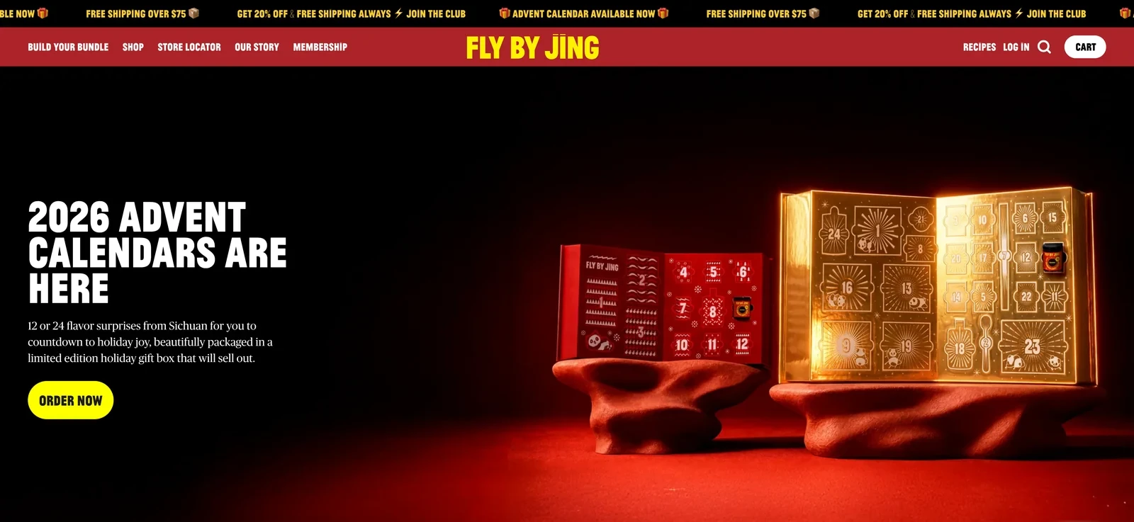
Fly By Jing's store uses the colors of its chili crisp, deep reds and bright yellow, with jagged dividers between sections. Jing Gao introduces herself on the homepage with a photo and a short note about the restaurants of Chengdu that inspired the brand.
Conversion tactics
A jar of chili crisp lasts a while, so Fly By Jing needs a reason for customers to come back. Its Tastemaker Club gives members 20% off and free shipping on every order, plus a say in new products and direct access to Jing.
Recipes then give customers new ways to use each sauce, which empties the jar faster. Build your bundle comes first in the main menu, and a rolling bar repeats the $75 free shipping threshold.
Takeaway for Shopify food stores
For a product that lasts, a membership with ongoing perks gives customers a reason to return. Perks such as product testing and contact with the founder build loyalty beyond the discount.
Related:
Grow revenue from the traffic you already have: how to increase ecommerce sales
41. Fishwife
The Fishwife Shopify homepage
Design and navigation
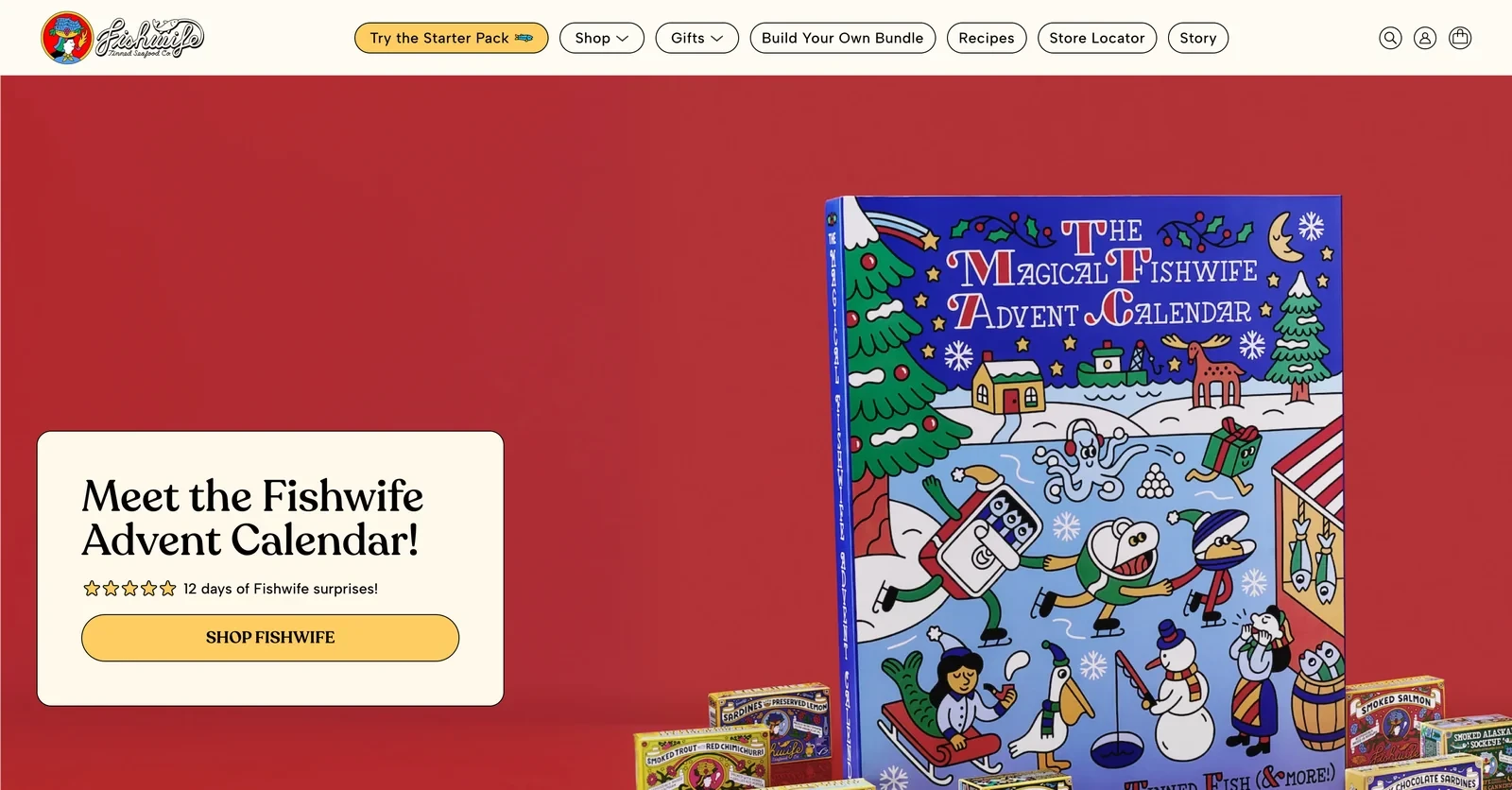
Fishwife's store carries over the illustrations from its tins, with drawn characters and bright colors. A section called Meet our canneries shows the people who smoke and pack the fish, and each product names its source.
How the store converts visitors
Tinned fish is still new to many shoppers, so the store points them to one easy first step. Try the Starter Pack is the first button in the main menu, highlighted in yellow.
In the holiday season, Fishwife positions tinned fish as a gift to reach a new group of buyers. A table compares it with typical gifts such as wine and cheese, candles and gift cards.
Why the approach makes sense
When a category is new to most shoppers, one starter set in the main menu gives them an easy way in. Comparing a product with other gifts can also open up a new reason to buy.
42. Banza
The Banza Shopify homepage
Design and navigation
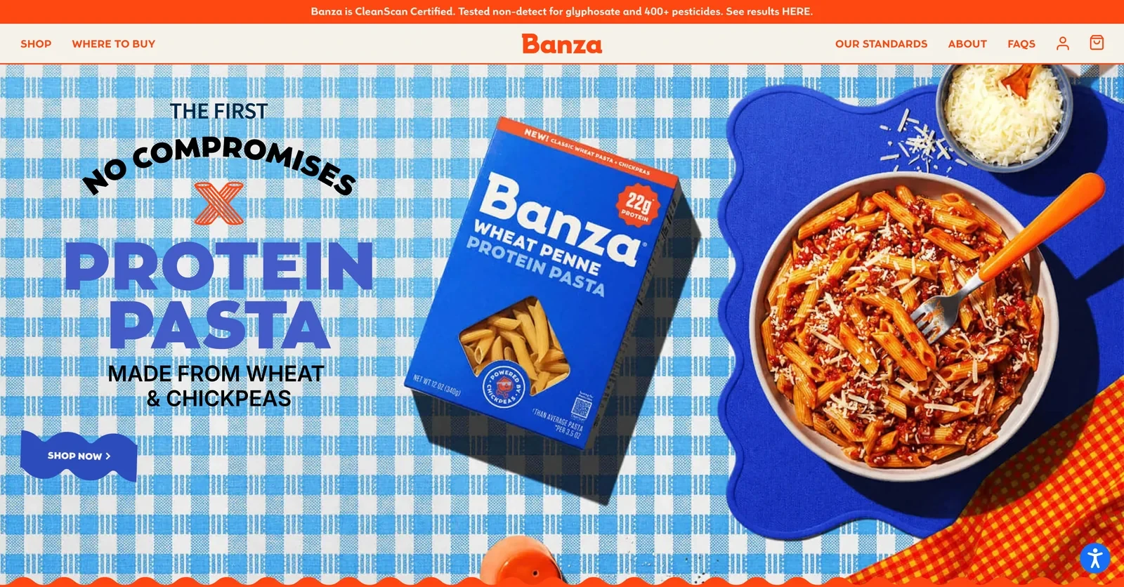
Banza's homepage looks like a family dinner table, with gingham cloth, bowls of pasta and playful lettering. Each product section has two buttons side by side: shop online, or find it in a store.
Conversion practices
Health-minded shoppers want to know what's in their food. A bar on every page says Banza is tested non-detect for glyphosate and over 400 pesticides, with a link to the results.
Banza also changed its boxes and the fiber number on its label. Instead of leaving regular buyers to wonder whether the pasta changed, the homepage says so directly: new look, same pasta, no recipe change.
Takeaway for Shopify food stores
When a brand changes its packaging or label, telling regular buyers on the homepage protects their trust. Linking straight to test results makes a health claim easy to check.
43. Graza
The Graza Shopify homepage
Design and navigation
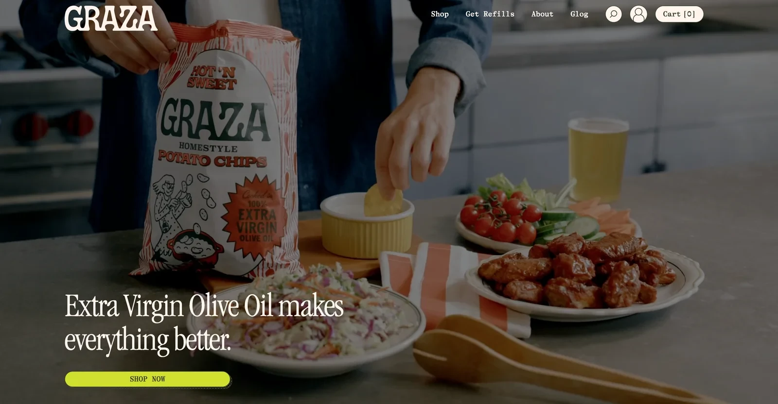
Graza pairs simple illustrations of olives and farmers with a muted green palette and typewriter-style text. The hero video shows the oil with everyday food, such as chips and chicken wings, to show it's meant for daily cooking.
A bar under the hero shows where the olives come from right now and when they're harvested, which supports the brand's freshness claim.
Conversion tactics
Olive oil shoppers often aren't sure which grade to buy, so Graza names each oil by its use. Drizzle is for finishing, Sizzle for everyday cooking and Frizzle for high heat.
Olive oil runs out, so Get Refills is the second item in the main menu. Regular buyers are one click from their next order.
Why the approach makes sense for Shopify food stores
A small range with names that explain the use is easier to shop than a list of grades. Putting refills in the main menu tells regular buyers the store expects them back.
Related:
Win new subscribers with these giveaway ideas for online stores
44. Le Marké
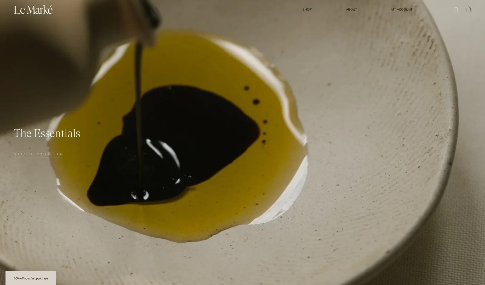
The Le Marké Shopify homepage
Design and navigation
Le Marké looks more like an interiors brand than a food store. The hero is a slow close-up of olive oil and balsamic vinegar in a stone bowl. Soft shadows, muted beige tones and a fine serif font fill the rest of the page.
How the store converts visitors
The food range fits in a single row, so Le Marké raises the order value with objects for the table. A section titled Pieces for your collection sells bistro cups, glasses and dishes alongside the oil.
A small tab on every page offers a welcome discount of 10% off the first purchase. That gives first-time visitors a reason to try a premium product.
Takeaway for Shopify food stores
Pairing a pantry staple with tableware turns one bottle into a larger order. The tableware also positions the brand as a lifestyle choice, which supports a premium price.
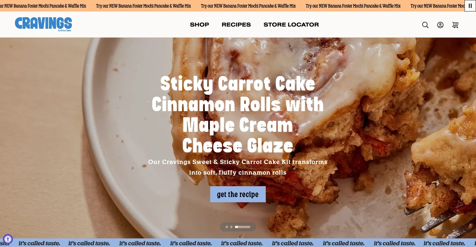
The Cravings by Chrissy Teigen Shopify homepage
Design and navigation
Cravings uses bold retro type, warm colors and photos of Chrissy Teigen in her kitchen, so the store feels like her own cookbook. Recipes is the second item in the main menu, right after Shop.
Conversion practices
A baking mix gets used once, so Cravings gives customers reasons to buy again. Many recipes turn a mix into something new, such as cinnamon rolls made from the carrot cake kit.
The store also links products and recipes the other way. Its bakeware set lists a recipe it's great for, which helps sell items that aren't food.
Why the approach makes sense
Recipes that use a product in new ways give customers more reasons to finish it and reorder. Linking cookware to a specific recipe also helps sell non-food products.
46. Hot Ones
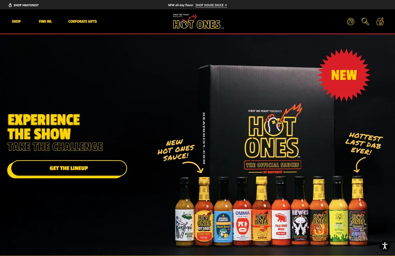
The Hot Ones Shopify homepage
Design and navigation
The Hot Ones store looks like the YouTube show it comes from, with a black background, neon yellow lettering and the same lineup of bottles. A row of videos shows people tasting the sauces, each with an add to cart button.
Conversion tactics
Hot Ones has a large audience of viewers, and the store sells them the experience they know. Each season's lineup of sauces comes as a set of 10 in a gift box, with a heat guide and stickers, so fans can host their own challenge.
To reach people who would never take the challenge, a mild House Sauce is pitched for everyday cooking. Corporate gifts also have their own place in the main menu.
Takeaway for Shopify food stores
A brand that started as a show can sell the experience viewers already know. Shoppable reaction videos let shoppers buy the exact sauce they saw someone taste a moment ago.
Related:
See what other brands achieved in these ecommerce case studies
Shopify bakery and dessert stores
Baked goods are hard to ship fresh, so these stores choose carefully what travels and how. They also give fans far from the shop a reason to order.
47. Wildgrain
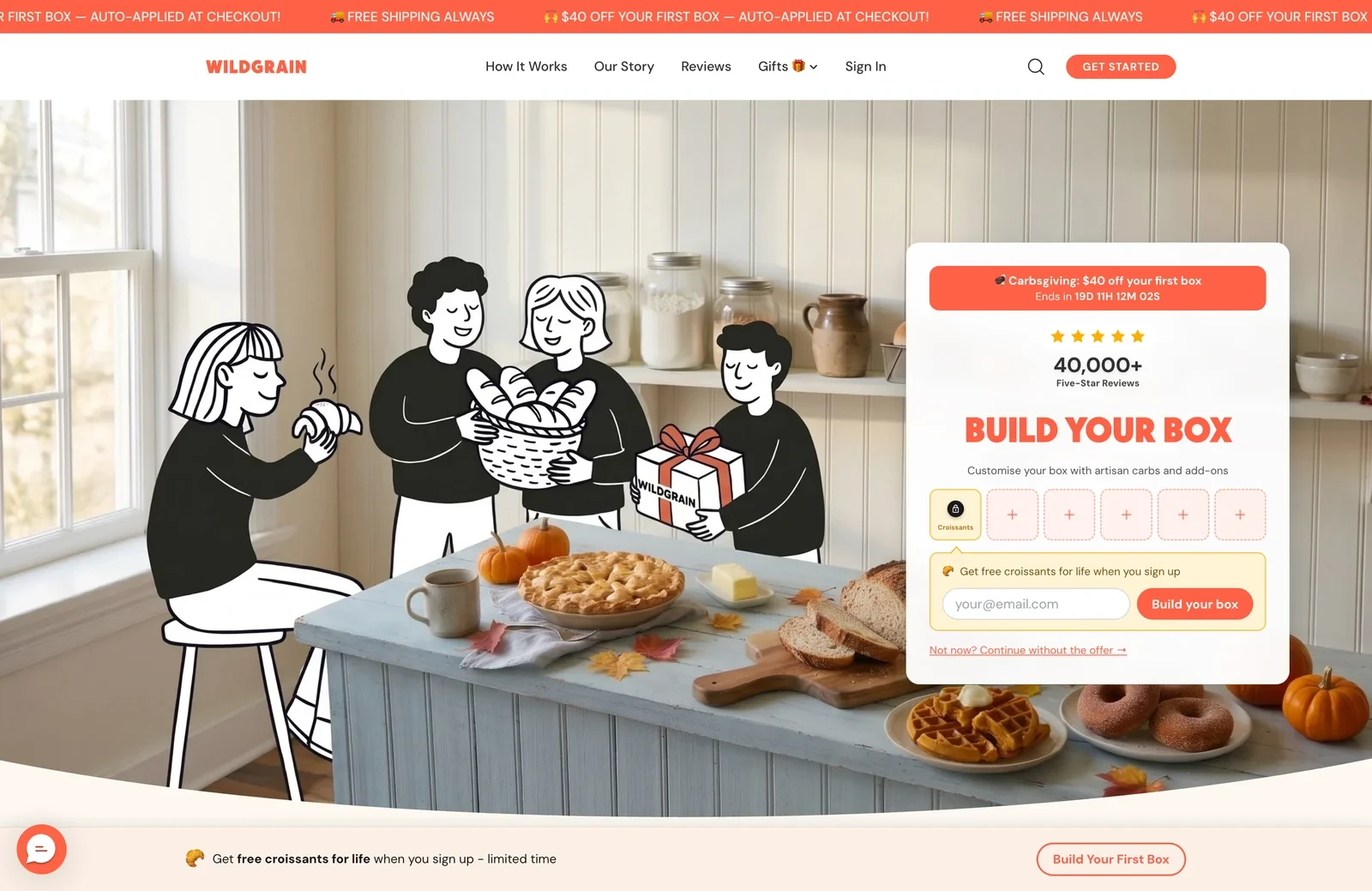
The Wildgrain Shopify homepage
Design and navigation
Wildgrain mixes hand-drawn illustrations of people with real photos of bread and pastries, which makes the store feel warm and personal. The main menu explains the service before selling it, with How it works and Reviews near the top.
How the store converts visitors
Wildgrain is a subscription box, so the goal is to start an order on the first click. The hero holds the box builder itself, with six slots to fill.
Visitors who enter their email first get free croissants for life, already shown in the first slot. That gives a stronger reason to sign up than a one-time code, and first boxes come with a discount and free shipping.
Why the approach makes sense for Shopify food stores
Putting the box builder in the hero turns the first click into the start of an order. An email offer tied to every future box also builds a list of committed subscribers.
48. Lola's Cupcakes
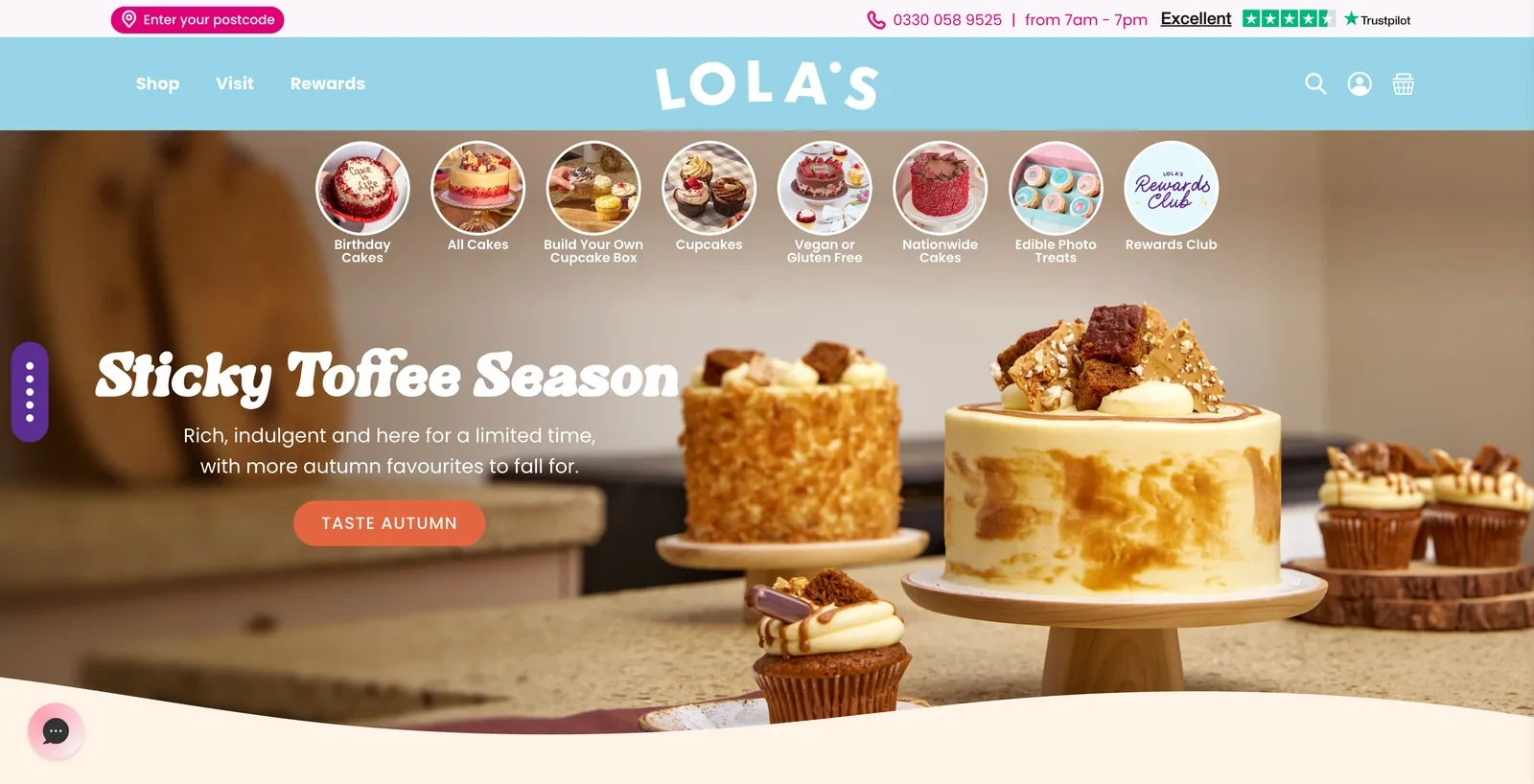
The Lola's Cupcakes Shopify homepage
Design and navigation
Under the header, Lola's lists its categories as round photos, like stories on Instagram, from birthday cakes to vegan or gluten-free options. A section called #lolasmoments shows customers' own photos of celebrations with their cakes.
Conversion practices
Cakes are bought for a specific day, and a late or damaged delivery ruins the occasion. So the store answers delivery questions first: a button at the top asks for the visitor's postcode, next to a phone number with opening hours.
A delivery promise of on time and in perfect condition is backed by over 70,000 Trustpilot reviews. A rewards club then gives regular customers a reason to order the next cake from Lola's.
Takeaway for Shopify food stores
When a product is bought for a big occasion, reassurance about delivery matters more than anything else on the page. A postcode check and a real phone number both reduce that worry.
Related:
Find out which version of a page sells more with A/B testing on Shopify
Shopify meal delivery stores
Meal delivery customers order every week or two and want control over what arrives.
49. Daily Harvest
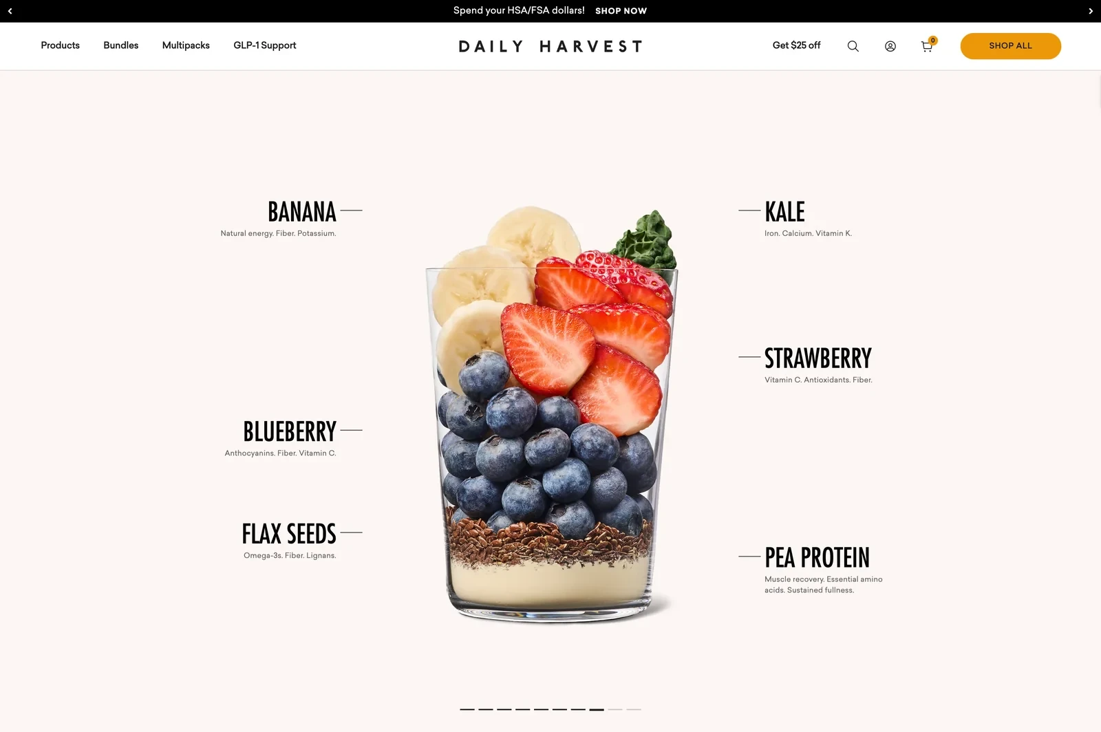
The Daily Harvest homepage ingredient section
Design and navigation
Frozen food can sound less fresh, so Daily Harvest shows what goes into its smoothies. A section called What's in the cup fills an empty glass with each ingredient as the visitor scrolls, from banana to pea protein.
Conversion tactics
Daily Harvest is positioning itself around health, and the store speaks to specific situations. A section titled What brings you here? lets shoppers start from goals such as eating more protein or following a GLP-1 diet.
A bar at the top tells shoppers they can pay with HSA or FSA funds. That lowers the real cost for customers who budget for health spending. New customers also see $25 off in the header.
Why the approach makes sense
When a product's format raises doubts, showing the ingredients and explaining the format helps. Starting shoppers from their own situation also makes a large range easier to navigate.
Shopify stores for nutrition and protein products
Nutrition shoppers compare ingredients and goals before buying, and they come back when a tub or a box of shakes runs out.
50. Huel
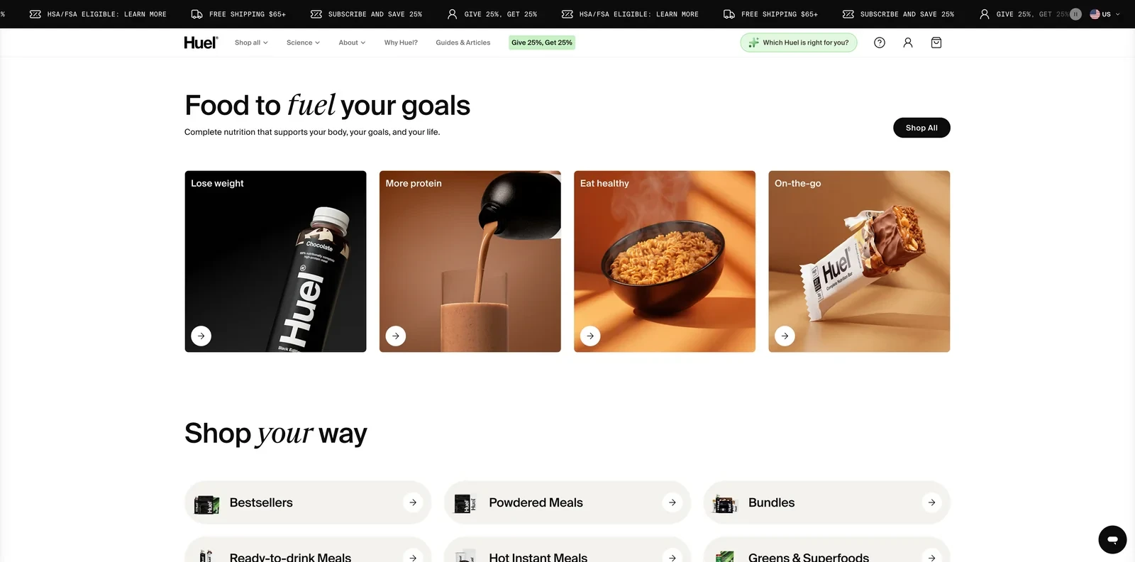
The Huel Shopify homepage
Design and navigation
Huel's homepage starts from what the shopper wants, with four tiles: lose weight, more protein, eat healthy and on-the-go. Product cards show protein, calories and the price per meal, from $1.52.
How the store converts visitors
Buying a meal replacement online is a risk, since shoppers can't taste it first. Huel removes that risk with a 30-day taste guarantee, and an AI assistant in the header helps shoppers pick the right product.
Huel then grows through its existing customers. Subscribers save 25%, and Give 25%, Get 25% is highlighted in the main menu so every visitor sees the referral offer.
Takeaway for food and beverage Shopify stores
A taste guarantee removes the biggest risk of buying food online. Showing the price per meal also helps shoppers compare a new product with what they already spend.
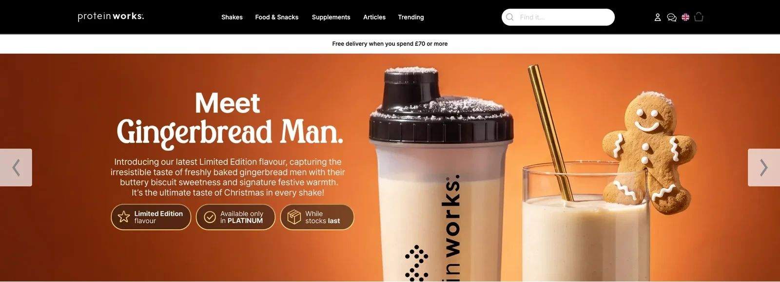
The Protein Works Shopify homepage
Design and navigation
The Protein Works sells hundreds of products, so it sorts them several ways. Each card carries a tier label from Gold to Black. Shoppers can also start from a need, such as sleep, or a time of day, from breakfast to snacks.
Conversion practices
A large range can stop shoppers from choosing at all, so a quiz titled Which shake is right for you? narrows it down. Over 53,000 Trustpilot reviews near the top reassure first-time buyers.
To bring regular customers back, limited flavors such as a holiday Gingerbread Man shake carry three badges: limited edition, Platinum only and while stocks last. The OnTap subscription and a £20 refer-a-friend offer keep them buying.
Why the approach makes sense for food and beverage Shopify stores
Clear tiers and a short quiz help shoppers find their way through a very large range. A limited flavor with a clear end gives regular customers a reason to order now.
52. Transparent Labs
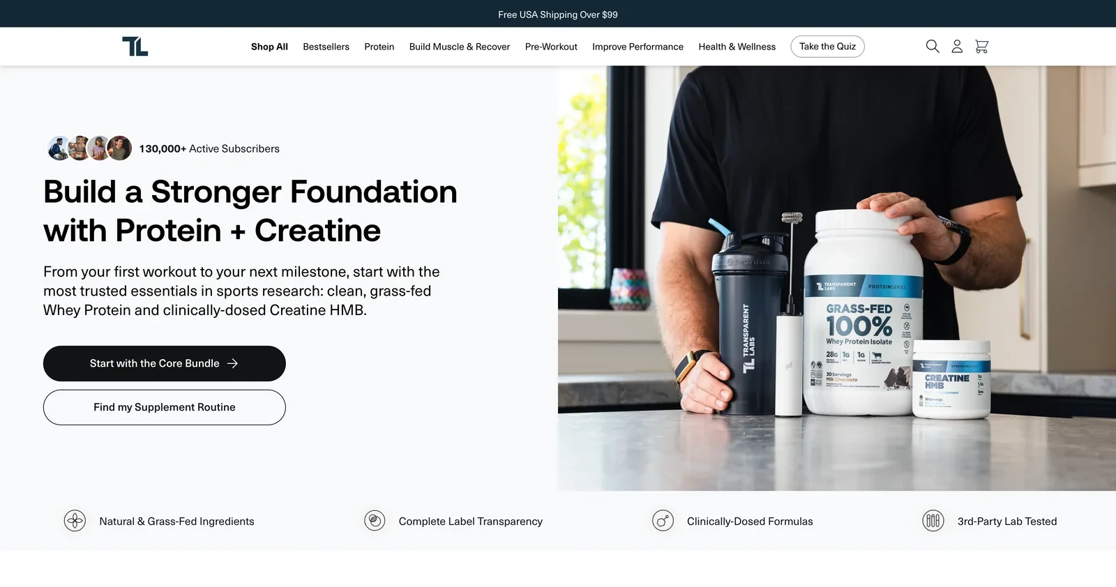
The Transparent Labs Shopify homepage
Design and navigation
Transparent Labs organizes its main menu by goal, such as building muscle or improving performance, with a Take the Quiz button at the end. The hero opens with over 130,000 active subscribers, shown with a row of customer photos.
Conversion tactics
The store serves two kinds of visitors, and the hero gives each a way in. Shoppers who know what they want can start with the Core Bundle of protein and creatine, and anyone unsure can take a short quiz.
Clean is a vague word in supplements, so the store defines it with a checklist, from no artificial sweeteners to third-party testing. A link to all its test results makes the claim easy to check.
Takeaway for food and beverage Shopify stores
Two clear starting points, a starter bundle and a quiz, cover both confident and unsure shoppers. Defining a vague claim with specific points also makes it easier to trust.
Related:
Show each visitor content that fits with these website personalization ideas
53. Momentous
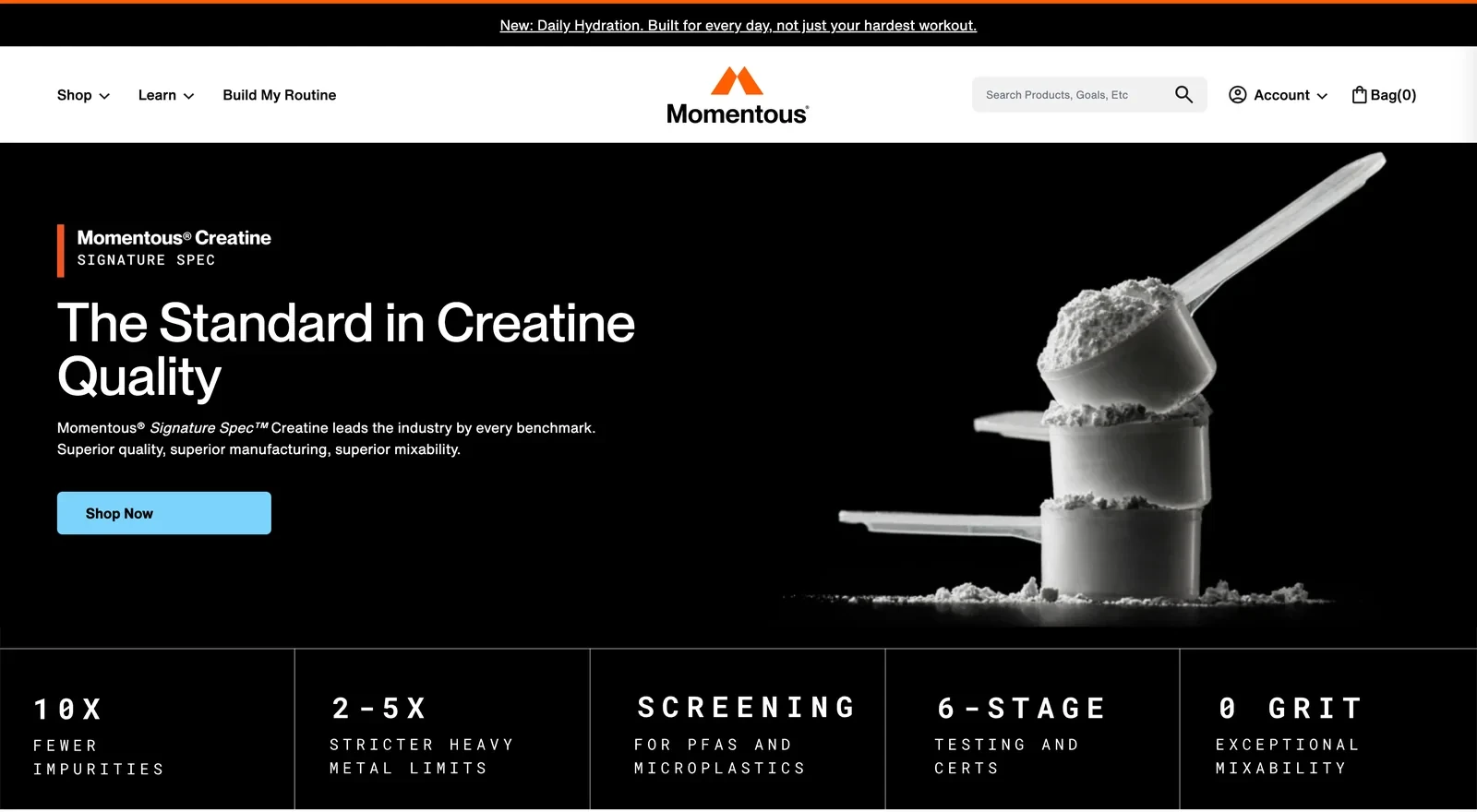
The Momentous Shopify homepage
Design and navigation
Momentous presents its creatine like a lab report. Under a black hero, a row of figures in monospaced type lists the specs, from 10x fewer impurities to screening for PFAS and microplastics.
How the store converts visitors
Supplement buyers are often unsure which products to combine, so Momentous sells ready-made plans. Build My Routine sits in the main menu, and experts such as Dr. Stacy Sims each have a Shop Routine button.
To back its quality claims, the store notes that Momentous works with more than 150 professional and college teams. A production run that fails testing, the store adds, never reaches the shelf.
Why the approach makes sense
Shopping by an expert's routine turns a list of supplements into a plan shoppers can follow. Specific numbers also say more about quality than a general claim.
54. Grüns
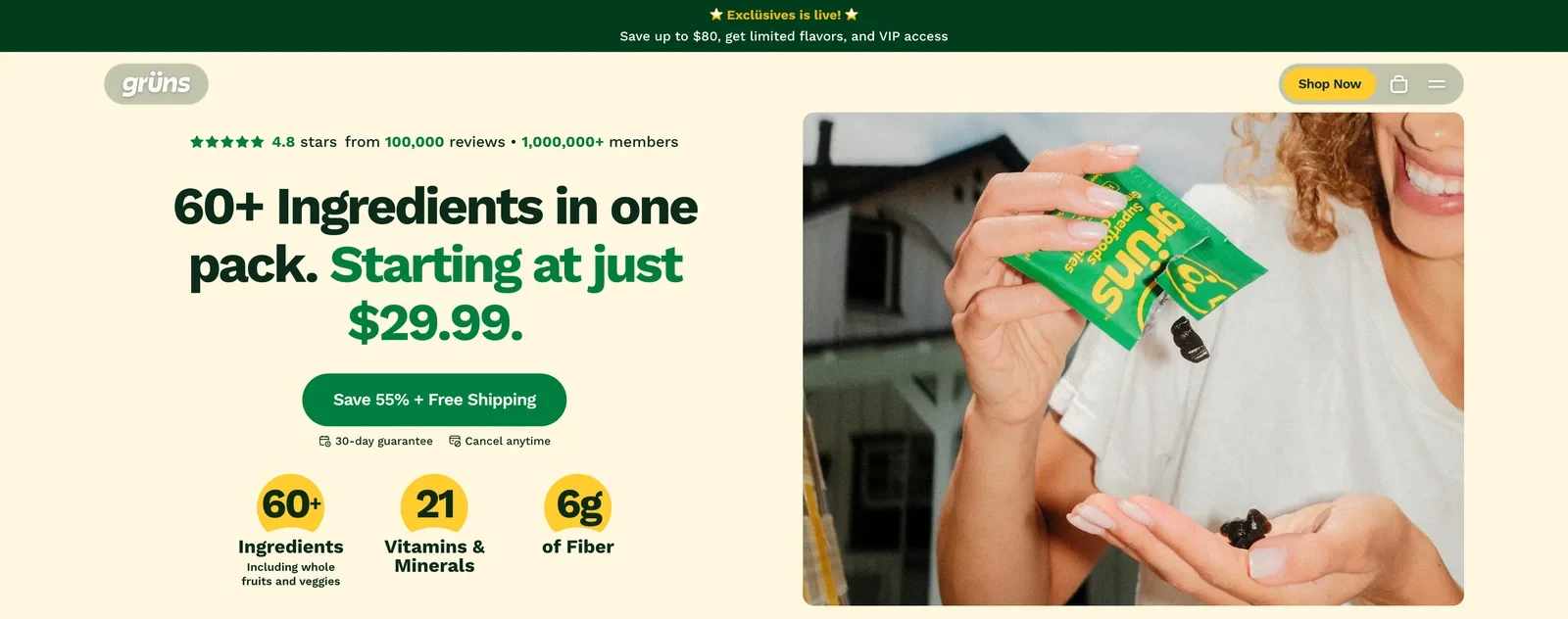
The Grüns Shopify homepage
Design and navigation
Grüns sells one main product, so the header has almost nothing in it: the logo, a Shop Now button and the cart. The full buy box sits on the homepage, where shoppers choose a flavor, a sugar level and the number of adults.
Conversion practices
Grüns is built around subscriptions, and the hero is designed to make subscribing feel safe. The headline includes the starting price, $29.99, and two lines under the button promise a 30-day guarantee and cancel anytime.
A 4.8-star rating from 100,000 reviews and a count of over 1 million members sit above the headline. New licensed flavors, such as a Shrek edition, give members a reason to stay.
Takeaway for Shopify food stores
A brand with one core product can put the full buy box on its homepage and skip a click. A guarantee and a cancel-anytime note right under the button answer the main doubts about subscribing.
55. Tropeaka
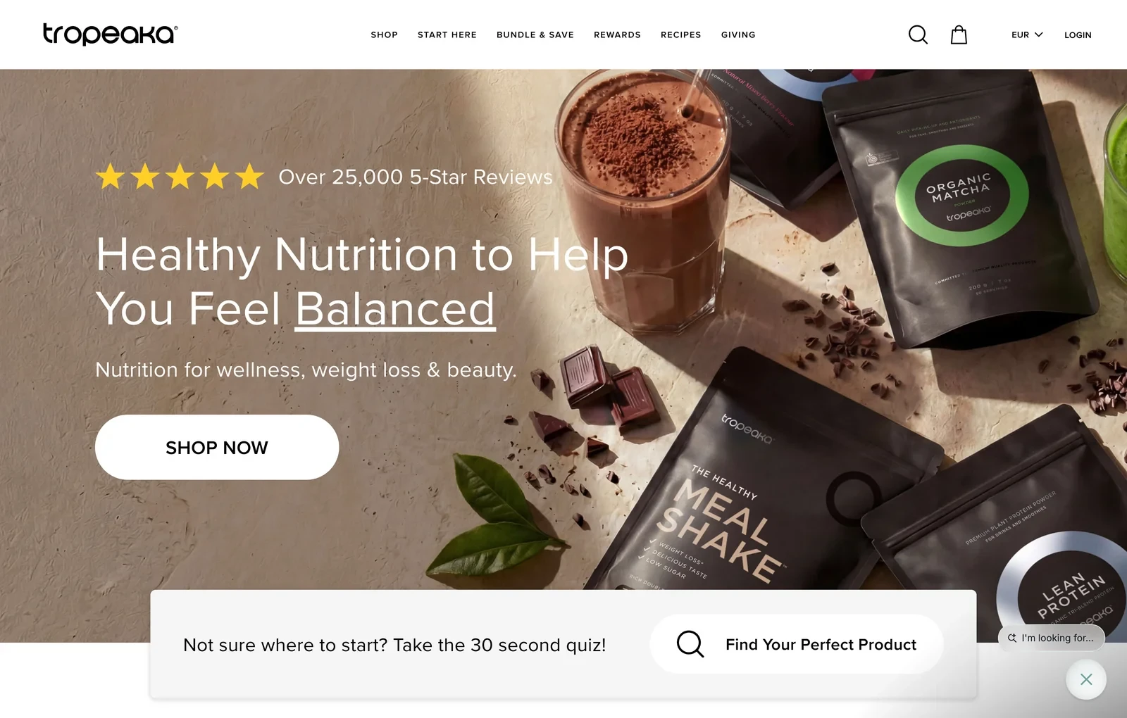
The Tropeaka Shopify homepage
Design and navigation
Tropeaka's main menu has a Start Here link for new visitors, next to Bundle & Save and Rewards. Shoppers can browse by product type or by benefit, from building lean muscle to beauty.
Conversion tactics
Tropeaka's range covers goals as different as weight loss and beauty, which can confuse new visitors. A 30-second quiz appears twice on the homepage, and an assistant in the corner invites shoppers to type what they're looking for.
A protein powder is hard to judge before tasting it, so a 60-day money-back guarantee removes the risk. Time-limited discounts come with a countdown timer, which adds a reason to order now.
Why the approach makes sense
A quiz and a search assistant help shoppers find their part of a wide range. A long guarantee also lowers the risk of trying a powder they haven't tasted.
Highlight: A few stores on this list now offer an AI shopping assistant to help visitors choose. Huel puts a button in its header asking Which Huel is right for you?, and Tropeaka invites shoppers to type what they're looking for.
Le Petit Ballon also shows an AI assistant button on every page. For a large range with similar-looking products, a short conversation can replace a long browse. The questions shoppers ask also show the brand what they care about.
Shopify food store checklist: features to include
These are the features that came up most often across the stores, grouped by the part of the visit they serve.
Discovery and shopping
Quiz or product finder: Three Spirit, Curious Elixirs and The Protein Works narrow a large range down to a first pick.
Shopping by goal or flavor: Firebelly Tea offers flavor and benefit paths, and Huel lets shoppers start from their own goals.
Starter sets: Fishwife puts a starter set first in its main menu, and Magic Spoon's hero question starts a bundle.
AI shopping assistant: Huel, Tropeaka and Le Petit Ballon answer product questions with an assistant on the page.
Signup and first-order offers
A reason to sign up: Chomps offers 10% off the first order for an email or text signup, and Gimber offers free delivery.
A first-order offer that lasts: Wildgrain gives free croissants for life to visitors who sign up, which beats a one-time code.
A small reminder on every page: Le Marké keeps a tab with its first-purchase discount visible across the store.
Product information and trust
Close-ups and ingredient photos: Intelligentsia styles each launch with its tasting-note fruits, and SkinnyDipped shows a snack cut in half.
Customer photo reviews: NOBL shows a grid of photos from customers who bought the drink.
Test results: Transparent Labs links to all its lab results, and Loonen gives Test Results a place in the main menu.
Guarantees: Huel offers a 30-day taste guarantee, Opopop a satisfaction guarantee and Compartés a no-melt promise.
Comparison tables: LesserEvil and Opopop compare their snacks with other brands in simple tables.
Order value
Free-shipping threshold: Fly By Jing, Fishwife and The Protein Works repeat their threshold in a bar at the top of every page.
Mix-and-match pricing: Alpha Box & Dice sells any six bottles at one flat price, and Legendary Foods pushes bundles.
Repeat purchases
Subscriptions that are easy to change: Chamberlain Coffee subscribers skip or change a delivery by text, and Magic Spoon subscribers swap flavors.
Build-a-box plans: Magic Spoon, Wildgrain and Opopop let customers pick the items in a box that renews on schedule.
Curated clubs: Le Petit Ballon and Dry Farm Wines choose the bottles in each delivery.
Memberships and refills: Fly By Jing's Tastemaker Club gives a discount on every order, and Graza sells refills.
Limited flavors: Liquid I.V., Poppi and The Protein Works release limited flavors that give regulars a reason to come back.
Gift subscriptions: Le Petit Ballon lets shoppers pay for a few months of wine for someone else.
Related:
Selling fashion too? Browse these Shopify clothing stores
Conversion practices the best food and beverage Shopify stores share
I looked at how these great food and drink stores on Shopify win a first order and bring the customer back. Those are the two goals behind ecommerce conversion rate optimization.
Six practices came up again and again:
Subscriptions shoppers can change: Chamberlain Coffee preselects Subscribe and Save and lets subscribers change or skip a delivery by text. NOBL's Seasonal Latte subscription switches to each new flavor on its own.
Starter sets for the first order: A first-time buyer rarely knows which flavor to pick, which makes product recommendations important. Fishwife puts a starter set first in its main menu, and Magic Spoon's hero question starts a bundle.
Free shipping shown before checkout: Small food orders rarely cover their own shipping. Fly By Jing, Fishwife and The Protein Works repeat their free shipping threshold in a bar at the top of every page.
Guarantees and comparisons that remove doubt: Huel offers a 30-day taste guarantee and Compartés promises its chocolate won't melt on the way. LesserEvil and Opopop compare themselves with other snacks in simple tables.
Ingredient and lab transparency: Transparent Labs links to all its test results, and Loonen lists Test Results in its main menu. Dry Farm Wines shows how many wines it tested and how few it accepted.
A reason to come back: Fly By Jing's Tastemaker Club and Graza's refills target the repeat stage of the customer lifecycle. Limited flavors at Liquid I.V. and The Protein Works give regulars news to come back for.
How Wisepops converts and retains shoppers for food and beverage stores
With Wisepops, a traffic activation platform, brands see who visits their store and create onsite campaigns for each group.
Show each type of visitor a personalized campaign
A first-time visitor arriving from a recipe needs different information from a customer coming back for a refill. Yet a homepage shows them all the same thing, which is why Huel and Daily Harvest let shoppers start from their own goals.
Showing everyone the same offer has a cost too. A welcome discount that converts new visitors can stop working once regular customers have seen it a dozen times.
Wisepops personalized campaigns can target visitors by the page they arrive on, what they browse, what's in their cart and whether they bought before. Each group then sees an offer that fits.
A free traffic audit shows which visitor segments a store has, such as first-time browsers, returning customers or recipe readers. The audit also suggests campaigns for each one.
yourstore.com
Finding: Explorers hold 23% of sessions and convert above average, with no campaign aimed at them.
Help first-time visitors choose with product quizzes
A new visitor facing a dozen flavors or several formulas can leave without choosing any. Three Spirit, Curious Elixirs and The Protein Works all use quizzes to narrow the range down to a first pick.
With Wisepops, a quiz can run as a popup or inside a page, and each answer changes the next question. The answers also tell a brand what each shopper wants, which makes later emails and offers more relevant.
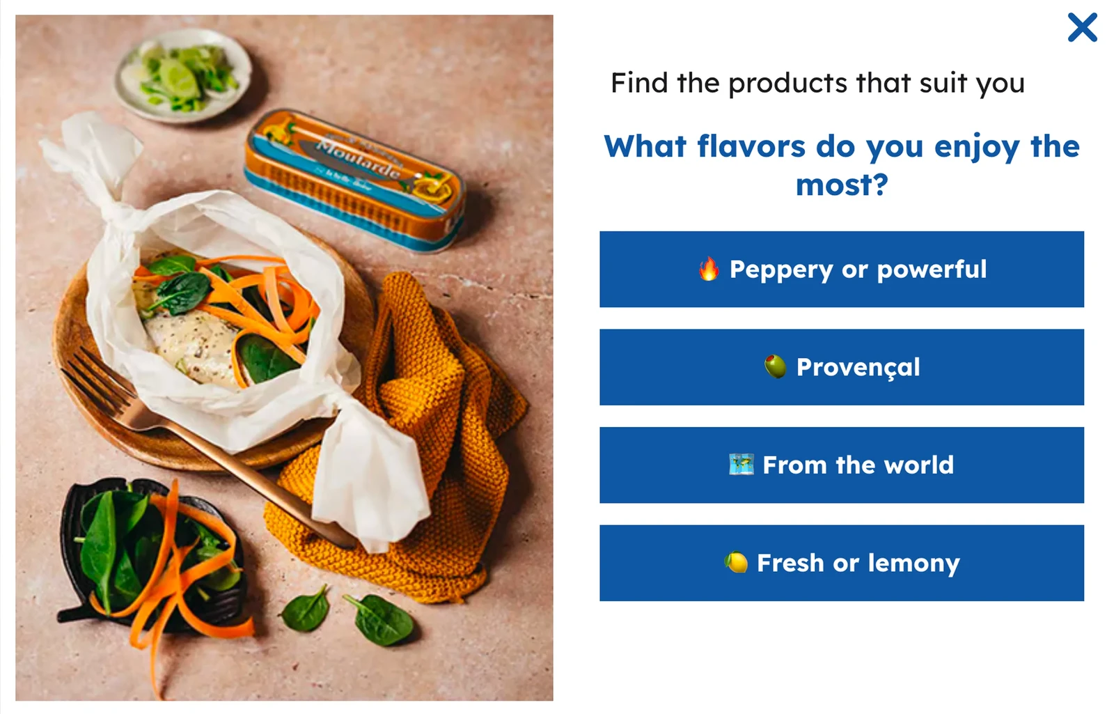
la belle-iloise uses a flavor preference quiz that routes visitors to personalized product recommendations
Keep shoppers up to date without interrupting their visit
Food and drink brands have a lot to share: new flavors, limited editions, offers, restocks, recipes and loyalty perks. Popups suit the biggest moments, while the rest needs a place shoppers can find from any page.
The Wisepops Onsite feed is a small tab that opens a panel of news, offers, content and AI product recommendations whenever shoppers choose to look.
About 90% of visitors to la belle-iloise arrive on product or category pages. The brand uses the feed and popups there to show new products and recipes.
Those campaigns brought in 7.6% of the brand's ecommerce revenue.
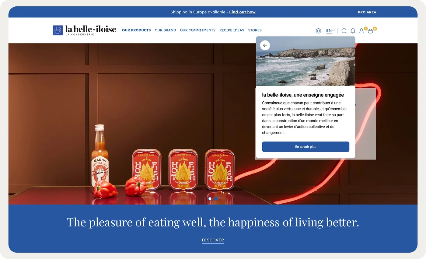
la belle-iloise shows new products and recipes in the Onsite feed on the pages where visitors arrive
Grow order value and recover abandoned carts
A single jar or bag rarely covers shipping, which is why Legendary Foods and Alpha Box & Dice push bundles. Shoppers also add snacks to a cart on impulse and leave before checkout.
Wisepops AI recommendations suggest products that go with what each visitor browses. AI cart recovery reminds shoppers what they left in the cart while they're still on the site.
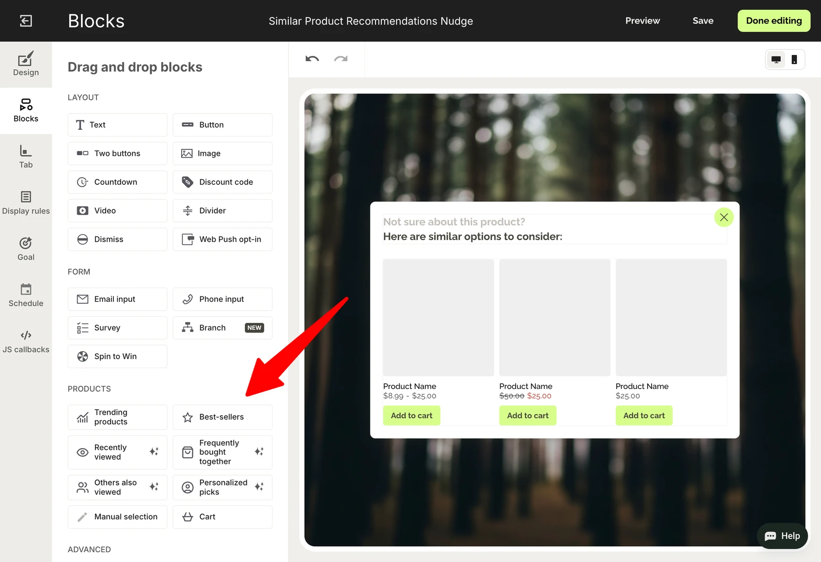
A recommendations nudge suggests similar products to shoppers as they browse
Find out which product pages sell
Seedlip and Compartés put their key answers on product pages, because that's where shoppers decide.
Wisepops analytics show results and revenue for every page and campaign, so a brand can see where a campaign would help most.
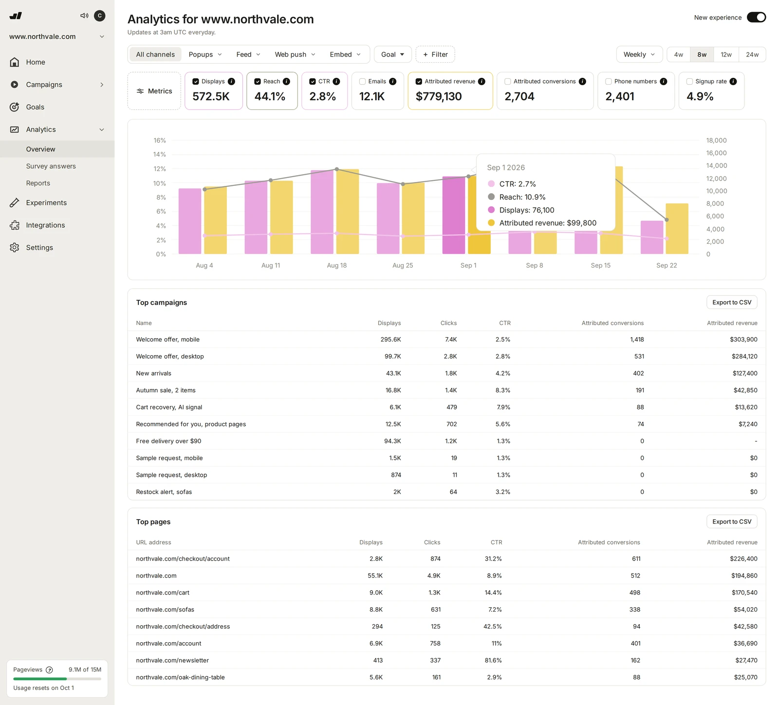
Analytics by page show which pages convert best and where campaigns help
 All Wisepops featuresSee every feature, integration and included service in one place.See all features →
How I chose these food and beverage Shopify stores
I picked every store by hand and checked that each one runs on Shopify. I kept only stores that show at least one tactic another food or drink brand could use, and I reviewed the list in November 2026.
Every description is based on what I saw on the stores themselves, mostly on their homepages and product pages.
Food and beverage Shopify stores FAQ
What are some food and drink business ideas?
Ideas that already work online include functional drinks, non-alcoholic spirits and beer, wine in cans, high-protein snacks, tinned seafood and chili crisp.
Others build a business around a format, such as frozen breads baked at home, drink cubes that flavor water or candy-flavored dates.
Gifts are a business of their own, from custom-wrapped chocolate bars to wine subscriptions bought for someone else.
Which Shopify themes do food and drink stores use?
Many stores on this list run custom themes built for their brand. Others start from Shopify themes such as Palo Alto, Flow, Dawn and Broadcast, then customize colors, fonts and sections to match their packaging.
Other themes that suit food and drink stores include Refresh, Foodie, Shapes, Whisk, Fizz, Chill, Press, Boule and Iridium.
What are the most common sales and conversion tactics for food and drink stores?
The tactics I saw most often were subscriptions with a discount, starter sets and bundles, free-shipping thresholds, customer reviews and limited flavors.
Many stores also use quiz popups to collect leads. A short quiz helps a new visitor pick a first product, and every answer becomes zero-party data the brand can use in later emails and offers.
How do food brands sell products shoppers can't taste first?
The stores on this list help shoppers imagine the flavor instead. Intelligentsia photographs each new coffee with the fruits from its tasting notes, and SkinnyDipped opens on a close-up of a chocolate wafer cut in half.
Customer photos help too. NOBL shows a grid of photo reviews from customers, and Hot Ones lets fans buy the sauces they saw guests taste on the show.
How do food brands earn trust before the first order?
The stores on this list answer three doubts: what's inside, whether it's tested and what happens if the shopper doesn't like it. Transparent Labs links to all its test results, and Loonen gives Test Results its own place in the main menu.
Others take the risk away. Huel offers a 30-day taste guarantee and Opopop a 100% satisfaction guarantee, while LesserEvil compares its snacks with other brands in a simple table.
Which Shopify apps do food and beverage stores use?
The stores on this list rely on Shopify apps for the features Shopify doesn't cover out of the box.
For email and SMS, these brands use Klaviyo, Omnisend and Mailchimp, along with Retention.com to identify more of their visitors. Gorgias and Intercom handle customer support, Yotpo collects reviews and Rebuy recommends products in the cart.
For testing and analytics, they use Optimizely and Hotjar. Some also connect Salesforce, and some link their store to TikTok.
Many stores also use Shopify popup apps such as Wisepops and Alia to run quizzes, collect emails and recover carts.
Get started
in minutes
Start converting more visitors today.
Get started in minutes and see results right after.